
4D v16.3
Form editor
- 4D Design Reference
-
- Building forms
-
- Form editor
- Form properties
- Form Properties (Explorer)
- Creating a multi-page form
- Using inherited forms
- Modifying data entry order
- Inserting and organizing form objects
- Setting object display properties
- Rotation of text
- Using static pictures
- Using references in static text
- Duplicating on a matrix
- Incrementing a set of variables
- Scaling a form
- Using object methods
- Using object views
- Using shields
- Using the preconfigured library
- Creating and using custom object libraries
- Displaying information about objects on forms being executed
 Form editor
When you create a new form with the Form Wizard, you can choose many customization options. Using templates, you can control the appearance of fields and field labels, choose the size of the form and add a set of automatic buttons.
This is only the beginning though, since 4D provides a full-featured Form editor that allows you to modify your form until you achieve the effect that you want. With the Form editor, you can create and delete objects, manipulate objects directly, and set form and object properties.
The Form editor displays each form in its own window, which has both an object and tool bar. You can have several forms open at the same time. The rulers on the side and bottom help you position objects in the form. You can change measurement units so that it displays inches, centimeters, or pixels.
This section covers the basic elements of the Form editor. The section Working with active objects describes the fields and other active objects in detail.
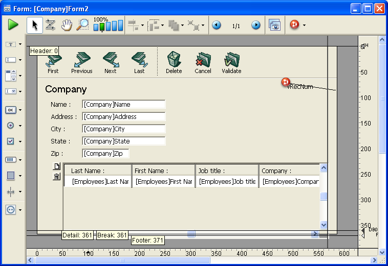
You can show or hide most interface elements in the Form editor. This feature allows you to show only the elements that you need to create or view in a form, or only the tools that you want to use. This option is always applied to the Form editor’s current window. For example, it is useful to show the output control lines when you are working on an output form.
To show or hide an element in the Form editor:
- Choose Display from the Form menu.
OR
Use the Display command in the context menu that appears in the Form editor’s window (right-click in the window without clicking on an object).
A hierarchical submenu appears listing all the elements that you can show or hide: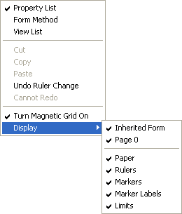
A check mark placed next to the element indicates that it will be shown. To hide an element, select the element so that the check mark disappears. - Select the element that you want to show or hide.
Here is a description of the commands in this menu:- Inherited form: Shows or hides inherited form objects (if there is an inherited form) on the current page of the form. For more information, refer to Using inherited forms.
- Page 0: Shows or hides the objects from page 0 on the form’s current page. This option allows you to distinguish between the objects on the form’s current page and those on page 0. For more information about pages in forms, refer to the Creating a multi-page form section.
- Paper: Shows or hides the borders of the printing page, which are shown as gray lines. This option may have no apparent effect when the Limits (see below) option is selected. If the size of the form is smaller than the printing page, the page’s borders are shown outside of the form’s viewing area and therefore do not appear. Refer to Printing a form.
- Rulers: Shows or hides the rulers in the Form editor’s window.
- Markers: Shows or hides the output control lines and associated markers that show the limits of the form’s different areas.
- Marker Labels: Shows or hides the marker labels, available only when the output control lines are displayed. For more information, refer to the Moving output control lines paragraph.
- Limits: Shows or hides the form’s limits. When this option is selected, the form is displayed in the Form editor as it appears in Application mode. This way you can adjust your form without having to switch to the Application mode in order to see the result.
You can zoom in the current form. Switch to “Zoom” mode by clicking on the magnifying glass  , or by clicking directly on the desired bar
  . The display percentages are 50%, 100%, 200%, 400% and 800%.
- When you click on the magnifying glass, the cursor changes into one. You can then click in the form to increase the display or hold down Shift and click to reduce the display percentage.
- When you click on a percentage bar, the display is immediately modified.
In Zoom mode, all Form editor functions remain available(*).
(*) For technical reasons, it is not possible to select list box elements (headers, columns, footers) when the Form editor is in Zoom mode.
The toolbar of the Form editor offers a set of tools to manipulate and modify the form. Each window has its own toolbar.

The toolbar contains the following elements:
 Execute the form: Used to test the execution of the form. When you click on this button, 4D opens a new window and displays the form in its context (list of records for a list form and current record page for a detail form). The form is executed in the main process.
 Selection tool: Allows selecting, moving and resizing form objects. For more information, refer to Selecting objects.
Note: When an object of the Text or Group Box type is selected, pressing the Enter key lets you switch to editing mode. Entry order: Switches to “Entry order” mode, where it is possible to view and change the current entry order of the form. For more information, refer to Data entry order. Note that shields now allow viewing the current entry order, while still working in the form (see Using shields).
  Moving: Switches to “Move” mode, where it is possible to reach any part of the form quickly by using drag and drop in the window. The cursor takes the shape of a hand. This navigation mode is particularly useful when zooming in the form.
 Zoom: Allows modifying the form display percentage (100% by default). You can switch to “Zoom” mode by clicking on the magnifying glass or by clicking directly on the desired bar. This feature is detailed in previous section.
 Alignment: This button is linked to a menu that allows aligning objects in the form. It is enabled (or not) depending on the objects selected.
 Distribution: This button is linked to a menu that allows distributing objects in the form. It is enabled (or not) depending on the objects selected.
Note: For more information about alignment and distribution of objects, refer to the Aligning objects paragraph. Level: This button is linked to a menu that allows changing the level of objects in the form. It is enabled (or not) depending on the objects selected. For more information, refer to the Layering objects paragraph.
 Group/Ungroup: This button is linked to a menu that allows grouping and ungrouping selections of objects in the form. It is enabled (or not) depending on the objects selected. For more information, refer to the Grouping objects paragraph.
 Display and page management: This area allows passing from one form page to another and adding pages. To navigate among form pages, click the arrow buttons, or click the central area and choose the page to display from the menu that appears. If you click the right arrow button while the last form page is displayed, 4D allows you to add a page. For more information about this, refer to the Creating a multi-page form section.
  Managing views: This button displays or hides the views palette. This new function is detailed in Using object views .
  Displaying shields: Each click on this button causes the successive display of each type of form shield. The button is also linked to a menu that allows directly selecting the type of shield to display. This function is detailed in the Using shields section.
 Preconfigured object library: This button displays the preconfigured object library that provides numerous objects with certain properties that have been predefined. For more information, refer to Using the preconfigured library.
  User lock: When shown on the right side of the toolbar, this icon means that the form is “Editable by user.” In this case, it cannot be edited directly; the form must first be unlocked by clicking this icon. For more information, please refer to the Editable by user paragraph.
The object bar contains all the active and inactive objects that can be used in 4D forms. Some objects are grouped together by themes (buttons, radio buttons, menus, etc.). Each theme includes several alternatives that you can choose between. When the object bar has the focus, you can select the buttons using the keys of the keyboard. The following table describes the object groups available and their associated shortcut key.
| Button | Group | Key |
 | Text / Group Box | T |
 | Field / Variable | F |
 | Scrollable Area / Hierarchical List / List Box | L |
 | Combo Box / Pop-up/Drop-down List / Hierarchical Pop-up Menu / Picture Pop-up Menu | P |
 | Button / 3D Button / Highlight Button / Invisible Button / Picture Button / Button Grid | B |
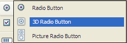
 | Radio Button / 3D Radio Button / Picture Radio Button | R |
 | Check Box / 3D Check Box | C |
 | Progress Indicator / Dial / Ruler | I |
 | Rectangle / Line / Rounded Rectangle / Oval / Matrix | S |
 | Splitter / Tab Control | D |
 | Plug-in Area / Subform / Web Area | X |
To draw an object type, select the corresponding button and then trace the object in the form. After creating an object, you can modify its type using the Property List. Hold down the Shift key as you draw to constrain the object to a regular shape. Lines are constrained to horizontal, 45°, or vertical, rectangles are constrained to squares, and ovals are constrained to circles.
The current variant of the theme is the object that will be inserted in the form. When you click the right side of a button, you access the variant menu:
When a button is selected, you can scroll through its variants using the Shift+Selection key shortcut. Help tips display the currently selected variant and the associated selection key of the object.
You can click twice on the button so that it remains selected even after you have traced an object in the form (continual selection). This function makes creating several successive objects of the same type easier. To cancel a continual selection, click on another object or tool.
Both forms and form objects have properties that control access to the form, the appearance of the form, and the behavior of the form when it is used. Form properties include, for example, the form’s name, its menu bar, and its size. Object Properties include, for example, an object’s name, its dimensions, its background color, and its font.
You can display and modify form and object properties using the Property List. It displays either form or objects properties depending on what you select in the editor window.
To display/hide the Property List:
- Choose Property List from the Form menu or from the context menu of the Form editor (right-click in the editor window but not on any object).
OR
Use the Ctrl+Shift+Space bar (Windows) or Command+Shift+Space bar (Mac OS) shortcut.
The Property List appears:
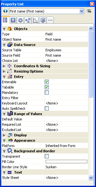
The Property List displays either the properties of the form or those of the object(s) selected:
- When no object is selected, the Property List displays the form properties,
- When an object or set of objects is selected, the Property List displays the properties of the object or the common properties of all the objects selected.
You can select the elements whose properties you want to display by clicking on them in the form or using the selection list at the top of the Property List window. The selection list contains three different parts, separated by a line:
- Form name,
- Dynamic objects (linked to a variable),
- Static objects (not linked to a variable).
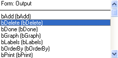
For each dynamic object, the list displays either the name of the variable followed by the object name between parentheses, or the object name only. You can set this display using the menu associated with the list. The command indicates the current type of display:
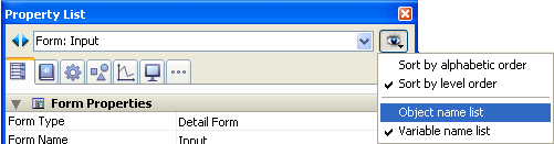
You can also modify the sort of each part of the list. By default, the list is sorted according to level order (from foreground toward the background). The associated menu allows you to sort the list by alphabetical order.
Also, the buttons located to the left of the list  allow you to select each object in the list successively, toward the top or bottom.
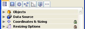
You can choose how information in the Property List is displayed using the page selection tabs.
- The first page
 (Main) displays all information related to the selected object using different themes (Data Source, Coordinates & Sizing, Events, etc.). You can expand or collapse each theme by clicking on the expansion icon to the left of its name; this lets you display only the properties with which you want to work.
The display is contextual: only themes and properties relevant to the form/type of object selected are displayed. The display of certain properties is also dynamically modified depending on the value of other properties. If, for instance, you set the Enterable property for a field, the Tabable property is then displayed. - The six other pages each contain specific information related to the selected object. In addition, all properties of each theme are displayed, regardless of the object type. Non-pertinent properties are dimmed.
This alternative provides a more global vision of the settings associated with a given object. The following describes the six theme pages: Settings: Contains properties that define object identity (type, name, data source, etc.).
 Behavior: Contains properties that set the dynamic behavior of the objects (associated method, drag and drop, form events).
 Dimensions: Contains properties that set coordinates, size and object resizing.
 Value: Contains properties that define the editing and display of enterable objects (enterable, shortcut, display format, etc).
 Appearance: Contains properties that set the graphic appearance of objects.
 Specific: Contains properties of the selected object type (tips for fields, animated picture buttons, print settings for forms, etc.).
Unlike other theme pages, non-relevant properties for the object do not appear.
You can navigate in the Property List using the following shortcuts:
- Arrow keys ↑ ↓: Used to go from one cell to another.
- Arrow keys ← →: Used to expand/collapse themes or menus.
- PgUp and PgDn: Used to select the first or last visible cell of the Property List.
- Home and End: Used to select the first or last cell of the Property List.
- Ctrl+click (Windows) or Command+click (Mac OS) on an event: Used to select/deselect every event in the list, according to the initial state of the event on which you clicked.
- Ctrl+click (Windows) or Command+click (Mac OS) on a theme label: Used to Collapse/Expand every theme in the list.
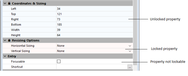
When the Editable by user property is applied to the form, padlocks are displayed in the Property List indicating the properties that are modifiable (or not) by the user:
For more information, refer to the Editable by user paragraph.
In addition to the padlock, the background color of properties indicates their status (64-bit versions of 4D only):
- light red: locked
- light blue: unlocked
- white: not lockable
The Form editor rulers extend along the height and width of the form. You can hide the rulers to increase your working area in the Form editor window. You can display the rulers again whenever necessary. To hide or display rulers, choose Rulers from the Display submenu in the Form menu or the Form editor context menu.
The rulers contain markers that show the position of the pointer when creating or resizing an object. While you are moving the object, the markers change to show the top, bottom, left and right sides of the object. The object markers allow you to align other objects to the same position on the rulers.
You can change the units the rulers use to suit your preference.
To define ruler units:
- Choose Ruler Definition from the Form menu.
4D displays the Ruler Definition dialog box, shown below. - Click the measurement unit you want to use.
- Click Points to display rulers that provide measurement in points. One point is equal to the width of one pixel. There are 72 points in an inch.
- Click Centimeters to display metric scale rulers.
- Click Inches to display rulers that use feet and inches.
- Click OK.
4D changes the measurement units to the scale you have selected. The objects’ coordinates will also use the same units.

Product: 4D
Theme: Building forms
4D Design Reference ( 4D v16)
4D Design Reference ( 4D v16.1)
4D Design Reference ( 4D v16.3)


