
4D v16.3
3D Buttons, 3D Check Boxes and 3D Radio Buttons
- 4D Design Reference
-
- Working with active objects
-
- What are active objects?
- Field and variable objects
- Buttons
- 3D Buttons, 3D Check Boxes and 3D Radio Buttons
- Picture Buttons
- Button Grids
- Check Boxes
- Radio Buttons and Picture Radio Buttons
- Pop-up Menus/Drop-down Lists
- Combo Boxes
- Hierarchical Pop-up Menus and Hierarchical Lists
- Picture Pop-up Menus
- Indicators
- Tab Controls
- Splitters
- Web areas
- Plug-in areas
- List boxes
- Subforms
 3D Buttons, 3D Check Boxes and 3D Radio Buttons
The family of 3D buttons includes 3D buttons, 3D check boxes and 3D radio buttons. These objects are structurally identical; the only difference is the processing of the associated variable:
- The associated variable of a 3D button equals 0 when the form is opened (standard state); it equals 1 when the user clicks the button (pressed state); then returns to its standard state and equals 0 again.
- The associated variable of a 3D check box equals 0 when the box is not checked and is set to 1 when the box is checked. Unlike buttons, the 3D check box keeps its state (0 or 1) until the user selects it again. For more information, refer to Check Boxes.
- 3D radio buttons operate in groups; the associated variable of the selected button equals 1 and the others equal 0. The variable can equal either 0 or 1 when the form is opened. For more information, refer to Radio Buttons and Picture Radio Buttons.
The family of 3D buttons offers numerous specific properties, which can be used to set up interfaces that can be perfectly integrated into different operating systems. More particularly, it is possible to apply different pre-defined styles to 3D buttons (bevel buttons, push buttons, etc.) or to associate pop-up menus with them. A great number of variations can be obtained by combining the various properties.
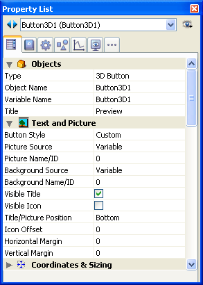
This property allows inserting a label on the button. The font and the style of this label can be set in the “Text” theme.
You can force a carriage return in the label by using the \ character (backslash).

To insert a \ in the label, enter \\.
By default, the label is placed in the center of the button. When the button also contains an icon, you can modify the relative location of these two elements using the Title/Picture Position property. It is possible to hide the title by deselecting the Visible Title property. In this case, the icon is automatically moved to the center of the button.
For the purpose of database translation, you can enter an XLIFF reference in the title area of a button (see Appendix C: XLIFF architecture).
This property allows setting the general appearance of the button. The style also plays a part in the availability of certain options. The following styles are available (Windows/Mac OS illustrations):
- None (default value).
A 3D button with the “None” style is similar to an invisible button: its “highlight” is not displayed. However, it has the same 3D button options available.
Under Mac OS, it is not possible to display the triangle indicating a linked pop-up menu. - Background Offset


This style corresponds to highlight buttons, except that when the user clicks on this type of button, a 3D effect is obtained by offsetting the picture located under the button.
When the “Background Offset” style is selected, no options are available. - Push Button
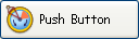
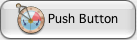
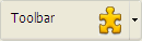
A 3D button with the “Push Button” style appears as a standard system button. It nevertheless benefits from 3D button options, with the exception of the “With Pop-up Menu” property. - Toolbar Button
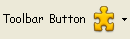
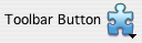
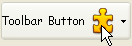
This style of 3D button is primarily intended for integration in a toolbar.
Under Windows, its highlight appears when the mouse rolls over it. When it uses the “With Pop-up Menu” property, a triangle is displayed to the right and in the center of the button.
Under Mac OS, the highlight of the button never appears. When it uses the “With Pop-up Menu” property, a triangle is displayed to the right and at the bottom of the button. - Custom
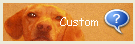
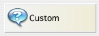
This 3D button style accepts a custom background picture and allows managing various additional parameters (icon and margin offset). For more information, refer to the “Custom 3D buttons” section below.
This style benefits from 3D button options, with the exception of the “With Pop-up Menu” property. - Circle


Under Mac OS X, a 3D button with the “Circle” style appears as a round system button. Two set styles are available for the circle, which depend on the size of the button in the form.
This style benefits from 3D button options, with the exception of the “With Pop-up Menu” property.
Under Windows, this button style is identical to the “None” style (the circle in the background is not taken into account). - Small System Square
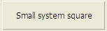
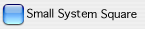
Under Mac OS X, a 3D button with the “Small System Square” style appears as a system square. This style benefits from all the 3D button options, except for the “With Pop-up Menu” property.
Under Windows, this button style is identical to the “None” style (the square in the background is not taken into account). - Office XP
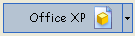
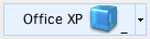
A 3D button with the “Office XP” style has the following characteristics:- The colors of its highlight and background are based on the system colors.
- Under Windows, in use, its highlight only appears when the mouse rolls over it.
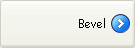
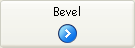
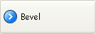
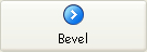
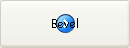
- Bevel
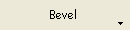
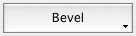
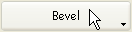
Under Mac OS, a “Bevel” button appears as a standard system button. It benefits from 3D button options, including the “With Pop-up Menu” property.
Under Windows, this button style is similar to the “Toolbar button” style, the only difference being that the triangle indicating the presence of an associated pop-up menu is located at the bottom right of the button. - Rounded Bevel
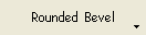
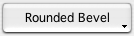
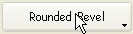
Under Mac OS, a “Rounded bevel” button is similar to a “Bevel” button except that its highlights are rounded.
Under Windows, this button style is identical to the “Bevel” style. - Collapse/Expand


This button style can be used to add a standard collapse/expand icon. These buttons are used natively in hierarchical lists. Under Windows, the button looks like a [+] or a [-]; under Mac OS, it looks like a triangle pointing right or down. This style is only used with 3D checkboxes, where the two states of the button correspond to the selected/deselected state of the check box. - Help


This button style can be used to display a standard help button of the system. You can use this style to add "system" help buttons in your forms. - OS X Textured

Under Mac OS X, a "Textured" button is a standard system button displaying a gradation of gray. Its height is predefined: it is not possible to enlarge or reduce it. This button style can make use of all the 3D buttons options.
Under Windows, this style is equivalent to a push button, which can, however, have a pop-up menu and which has the special feature of being transparent under Vista. - OS X Gradient
Under Mac OS X, a "Gradient" button is a two-tone system button. This button style can make use of all the 3D buttons options.
Under Windows, this style is equivalent to a push button, which can, however, have a pop-up menu.
It is possible to add an icon to any 3D button style (except for the “Background Offset” style).
Managing associated icons is done using several properties such as Picture Source and Picture Name/ID.
- Picture Source
As with picture buttons, the icon of a 3D button can come from four different sources: Variable, Picture Library, Resource File or File. Once the source is set, you can indicate the name or the number of the picture in the “Picture Name/ID” property. - Picture Name/ID
Once the picture source is set, enter the name (if the picture is a variable or comes from the picture library), the number (if the picture comes from the picture library or a resource file) or the pathname (if the picture comes from a picture file) of the picture in this area; in the case of a picture file, the pathname must be relative to the Resources folder of the database (see Automatic referencing of picture files). Pass 0 in this property if you do not wish to add a 3D button picture.
Note: You can associate a picture with a button by dragging and dropping a picture from the picture library or from a disk file. - Number of states
This property sets the exact number of states present in the picture used as the icon for the 3D button. In general, a button icon includes 4 states: active, clicked, mouse over and inactive. In the source picture, the states must be stacked vertically: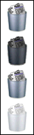
- Visible Title / Visible Icon
When the button includes both a title and a picture, you can hide one or the other item by deselecting the Visible Title or Visible Icon option (or both). When one of these items is hidden, it is automatically replaced by the other in the center of the button.
This property allows modifying the relative location of the button title in relation to the associated icon. This property has no effect when the button contains only a title (no associated picture) or a picture (no title). By default, when a 3D button contains a title and a picture, the text is placed below the picture .
Here are the results using the various options for this property:
- Left: The text is placed to the left of the icon. The contents of the button are aligned to the right.
- Top: The text is placed above the icon. The contents of the button are centered.
- Right: The text is placed to the right of the icon. The contents of the button are aligned to the left.
- Bottom: The text is placed below the icon. The contents of the button are centered.
- Centered: The text of the icon is centered vertically and horizontally in the button. This parameter is useful, for example, for text included in an icon.
This property allows displaying a symbol that appears as a triangle in the 3D button, which indicates that there is a pop-up menu attached:

The appearance and location of this symbol depend on the button style and the current platform.
The following 3D button styles accept the “With Pop-up Menu” property:
- None
- Toolbar Button
- Bevel
- Rounded Bevel
- Office XP
- OSX Textured
- OSX Gradient
To attach a pop-up menu symbol to a 3D button, there are two display options available: Linked and Separated.
 Separated
 Linked
Note: The real availability of a “separated” mode depends on the style of the button and the platform.
Each option specifies the relation between the button and the attached pop-up menu:
- When the pop-up menu is separated, clicking on the left part of the button directly executes the current action of the button; this action can be modified using the pop-up menu accessible in the right part of the button.
- When the pop-up menu is linked, a simple click on the button only displays the pop-up menu. Only the selection of the action in the pop-up menu causes its execution.
These options also influence the handling of form events by the button (for more information on this, refer to the 4D Language Reference manual).
It is important to note that the “With Pop-up Menu” property only manages the graphic aspect of the button. The display of the pop-up menu and its values must be handled entirely by the developer, more particularly using form events and the Dynamic pop up menu and Pop up menu commands.
When the “Custom” 3D button style is selected, several additional properties are available: Background Source, Background Name/ID, Icon Offset, Horizontal Margin and Vertical Margin.
- Background Source: This property allows you to set the picture that will be drawn in the background of the button. As with icons, you can indicate whether the picture comes from a variable, picture library, resource file or disk file.
- Background Name/ID: Once the source is set, you can indicate the name or number of the picture in this area.
As with icons, the background pictures can contain four distinct vertical areas, which will be used by 4D to represent the four standard states of the button: active, clicked, roll over, and disabled. Note that the effect produced during a click can also be handled using the Icon Offset property. - Icon Offset: This property allows setting a custom offset value in pixels, which will be used when the button is clicked: the title of the button will be shifted to the right and toward the bottom for the number of pixels entered. This function allows applying a customized 3D effect when the button is clicked.
- Horizontal Margin / Vertical Margin: These properties allow you to set the size (in pixels) of the internal margins of the button. These margins delimit the area that the 3D button icon and title must not surpass.
This parameter is useful, for example, when the background picture contains borders: Custom 3D button without margin
 3D button with 13-pixel margin

Product: 4D
Theme: Working with active objects
4D Design Reference ( 4D v16)
4D Design Reference ( 4D v16.1)
4D Design Reference ( 4D v16.3)


