
4D v16.3
Buttons
- 4D Design Reference
-
- Working with active objects
-
- What are active objects?
- Field and variable objects
- Buttons
- 3D Buttons, 3D Check Boxes and 3D Radio Buttons
- Picture Buttons
- Button Grids
- Check Boxes
- Radio Buttons and Picture Radio Buttons
- Pop-up Menus/Drop-down Lists
- Combo Boxes
- Hierarchical Pop-up Menus and Hierarchical Lists
- Picture Pop-up Menus
- Indicators
- Tab Controls
- Splitters
- Web areas
- Plug-in areas
- List boxes
- Subforms
 Buttons
The Form editor lets you add a wide variety of buttons to your forms. When you add buttons to a form, you can associate a standard action with each button. Automatic buttons let the user accept, cancel, or delete records, move between records, move from page to page in a multi-page form, and open, delete, or add records in a subform, etc.
You normally add buttons when you create the form using the Form Wizard. You can modify these buttons’ actions in the Property List. For example, you can remove a standard action from a button and write an object method that specifies the button’s action.
You can also add buttons and assign button actions with the Form editor. For example, if you need more than one subform on the form, you can add the necessary additional subforms and automatic buttons in the Form editor. You simply add each button to the form and associate a standard action with each one.
4D lets you use the following types of buttons:
- Buttons: These buttons are displayed in the current platform interface. Button text is displayed in the selected font, font size, style, and color.
The label displayed by the button is set in the Title field of the “Objects” theme in the Property List. You can change it at any time:
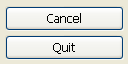
- Default Buttons: A default button looks exactly like a standard button, except that its border is thicker. This indicates to the user that the button is the recommended choice. The following illustration compares a button to a default button.
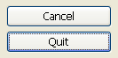
Under Mac OS, the default buttons are pulsing buttons:
The Default button object type does not exist as such but it is a property that is available for buttons.
Note: There can only be one Default button per form page. - Highlight buttons and Invisible buttons: These buttons are designed to be placed on top of graphic objects. Highlight buttons are transparent. When the user clicks a highlight button, the graphics of the button are highlighted.
Invisible buttons remain invisible and do not highlight when clicked. It is the resulting action, such as the display of a different page, which indicates that the button has been clicked. You place an invisible button on top of text or a graphic that denotes its function; then the user clicks on the text or graphic, and the button is activated. - 3D buttons and Picture buttons: The family of 3D buttons (3D buttons, 3D check boxes, and 3D radio buttons) and picture buttons include numerous specific properties. These buttons are described in the sections 3D Buttons, 3D Check Boxes and 3D Radio Buttons and Picture Buttons.
Buttons with standard actions are dimmed when appropriate during form execution. For example, if the first record of a table were displayed, the First Record button would appear dimmed.
You create a button by choosing the desired button type from the Type drop-down list. You then choose the standard button action you want from the Standard Action drop-down list (see Standard actions):
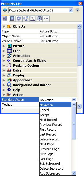
Note: You can also use the Standard Action hierarchical command in the context menu of the editor (right-click on the object).
Regardless of the type of button, you must select an item from this drop-down list. If you want the button to perform an action not listed in the Standard Action drop-down list, choose No Action and write an object method that specifies the button’s action (see Editing methods).
Normally, you would activate the On Clicked event in the Events theme and the method would run only when the button is clicked. You can associate a method with any button .
All variables associated with buttons (including regular buttons, highlight buttons, invisible buttons, radio buttons, picture radio buttons and check boxes) are set to 0 when the form is executed for the first time in Design or Application mode. When the user clicks a button, its variable is set to 1.
For a description of each action, see Standard actions.
Compatibility note: In previous versions of 4D, because of a sort of "side effect," you could use a custom button that was automatically enabled/disabled if you gave it the same variable name as a button with a standard action. For example, if your form contained a button that was named v1 with a standard action and a customized button whose variable name was also v1, this latter was automatically enabled/disabled according to the state of the standard button. This was corrected beginning with 4D v12 and you must now handle the enabling/disabling of each button separately.

Product: 4D
Theme: Working with active objects
4D Design Reference ( 4D v16)
4D Design Reference ( 4D v16.1)
4D Design Reference ( 4D v16.3)


