
4D v16.3
Picture Pop-up Menus
- 4D Design Reference
-
- Working with active objects
-
- What are active objects?
- Field and variable objects
- Buttons
- 3D Buttons, 3D Check Boxes and 3D Radio Buttons
- Picture Buttons
- Button Grids
- Check Boxes
- Radio Buttons and Picture Radio Buttons
- Pop-up Menus/Drop-down Lists
- Combo Boxes
- Hierarchical Pop-up Menus and Hierarchical Lists
- Picture Pop-up Menus
- Indicators
- Tab Controls
- Splitters
- Web areas
- Plug-in areas
- List boxes
- Subforms
 Picture Pop-up Menus
A picture pop-up menu is a pop-up menu that displays a two-dimensional array of pictures. A picture pop-up menu can be used to replace a picture button. The creation of the picture to use with a picture pop-up menu is similar to the creation of a picture for a picture button.
The concept is the same as for Button Grids, except that the graphic is used as a pop-up menu instead of a form object.
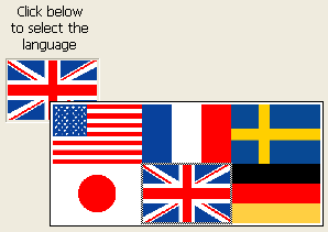
To create a picture pop-up menu, you need to refer to a picture. The following example uses the picture that was defined for picture buttons (see Picture Buttons). In this case, it allows you to select the interface language by selecting it from a picture pop-up menu.
Each language is represented by the corresponding flag:
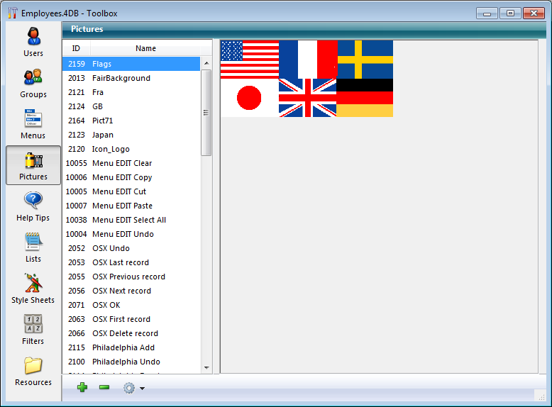
As with a picture button, a picture pop-up menu uses a picture that is organized in columns and rows (or in a grid). You can place that picture in the Picture Library, in a picture variable or in a picture file:
Then you can add the picture pop-up menu to the form.
Note: The Picture Library includes features that allow you to organize a picture as a table of thumbnails. It also allows you to preview the effects of the current settings. When a picture is defined as a table of thumbnails, you can create a picture pop-up menu by dragging the picture name into the form while pressing the Shift key.
Various specific properties can be used to configure picture pop-up menus:
- In the “Picture” theme, set the picture source using the “Source” drop-down list. You can choose between Variable, Picture Library, Resource File or File. Once the picture source has been set, enter the name (if the picture is a variable) or number (if the picture comes from a picture library or a resource file) or pathname (if the picture comes from a picture file) of the picture in the “Name/ID” area; in this latter case, the pathname must be relative to the Resources folder of the database (see Automatic referencing of picture files).
- In the “Crop” theme, set the number of rows and columns making up the thumbnail table.
- The Hor. margin and Vert. margin options create a margin between the edge of the menu and the picture. Enter values expressed in pixels.
You can assign the Goto Page action to a picture pop-up menu. When that action is selected, 4D will automatically display the page of the form that corresponds to the position of the picture selected in the picture array. Elements are numbered from left to right and top to bottom, beginning with the top left corner.
For example, if the user selects the 3rd element, 4D will display the third page of the current form (if it exists).
If you want to manage the effect of a click yourself, select No action.
For more information about standard actions, refer to Standard actions.
You can manage picture pop-up menus using methods. As with button grids, variables associated with picture pop-up menus are set to the value of the selected element in the picture pop-up menu. If no element is selected, the value is 0. Elements are numbered, row by row, from left to right starting with the top row.

Product: 4D
Theme: Working with active objects
4D Design Reference ( 4D v16)
4D Design Reference ( 4D v16.1)
4D Design Reference ( 4D v16.3)


