
4D v16.3
Picture Buttons
- 4D Design Reference
-
- Working with active objects
-
- What are active objects?
- Field and variable objects
- Buttons
- 3D Buttons, 3D Check Boxes and 3D Radio Buttons
- Picture Buttons
- Button Grids
- Check Boxes
- Radio Buttons and Picture Radio Buttons
- Pop-up Menus/Drop-down Lists
- Combo Boxes
- Hierarchical Pop-up Menus and Hierarchical Lists
- Picture Pop-up Menus
- Indicators
- Tab Controls
- Splitters
- Web areas
- Plug-in areas
- List boxes
- Subforms
 Picture Buttons
A picture button can have several different states— by comparison, a standard button accepts three states: enabled, disabled and clicked. As the name indicates, with a picture button each state is represented by a different picture.
Picture buttons can be used in two ways:
- As command buttons in a form. In this case, the picture button generally includes four different states: enabled, disabled, clicked and rolled over. This is what is used by the Form Wizard for most form templates.
- As a picture button letting the user choose among several choices. In this case, a picture button can be used in place of a pop-up picture menu. With Picture Pop-up Menus, all choices are displayed simultaneously (as the items in the pop-up menu), while the picture button displays the choices consecutively (as the user clicks the button).
Here is an example of a picture button. Suppose you want to give the users of a custom application the opportunity to choose the interface language for the application. You implement the option as a picture button in a custom properties dialog box: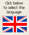 Clicking the object changes the picture
You implement the picture button in the following manner. First, you prepare one graphic in which the series of pictures is arranged in a row, a column, or a row-by-column grid bouton. You can add this graphic to the Picture Library, to a picture variable, or to a picture file.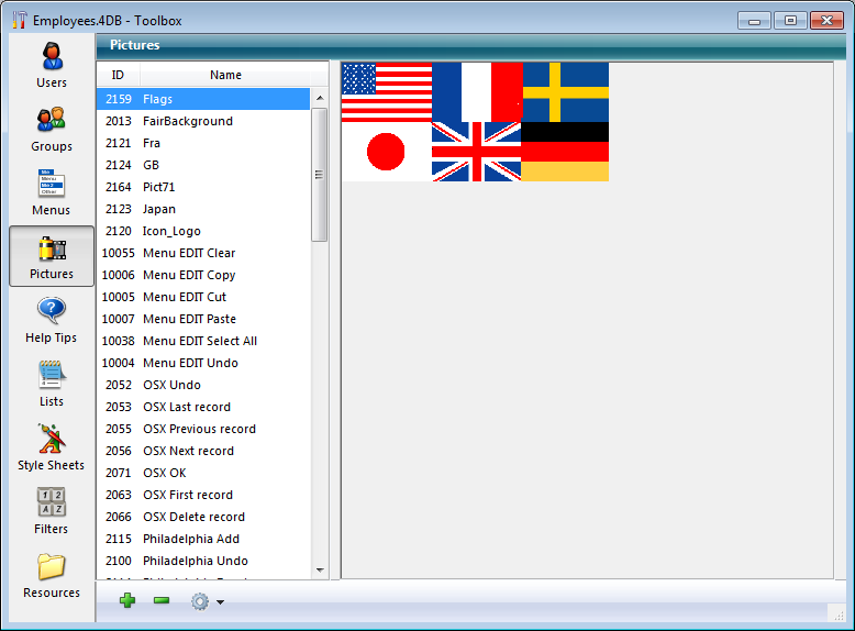
You can organize pictures as columns, rows, or a row-by-column grid (as shown above). When organizing pictures as a grid, they are numbered from left to right, row by row, beginning with 0. For example, the second picture of the second row of a grid that consists of four rows and three columns, is numbered 4.
Note: The Picture Library includes features that allow you to organize a picture as a table of thumbnails. When a picture has been defined as a table of thumbnails, you can create a picture button by dragging the picture name from the library.
Picture buttons have the following specific properties:
- In the “Picture” theme, set the picture source using the “Source” drop-down list. You can choose between Variable, Picture Library, Resource File or File. Once the picture source has been set, enter the name (if the picture is a variable) or the number (if the picture comes from a picture library or resource file) or the pathname (if the picture comes from a picture file) of the picture in the “Name/ID” area; in this latter case, the pathname must be relative to the Resources folder of the database (see Automatic referencing of picture files).
- In the “Crop” theme, you can set the number of rows and columns making up the thumbnail table. In our example, we use a picture comprising three columns and two rows.
- In the “Animation” theme, you can set the picture button display mode and operation. You can combine several options. This is described in more detail in the following section.
Note: The associated variable of the picture button returns the index number, in the thumbnail table, of the current picture displayed. The numbering of pictures in the table begins with 0.
Here are the different display and operation modes you can set for picture buttons. Naturally, these options can be combined:
- <No option checked>
Displays the next picture in the series when the user clicks; it displays the previous picture in the series when the user holds down the Shift key and clicks. When the user reaches the last picture in the series, the picture does not change when the user clicks again. In other words, it does not cycle back to the first picture in the series. - Switch Continuously
Is similar to previous except that the user can hold down the mouse button to display the pictures continuously (i.e., as an animation). When the user reaches the last picture, the object does not cycle back to the first picture. - Loop back to First Frame
Is similar to previous except that the pictures are displayed in a continuous loop. When the user reaches the last picture and clicks again, the first picture appears, and so forth. - Switch when Roll Over
The contents of the picture button are modified when the mouse cursor passes over it. The initial picture is re-established when the cursor leaves the button’s area. This mode is frequently used in multimedia applications or in HTML documents. The picture that is then displayed is the last picture of the thumbnail table, unless the Use Last Frame as Disabled option is selected (128). If this option is selected, it is the next-to-last thumbnail that is displayed. - Switch back when Released
This mode operates with two pictures. It displays the first picture all the time except when the user clicks the button. In that case, the second picture is displayed until the mouse button is released, whereupon it switches back to the first picture. This mode allows you to create an action button with a different picture for each state (idle and clicked). You can use this mode to create a 3D effect or display any picture that depicts the action of the button. - Use Last Frame as Disabled
This mode allows you to set the last thumbnail as the one to display when the button is disabled. When this mode is selected, 4D displays the last “part” of the referenced picture when the picture button is disabled. The thumbnail used when the button is disabled is processed separately by 4D: when you combine this option with the “Switch Continuously” and “Loop Back to First Frame” options, the last picture is excluded from the sequence associated with the button and only appears when it is disabled. - Switch every x Ticks
This mode allows you to cycle through the contents of the picture button at the specified speed (in ticks). For example, if you pass 10, the thumbnails will change every 10 ticks. In this mode, all other options are ignored.
Note: Note that the Transparent option (“Appearance” theme) can also be used to set the depiction of the picture button (makes the picture background transparent).
For example, you want to set a button that accepts the following modes: Switch back when Released, Switch when Roll Over and Use Last Frame as Disabled.
In the case of a table of thumbnails that has one row of four columns, each thumbnail corresponds to the following states: Default, Clicked, Roll over and Disabled.
In the Property List you would set the following properties: 1 row, 4 columns as well as the options Switch back when Released, Switch when Roll Over and Use Last Frame as Disabled.

Product: 4D
Theme: Working with active objects
4D Design Reference ( 4D v16)
4D Design Reference ( 4D v16.1)
4D Design Reference ( 4D v16.3)


