
4D v16.3
Button Grids
- 4D Design Reference
-
- Working with active objects
-
- What are active objects?
- Field and variable objects
- Buttons
- 3D Buttons, 3D Check Boxes and 3D Radio Buttons
- Picture Buttons
- Button Grids
- Check Boxes
- Radio Buttons and Picture Radio Buttons
- Pop-up Menus/Drop-down Lists
- Combo Boxes
- Hierarchical Pop-up Menus and Hierarchical Lists
- Picture Pop-up Menus
- Indicators
- Tab Controls
- Splitters
- Web areas
- Plug-in areas
- List boxes
- Subforms
 Button Grids
A button grid is a transparent object that is placed on top of a graphic. The graphic should depict a row-by-column array. You can use a button grid object to determine where the user clicks on the graphic. Your object method would use the On Clicked event and take appropriate action depending on the location of the click.
In 4D, a button grid is used as a color palette:
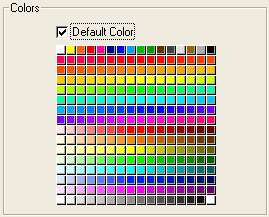
The buttons on the grid are numbered from top left to bottom right. In this example, the grid is 16 columns across by 16 rows down. The button in the top-left position returns 1 when clicked. If the red button at the far right of the second row is selected, the button grid returns 32.
To create the button grid, add a background graphic to the form and place a button grid on top of it. Specify the number of rows and columns in the corresponding entry areas of the “Crop” theme.
You can assign the Goto Page action to a button grid. When that action is selected, 4D will automatically display the page of the form that corresponds to the number of the button that is selected in the button grid.
For example, if the user selects the tenth button of the grid, 4D will display the tenth page of the current form (if it exists).
If you want to manage the effect of the selection of a button yourself, select No action.
For more information, refer to Standard actions.

Product: 4D
Theme: Working with active objects
grid
4D Design Reference ( 4D v16)
4D Design Reference ( 4D v16.1)
4D Design Reference ( 4D v16.3)


