
4D v16.3
OBJECT SET FORMAT
- 4D Language Reference
-
- Objects (Forms)
-
- Object Properties
- GET STYLE SHEET INFO
- LIST OF STYLE SHEETS
- OBJECT DUPLICATE
- OBJECT Get action
- OBJECT Get auto spellcheck
- OBJECT GET BEST SIZE
- OBJECT Get border style
- OBJECT Get context menu
- OBJECT GET COORDINATES
- OBJECT Get corner radius
- OBJECT Get data source
- OBJECT GET DRAG AND DROP OPTIONS
- OBJECT Get enabled
- OBJECT Get enterable
- OBJECT GET EVENTS
- OBJECT Get filter
- OBJECT Get focus rectangle invisible
- OBJECT Get font
- OBJECT Get font size
- OBJECT Get font style
- OBJECT Get format
- OBJECT Get help tip
- OBJECT Get horizontal alignment
- OBJECT Get indicator type
- OBJECT Get keyboard layout
- OBJECT Get list name
- OBJECT Get list reference
- OBJECT GET MAXIMUM VALUE
- OBJECT GET MINIMUM VALUE
- OBJECT Get multiline
- OBJECT Get name
- OBJECT Get placeholder
- OBJECT Get pointer
- OBJECT GET PRINT VARIABLE FRAME
- OBJECT GET RESIZING OPTIONS
- OBJECT GET RGB COLORS
- OBJECT GET SCROLL POSITION
- OBJECT GET SCROLLBAR
- OBJECT GET SHORTCUT
- OBJECT Get style sheet
- OBJECT GET SUBFORM
- OBJECT GET SUBFORM CONTAINER SIZE
- OBJECT Get text orientation
- OBJECT Get three states checkbox
- OBJECT Get title
- OBJECT Get type
- OBJECT Get vertical alignment
- OBJECT Get visible
- OBJECT Is styled text
- OBJECT MOVE
- OBJECT SET ACTION
- OBJECT SET AUTO SPELLCHECK
- OBJECT SET BORDER STYLE
- OBJECT SET COLOR
- OBJECT SET CONTEXT MENU
- OBJECT SET COORDINATES
- OBJECT SET CORNER RADIUS
- OBJECT SET DATA SOURCE
- OBJECT SET DRAG AND DROP OPTIONS
- OBJECT SET ENABLED
- OBJECT SET ENTERABLE
- OBJECT SET EVENTS
- OBJECT SET FILTER
- OBJECT SET FOCUS RECTANGLE INVISIBLE
- OBJECT SET FONT
- OBJECT SET FONT SIZE
- OBJECT SET FONT STYLE
- OBJECT SET FORMAT
- OBJECT SET HELP TIP
- OBJECT SET HORIZONTAL ALIGNMENT
- OBJECT SET INDICATOR TYPE
- OBJECT SET KEYBOARD LAYOUT
- OBJECT SET LIST BY NAME
- OBJECT SET LIST BY REFERENCE
- OBJECT SET MAXIMUM VALUE
- OBJECT SET MINIMUM VALUE
- OBJECT SET MULTILINE
- OBJECT SET PLACEHOLDER
- OBJECT SET PRINT VARIABLE FRAME
- OBJECT SET RESIZING OPTIONS
- OBJECT SET RGB COLORS
- OBJECT SET SCROLL POSITION
- OBJECT SET SCROLLBAR
- OBJECT SET SHORTCUT
- OBJECT SET STYLE SHEET
- OBJECT SET SUBFORM
- OBJECT SET TEXT ORIENTATION
- OBJECT SET THREE STATES CHECKBOX
- OBJECT SET TITLE
- OBJECT SET VERTICAL ALIGNMENT
- OBJECT SET VISIBLE
- _o_DISABLE BUTTON
- _o_ENABLE BUTTON
 OBJECT SET FORMAT
| OBJECT SET FORMAT ( {* ;} object ; displayFormat ) | ||||||||
| Parameter | Type | Description | ||||||
| * | Operator |

|
If specified, Object is an Object Name (String) If omitted, Object is a Field or a Variable | |||||
| object | Form object |
|
Object Name (if * is specified), or Field or Variable (if * is omitted) | |||||
| displayFormat | String |
|
New display format for the object | |||||
OBJECT SET FORMAT sets the display format for the objects specified by object to the format you pass in displayFormat. The new format is only used for the current display; it is not stored with the form.
If you specify the optional * parameter, you indicate an object name (a string) in object. If you omit the optional * parameter, you indicate a field or a variable in object. In this case, you specify a field or variable reference (field or variable objects only) instead of a string. For more information about object names, see the Object Properties section.
OBJECT SET FORMAT can be used for both input forms and output forms (displayed or printed) and can be applied to fields or variables (enterable/non-enterable).
Naturally, you must use a display format compatible with the type of data found in the object or with the object itself.
To learn more, see the example database.
To format Boolean fields, there are two possibilities:
- You can pass a single value in displayFormat. In this case, the field will be displayed as a checkbox and its label will be the value specified.
- You can pass two values, separated by a semicolon (;), in displayFormat. In this case, the field will be displayed as two radio buttons.
To format Date fields or variables, pass Char(n) in displayFormat, where n is one of the following predefined constants provided by 4D:
| Constant | Type | Value | Comment |
| Blank if null date | Longint | 100 | "" instead of 0 |
| Date RFC 1123 | Longint | 10 | |
| Internal date abbreviated | Longint | 6 | Dec 29, 2006 |
| Internal date long | Longint | 5 | December 29, 2006 |
| Internal date short | Longint | 7 | 12/29/2006 |
| Internal date short special | Longint | 4 | 12/29/06 (but 12/29/1896 or 12/29/2096) |
| ISO Date | Longint | 8 | 2006-12-29T00:00:00 (deprecated) |
| ISO Date GMT | Longint | 9 | 2010-09-13T16:11:53Z |
| System date abbreviated | Longint | 2 | Sun, Dec 29, 2006 |
| System date long | Longint | 3 | Sunday, December 29, 2006 |
| System date short | Longint | 1 | 12/29/2006 |
Note: The Blank if null date constant must be added to the format; it indicates that in the case of a null value, 4D must display an empty area instead of zeros.
To format Time fields or variables, pass Char(n) in displayFormat, where n is one of the following predefined constants provided by 4D:
| Constant | Type | Value | Comment |
| Blank if null time | Longint | 100 | "" instead of 0 |
| HH MM | Longint | 2 | 01:02 |
| HH MM AM PM | Longint | 5 | 1:02 AM |
| HH MM SS | Longint | 1 | 01:02:03 |
| Hour min | Longint | 4 | 1 hour 2 minutes |
| Hour min sec | Longint | 3 | 1 hour 2 minutes 3 seconds |
| ISO time | Longint | 8 | 0000-00-00T01:02:03 |
| Min sec | Longint | 7 | 62 minutes 3 seconds |
| MM SS | Longint | 6 | 62:03 |
| System time long | Longint | 11 | 1:02:03 AM HNEC (Mac only) |
| System time long abbreviated | Longint | 10 | 1•02•03 AM (Mac only) |
| System time short | Longint | 9 | 01:02:03 |
Note: The Blank if null time constant must be added to the format; it indicates that in the case of a null value, 4D must display an empty area instead of zeros.
To format Picture fields or variables, pass Char(n) in displayFormat, where n is one of the following predefined constants provided by 4D:
| Constant | Type | Value |
| On background | Longint | 3 |
| Replicated | Longint | 7 |
| Scaled to fit | Longint | 2 |
| Scaled to fit prop centered | Longint | 6 |
| Scaled to fit proportional | Longint | 5 |
| Truncated centered | Longint | 1 |
| Truncated non centered | Longint | 4 |
To format fields or variables of the Alpha or Number type, pass the label of the format directly in the displayFormat parameter.
For more information about display formats, see the Number formats and Alpha formats sections of the 4D Design Reference manual.
Note: In displayFormat, to use custom display formats that you may have created in the tool box, prefix the name of the format with a vertical bar (|).
To format picture buttons, in the displayFormat parameter, pass a character string respecting the following syntax:
cols;lines;picture;flags{;ticks}
- cols = number of columns in the picture.
- lines = number of lines in the picture.
- picture = picture used, coming from the picture library or a picture variable:
- If the picture comes from the picture library, enter its number, preceded by a question mark (e.g.: "?250").
- If the picture comes from a picture variable, enter the variable name.
- flags = display mode and operation of a picture button. This parameter can take any of the following values: 0, 1, 2, 16, 32, 64 and 128. Each of these values represents a display mode or an operation mode. These values are cumulative; for instance, if you want to enable the modes 1 and 64, pass 65 in the flags parameter. Here are the details for each value:
- flags = 0 (no option)
Displays the next picture in the series when the user clicks the picture. Displays the previous picture in the series when the user holds down the Shift key and clicks on the picture. When the user reaches the last picture in the series, the picture does not change when the user clicks it again. That is, it does not cycle back to the first picture in the series. - flags = 1 (Switch Continuously)
Similar to the previous option except that the user can hold down the mouse button to display the pictures continuously (i.e., as an animation). When the user reaches the last picture, the object does not cycle back to the first picture. - flags = 2 (Loop Back to First Frame)
Similar to the previous option except that the pictures are displayed in a continuous loop. When the user reaches the last picture and clicks again, the first picture appears, and so forth. - flags = 16 (Switch when Roll Over)
The contents of the picture button are modified when the mouse cursor passes over it. The initial picture is re-established when the cursor leaves the button's area. This mode is frequently used in multimedia applications or in HTML documents. The picture that is then displayed is the last picture of the thumbnail table, unless the Use Last Frame as Disabled option is selected (128). If that option is selected, it is the next-to-last thumbnail that is displayed. - flags = 32 (Switch Back when Released)
This mode operates with two pictures. It displays the first picture all the time except when the user clicks the button. In that case, the second picture is displayed until the mouse button is released, whereupon it switches back to the first picture. This mode allows you to create an action button that displays its status (idle or clicked). You can use this mode to create a 3D effect or display any picture that depicts the action. - flags = 64 (Transparent)
Used to make the background picture transparent. - flags = 128 (Use Last Frame as Disabled)
This mode allows you to set the last thumbnail as the thumbnail to display when the button is disabled. When this mode is selected, 4D displays the last thumbnail when the button is disabled. When this mode is used in addition to the modes 0, 1 and 2, the last thumbnail is not taken into account in the sequence of the other modes. It will appear only when the button is disabled.
- flags = 0 (no option)
- ticks = activates the “Switch every n Ticks” mode and sets the time interval between the display of each picture. When this optional parameter is passed, it allows you to cycle through the contents of the picture button at the specified speed. For example, if you enter "2;3;?16807;0;10", the picture button will display a different picture every 10 ticks. When this mode is active, only the Transparent mode can be used (64).
To format picture pop-up menus, in the displayFormat parameter, pass a character string respecting the following syntax:
cols;lines;picture;hMargin;vMargin;flags
- cols = number of columns in the picture.
- lines = number of lines in the picture.
- picture = picture used, coming from the picture library or a picture variable:
- If the picture comes from the picture library, enter its number, preceded by a question mark (e.g.: "?250").
- If the picture comes from a picture variable, enter the variable name.
- hMargin = margin in pixels between the horizontal limits of the menu and the picture.
- vMargin = margin in pixels between the vertical limits of the menu and the picture.
- flags = transparency mode of picture pop-up menu. Accepts the values 0 and 64:
- flags = 0: the picture pop-up menu is not transparent,
- flags = 64: the picture pop-up menu is transparent.
To format objects of the thermometer or ruler type, in the displayFormat parameter, pass a character string respecting the following syntax:
min;max;unit;step;flags{;format{;display}}
- min = value of the first graduation of the indicator.
- max = value of the last graduation of the indicator.
- unit = interval between the indicator graduations.
- step = minimum interval of cursor movement in the indicator.
- flags = display mode and operation of indicators. This parameter accepts the values 0, 2, 3, 16, 32 and 128. These values can be accumulated in order to set several options (except for 128). Here are the details for each value:
- flags = 0: does not display the units.
- flags = 2: displays the units on the right or below the indicator.
- flags = 3: displays the units on the left or above the indicator.
- flags = 16: displays graduations adjacent to the units.
- flags = 32: On Data Change is executed while the user is adjusting the indicator. If this value is not used, On Data Change occurs only after the user is finished adjusting the indicator.
- flags = 128: activates the "Barber shop" (continuous animation) mode. This value cannot be combined with others. In this mode, the other parameters are ignored (except for the display parameter if passed). For more information about this mode, please refer to the Design Reference manual.
- format = display format of the indicator graduations.
Keep in mind that the units and graduations are automatically hidden if the size of the indicator object does not permit them to be displayed correctly. - display = specific display options. In the case of thermometers, this parameter is only taken into account when the flags subparameter is 128.
- display = 0 (or is omitted): displays a standard ruler / displays a thermometer in continuous animation of the "barber shop" type.
- display = 1 : activates "Stepper" mode for a ruler / activates the "Asynchronous progress" mode for a thermometer. For more information about these options, please refer to the Design Reference manual.
To format objects of the dial type, in the displayFormat parameter, pass a character string respecting the following syntax:
min;max;unit;step{;flags}
- min = value of the first graduation of the indicator.
- max = value of the last graduation of the indicator.
- unit = interval between the indicator graduations.
- step = minimum interval of cursor movement in the indicator.
- flags = operation mode of the dial (optional). This parameter only accepts the value 32: On Data Change is executed while the user is adjusting the indicator. If this value is not used, On Data Change occurs only after the user is finished adjusting the indicator.
To format button grids, in the displayFormat parameter, pass a character string respecting the following syntax:
cols;lines
- cols = number of columns of the grid.
- lines = number of lines of the grid.
Note: For more information about the display formats for form objects, refer to the 4D Design Reference manual.
To format 3D buttons, in the displayFormat parameter, pass a character string respecting the following syntax:
title;picture;background;titlePos;titleVisible;iconVisible;style;horMargin;vertMargin;iconOffset;popupMenu;hyperlink;numStates
- title = Button title. This value can be expressed as text or a resource number (ex.: “:16800,1”)
- picture = Picture linked to a button that comes from a picture library or a picture variable:
- If the picture comes from a picture library, enter its number, preceded with a question mark (ex.: “?250”).
- If the picture comes from a picture variable, enter the variable name.
- If the picture comes from a file stored in the Resources folder of the database, enter a URL of the type "#{folder/}picturename" or "file:{folder/}picturename".
- background = Background picture linked to a button (Custom style), that comes from a picture library, a picture variable, a PICT resource or a file stored in the Resources folder (see above).
- titlePos = position of the button title. Five values are possible:
- titlePos = 1: Left
- titlePos = 2: Top
- titlePos = 3: Right
- titlePos = 4: Bottom
- titlePos = 5: Middle
- titleVisible = Defines whether or not the title is visible. Two values are possible:
- titleVisible = 0: the title is hidden
- titleVisible = 1: the title is displayed
- iconVisible = Defines whether or not the icon is visible. Two values are possible:
- iconVisible = 0 : the icon is hidden
- iconVisible = 1 : the icon is displayed
- style = Button style. The value of this option determines whether various other options are taken into consideration (for example, background). The following values are possible:
- style = 0: None
- style = 1: Background offset
- style = 2: Push button
- style = 3: Toolbar button
- style = 4: Custom
- style = 5: Circle
- style = 6: Small system square
- style = 7: Office XP
- style = 8: Bevel
- style = 9: Rounded bevel
- style = 10: Collapse/Expand
- style = 11: Help
- style = 12: OS X Textured
- style = 13: OS X Gradient
- horMargin = Horizontal margin. Number of pixels delimiting the inside left and right margins of the button (areas that the icon and the text must not encroach upon).
- vertMargin = Vertical margin. Number of pixels delimiting the inside top and bottom margins of the button (areas that the icon and the text must not encroach upon).
- iconOffset = Shifting of the icon to the right and down. This value, expressed in pixels, indicates the shifting of the button icon to the right and down when the button is clicked (the same value is used for both directions).
- popupMenu = Association of a pop-up menu with the button. Three values are possible:
- popupMenu = 0: No pop-up menu
- popupMenu = 1: With linked pop-up menu
- popupMenu = 2: With separate pop-up menu
- hyperlink = TItle is underlined on mouseover to resemble a hyperlink (legacy mechanism). Two values are possible:
- hyperlink = 0: title is not underlined on mouseover
- hyperlink = 1: title is underlined on mouseover
- numStates = Number of states present in picture used as icon for the 3D button, and which will be used by 4D to represent the standard button states (from 0 to 4).
Certain options are not taken into account for all 3D button styles. Also, in certain cases, you may wish to not change all the options. To not pass an option, simply omit the corresponding value. For example, if you do not want to pass the titleVisible, vertMargin and hyperlink options, you can write:
OBJECT SET FORMAT(myVar;"NiceButton;?256;:562;1;;1;4;5;;5;0;;2")To format the icon in a list box header, pass a character string in the displayFormat parameter, which respects the following syntax:
picture;iconPos
- picture = header picture, coming from the picture library, a picture variable, or a picture file:
- If the picture comes from the picture library, enter its number, preceded by a question mark (e.g.: "?250").
- If it comes from a picture variable, enter the variable name.
- If it comes from a file stored in the Resources folder of the database, enter a URL of the type "#{folder/}picturename" or "file:{folder/}picturename".
- iconPos = position of icon in header. Two values are supported:
- iconPos = 1: Left
- iconPos = 2: Right
This feature is useful, for example, when you want to work with a customized sort icon.
The following line of code formats the [Employee]Date Hired field to the fifth format (Internal date long).
OBJECT SET FORMAT([Employee]Date Hired;Char(Internal date long))The following example changes the format for a [Company]ZIP Code field according to the length of the value stored in the field:
 If(Length([Company]ZIP Code)=9)

    OBJECT SET FORMAT([Company]ZIP Code;"#####–####")

 Else

    OBJECT SET FORMAT([Company]ZIP Code;"#####")

End ifThe following example formats the value of the [Stats]Results field depending on whether it is a positive, negative, or null number:
OBJECT SET FORMAT([Stats]Results;"### ##0.00;(### ##0.00);")The following example sets the format of a Boolean field to display Married and Unmarried, instead of the default Yes and No:
OBJECT SET FORMAT([Employee]Marital Status;"Married;Unmarried")Provided that you have stored a picture file named "envelope_open.png" in the Resources folder of the database, you can write:
 vIcon:="#envelope_open.png"

 vPos:="2" // Right

 OBJECT SET FORMAT(*;"Header1";vIcon+";"+vPos)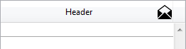
The following example sets the format of a Boolean field to display a checkbox labelled “Classified”:
OBJECT SET FORMAT([Folder]Classification;"Classified")You have a table of thumbnails containing 1 row and 4 columns, intended to display a picture button (“default”, “clicked”, “roll over” and “disabled”). You want to associate the Switch when Roll Over, Switch back when Released and Use Last Frame as Disabled options with it:
OBJECT SET FORMAT(*;"PictureButton";"4;1;?15000;176")Switching a thermometer to "Barber shop" mode:
 OBJECT SET FORMAT($Mythermo;";;;;128")

 $Mythermo:=1 `Start animation
Product: 4D
Theme: Objects (Forms)
Number:
236
Modified: 4D v11 SQL
Renamed: 4D v12
Modified: 4D v12
Modified: 4D v15 R5
4D Language Reference ( 4D v16)
4D Language Reference ( 4D v16.1)
4D Language Reference ( 4D v16.2)
4D Language Reference ( 4D v16.3)


