
4D v16.3
List box column specific properties
 List box column specific properties
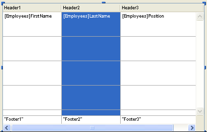
You can select a list box column in the Form editor by clicking on it when the List Box object is selected:
You can set standard properties (text, background color, etc.) for each column of the List box; these properties take priority over those of the List box object properties.
You also have access to specific properties that are detailed in this section.
Note: The Data Source theme is not available for list box columns of object array type. In this context, the contents of each column cell are based on attributes found in the corresponding element of the object array. For more information, refer to the List box, Using object arrays in columns (4D View Pro) section.
- Expression (selection type list boxes): The Expression lets you define the 4D expression to be associated with the column:
You can enter:- A 4D expression (simple expression, formula or 4D method). The expression must return a value. The result of the expression will be automatically displayed when you switch to Application mode. The expression will be evaluated for each record of the selection (current or temporary) of the Master Table. If it is empty, the column will not display any results.
- A simple variable (in this case, it must be explicitly declared for compilation). You can use any type of variable except BLOBs and arrays. The value of the variable will be generally calculated in the On Display Detail event.
- A field using the standard [Table]Field syntax (example: [Employees]LastName). The following types of fields can be used:
- Alpha
- Text
- Numeric
- Date
- Time
- Picture
- Boolean
In any case, you can define the expression using the 4D Formula Editor by clicking on the [...] button in the Property List. If an expression is used, the column is never enterable even if the Enterable option is checked.
If a field or a variable is used, the column can be enterable or not depending on the Enterable option (and the “Non modifiable” attribute in the Structure Editor).
In Design mode, the data source type is displayed in the first row of the column. For example, Field=[Table1]MyFld.
If the defined expression is not correct, the column of the list box will display an error message in Application mode.
- Default values (array type list boxes): click on the Edit... button to display a dialog box where you can enter a list of default values for the column. These values are automatically available in the array variable associated with this column when the form is executed.
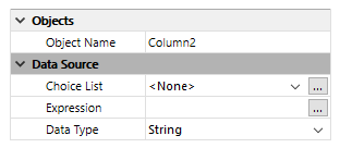
You must enter a list of values separated by carriage returns, then validate the dialog box. For more information about this dialog box, refer to Default values in the Data entry controls and assistance section. - Data Type (selection type list boxes): This menu is used to define the type of expression or variable associated with the column. It is used to indicate the display format to apply and lets you update the Display Type menu in the “Display” theme.
If a field is entered in the Expression area, the Data Type property is not displayed; the display format corresponding to the field type is used. - Choice List: This property can be used to associate a choice list with a column of the list box. If you designate a choice list, users can use its values (displayed via a pop-up menu) to modify the values of the column and its associated array:
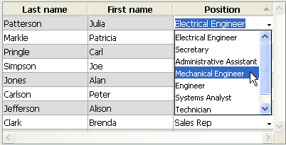
Note that keyboard entry is still possible. If you want values to only be modified using the pop-up selection menu, choose a required list (see below).
Note: - If you associate an choice list with a numeric column, you must use the character "." as a decimal separator in the list. It will be automatically converted to a common decimal separator and the other symbols (",", "$" ...) will be ignored in the pop-up menu.
- If the specified list is hierarchical, only the items of the first level are taken into account.
- Save as Value/Reference: When a column is associated with a choice list, this property allows the definition of the type of content to be saved in the column field or variable. For more information about this option, refer to Save as Value or Reference.
This theme groups together the properties related to the list box column width.
- Width: Default column width (in pixels). This value is updated when you resize the column using the mouse in the Form editor.
If the Resizable property is checked, the user can also manually resize the column. - Minimum Width: The minimum width of the column (in pixels). The width of the column cannot be reduced below this value when resizing the column or form.
- Maximum Width: The maximum width of the column (in pixels). The width of the column cannot be increased beyond this value when resizing the column or form.
Note: When resizing the form, if the Grow horizontal sizing property was assigned to the list box, the right-most column will be increased beyond its maximum width if necessary.
This theme only contains the Resizable option (checked by default). When this option is checked, the user can resize the column by moving the sides of the header area.
This theme groups together all the properties related to data entry in the list box column.
- Enterable: Authorizes column entry (checked by default). To change the value of a cell, the user must click twice on the value.
When this property is disabled, any pop-up menus associated with the column via a list (“Data Source” and “Range of Values” themes) are disabled.
Note: For more information about the mechanisms implemented for data entry in list boxes, refer to Managing entry in the 4D Language Reference manual. - Entry Filter: Associates an entry filter with column cells. This property is not accessible if the Enterable property is not checked.
This theme allows setting lists used to manage list box column entry.
- Required List: Allows setting a list where only these values can be inserted into the column. The list values are accessible using a pop-up menu associated with each cell (refer to the “Choice list” property in the Data Source theme).
Unlike the Choice List property, when a required list is defined, keyboard entry is no longer possible, only the selection of a list value using the pop-up menu is allowed. If different lists are defined using the Choice List and Required List properties, the Required List property has priority. - Excluded List: Allows setting a list whose values cannot be entered in the column. If an excluded value is entered, it is not accepted and an error message is displayed.
Note: If the specified list is hierarchical, only the items of the first level are taken into account.
This theme is used to specify the display format for column values and the state of the Invisible property. The contents of this theme vary according to the type of variable set in the Objects theme.
Note: When the list box is displayed in hierarchical mode, all the properties of this theme are disabled for the first column.
- Type Format: Used to associate a display format with the column data. The formats provided will depend on the variable type (array type list box) or the data/field type (selection type list box). The standard 4D formats that can be used are: Alpha, Numeric, Date, Time, Picture and Boolean. The Text type does not have specific display formats. Any existing custom formats are also available.
- Boolean arrays can be displayed as check boxes or pop-up menus. If you choose the Check Box option, the Title property appears so that you can enter the title of the check box. If you choose the Pop-up option, the Text when True and Text when False properties appear, allowing you to set both titles for the pop-up menu.
- Columns with numeric values can be displayed as three-states check boxes. This option is found in the Display Type drop-down list. If you choose the Three-states checkbox type, the following values are displayed:
- 0 = unchecked box,
- 1 = checked box,
- 2 (or any value >0) = semi-checked box (third state). For data entry, this state returns the value 2.
- -1 = invisible check box,
- -2 = unchecked box, not enterable,
- -3 = checked box, not enterable,
- -4 = semi-checked box, not enterable
- The Invisible property, when checked, allows hiding the column in the Application environment.
In the Design environment, you can choose to display or hide the invisible columns using the list box context menu (click on a column or column header):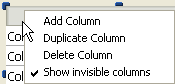
- Wordwrap (Text type columns only): manages the display of the column contents when it exceeds the width of the column.
When this option is checked, column text automatically wraps to the next line whenever its width exceeds that of the column, if the column height permits it.
When you do not check this option, any text that is too long is truncated and displayed with an ellipse (...).
In the following example, the Wordwrap option is checked for the left column but not for the right one: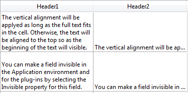
Note that regardless of the Wordwrap option’s value, the row height is not changed. If the text with line breaks cannot be entirely displayed in the column, it is truncated (without an ellipse). In the case of list boxes displaying just a single row, only the first line of text is displayed: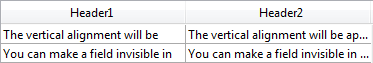
- Truncate with ellipsis: controls the display of values when list box columns are too narrow to show their full contents. This option is available for columns with any type of contents, except for pictures and objects.
- When the option is checked (default), if the contents of a list box cell exceed the width of the column, they are truncated and an ellipsis is displayed:
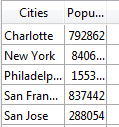
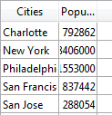
Note: The position of the ellipsis depends on the OS. In the above example (Windows), it is added on the right side of the text. On OS X, the ellipsis is added in the middle of the text. - When the option is unchecked, if the contents of a cell exceed the width of the column, they are simply clipped with no ellipsis added:
The Truncate with ellipsis option is checked by default and can be specified with list boxes of the Array or Selection type.
The Truncate with ellipsis option is also available for the list box as a whole as well as separately for each list box footer. For more information, refer to the List box specific properties and List box footer specific properties sections.
Notes:- When applied to Text or String type columns, the Truncate with ellipsis option is available only if the Wordwrap option is not checked. When the Wordwrap option is checked, extra contents in cells are handled through the word-wrapping features so the Truncate with ellipsis option is not available.
- The Truncate with ellipsis option can be applied to Boolean type columns; however, the result differs depending on the cell format:
- For Pop-up type Boolean formats, labels are truncated with an ellipsis,
- For Check box type Boolean formats, labels are always clipped.
- When the option is checked (default), if the contents of a list box cell exceed the width of the column, they are truncated and an ellipsis is displayed:
This theme groups together properties related to the background color of column cells.
- Background Color: Allows setting the background color of the column. By default, Automatic is selected: the column uses the background color set at the list box level.
- Alternate Background Color: Allows setting a different background color for odd-numbered rows in the column. By default, Automatic is selected: the column uses the alternate background color set at the list box level.
- Row Background Color Array (array type list boxes) / Background colors (selection type list boxes): Allows setting a custom background color for each cell of the column. You must use RGB color values.
- For array type list boxes, you must enter the name of a Longint array. Each element of this array corresponds to a cell of the column, so the array must be the same size as the array associated with the column. You can use the constants of the "SET RGB COLORS" theme. If you want the cell to inherit the background color defined at the higher level (see Inheritance), pass the value -255 to the corresponding array element.
- For selection type list boxes, you must enter an expression or a variable (apart from an array type). The expression or variable is evaluated for each cell displayed. You can use the formula editor to define an expression. To do this, click on the [...] button that is shown when you select the area. You can use the constants of the "SET RGB COLORS" theme.
- Row Style Array (array type list boxes) / Styles (selection type list boxes): Allows setting a custom font style to each cell of the column.
- For array type list boxes, you must enter the name of a Longint array. Each element of this array corresponds to a cell of the column, so the array must be the same size as the array associated with the column. To fill the array (using a method), use the constants of the "Font Styles" theme. You can add constants together to combine styles. If you want the cell to inherit the style defined at the higher level (see Inheritance), pass the value -255 to the corresponding array element.
- For selection type list boxes, you must enter an expression or a variable (apart from an array type). The expression or variable is evaluated for each cell displayed. You can use the formula editor to define an expression. To do this, click on the [...] button that is shown when you select the area. You can use the constants of the "Font Styles" theme.
- Row Font Color Array (array type list boxes) / Font Color (selection type list boxes): Allows setting a custom font color to each cell of the column. You must use RGB color values.
- For array type list boxes, you must enter the name of a Longint array. Each element of this array corresponds to a cell of the column, so the array must be the same size as the array associated with the column. You can use the constants of the "SET RGB COLORS" theme. If you want the cell to inherit the background color defined at the higher level (see Inheritance), pass the value -255 to the corresponding array element.
- For selection type list boxes, you must enter an expression or a variable (apart from an array type). The expression or variable is evaluated for each cell displayed. You can use the formula editor to define an expression. To do this, click on the [...] button that is shown when you select the area. You can use the constants of the "SET RGB COLORS" theme.

Product: 4D
Theme: List boxes
4D Design Reference ( 4D v16)
4D Design Reference ( 4D v16.1)
4D Design Reference ( 4D v16.3)


