
4D v16.3
Data entry controls and assistance
 Data entry controls and assistance
Using the Property List, you can set various properties that control and facilitate user data entry for active objects. Using these properties, you can:
- Set attributes related to selection and data entry,
- Set an entry filter that controls allowable characters,
- Display placeholder text,
- Attach a choice list,
- Establish a list of required or excluded values,
- Set maximum and minimum values, or default values,
- Set the object selection mode,
- Check spelling,
- Display help messages.
The Enterable attribute indicates whether users can enter values into the object. It can be set in the “Entry” theme of the Property List for the Get list item font.
A field from a related table may not be enterable if you deselected the Enterable Related Fields check box in the Form Wizard. You can make the related field enterable by selecting the Enterable check box.
All active objects are enterable by default. If you want to make a field or an object non-enterable for that form, you can deselect the Enterable check box for the object. A non-enterable object only displays data. You control the data by methods that use the field or variable name. You can still use the On Clicked, On Double Clicked, On Drag Over, On Drop, On Getting Focus and On Losing Focus form events with non-enterable objects. This makes it easier to manage custom context menus and lets you design interfaces where you can drag-and-drop and select non-enterable variables.
Notes:
- The contents of the Property List are contextual. When the Enterable attribute for a field or an object is deselected in the Property List, properties that are related to entry control (Mandatory, Tabable, Entry filter and so on) disappear from the list.
- You can also set the Display only property for a field in the Structure editor (see UNREGISTER CLIENT. In this case, the Enterable option does not appear in the Property List for this field (see below).
Selecting the Mandatory check box makes a field or enterable object mandatory for that form. 4D does not accept a record if the field or object does not contain a value.
No field or enterable object is mandatory by default. To make the field mandatory for all forms, set the Mandatory attribute in the Inspector window in the Structure editor. If you want to make a field or enterable object mandatory for a particular form, you can select the Mandatory option in the object properties.
The Enterable and Mandatory attributes are similar to the field attributes you set in the Structure editor (see Field properties). If you want these attributes to be different on a particular form, you can modify them in the properties of each field. These attributes can be set in the “Entry” theme of the Property List for the Get list item font.
These attributes do not override the field attributes set in the Structure editor. If a field already has the Display Only attribute assigned in the Structure editor, you cannot make it enterable with the Enterable form attribute. If a field already has the Mandatory attribute assigned in the Structure editor, you cannot make it non-mandatory by deselecting the Mandatory form attribute. The Enterable and Mandatory check boxes do not necessarily reflect the attribute settings in the Structure editor.
You can set the Tabable attribute for each active object of the form. When this attribute is selected, the object is included in the entry order and will therefore be active when the user presses the Tab key.
By default, this attribute is checked for all the fields and enterable variables. If you deselect it, the object will be excluded from the entry order. However, it can still be selected by a mouse click or using a method.
For more information about the entry order, refer to Modifying data entry order.
You can check the Tabable property for a non-enterable object. In this case, you can select this object using the Tab key but without being able to enter values in it.
The Tabable property is only accessible if the Focusable property is selected. In other words, any tabable object can have the focus. However, some objects can be “focusable” while not being “tabable” (for example, an object can be selected by clicking it and not “tabable”). In this case, the object does not belong to the data entry sequence.
This property can be set in the “Entry” theme of the Property List for active objects (whether enterable or not) as well as for non-enterable fields.
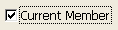
When the Focusable property is selected for an object, the object can have the focus (and can thus be activated by the keyboard for instance). It is outlined by a gray dotted line when it is selected — except when the “Hide focus rectangle” option has also been selected (see the following section).
 Check box shows focus when selected
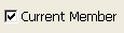 Check box is selected but cannot show focus
When the Focusable property is selected for a non-enterable object, the user can select, copy or even drag-and-drop the contents of the area.
During execution, a field or any enterable object is outlined by a selection rectangle when it has the focus (via the Tab key or a single click). You can hide this rectangle by checking the Hide focus rectangle option. Hiding the focus rectangle may be useful in the case of specific interfaces.
You can assign a choice list to enterable form objects. You can use three types: regular choice lists, a list of required entries, or a list of excluded entries.
Choice lists are designated in the “Data Source” theme of the Property List while lists of required or excluded entries are designated in the “Range of Values” theme.
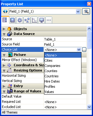
Before you can assign a choice list, you must have created the list in the Lists editor (see Lists).
Assigning a source choice list to a field with the Choice List drop-down list (“Data Source” theme) causes 4D to display a list of values automatically during data entry.
By default, a choice list automatically appears in a window when data is being entered. This choice list appears when the field or enterable object is selected in the form being executed. The user can then select an entry from the list.
You can also use Pop-up Menus/Drop-down Lists or Combo Boxes and associate a choice list with them in order to manage entry and display of values for a field or variable (if the choice list is hierarchical, only the first level can be used). To do this, just enter the name of the field or variable in the "Variable Name" area of the Properly List (see Pop-up Menus/Drop-down Lists) .
The entry chosen from the choice list can be overwritten by typing (unless the list is also a required list).
An Excluded List prevents the items on the list from being entered. For example, for a field on an input form used only by employees, you may want to attach a list of choices that can only be entered by a manager
You can assign a choice list to a field at either the table or form level. If you want to assign the choice list at the table level, use the Inspector window in the Structure editor (see Field properties). The choice list will then be associated with this field in all the forms and search editors of the database. If you attach a choice list at the form level, it can serve as a choice list only for that form. Note that in this case, you can directly manage data entry and display in the field using Pop-up Menus/Drop-down Lists or Combo Boxes.
A Required List (“Range of Values” theme) restricts the valid entries to the items on the list. For example, you may want to use a required list for job titles so that valid entries are limited to titles that have been approved by management.
Making a list required does not automatically display the list when the field is selected. If you want to display the required list, assign the same list with the Choice List drop-down list (“Data Source” theme).
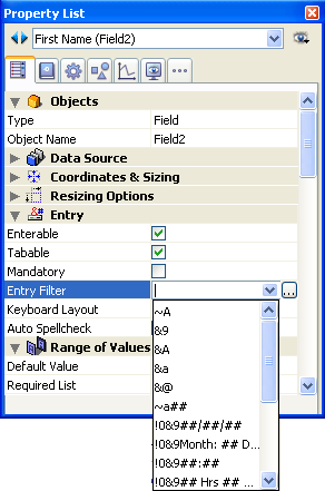
An entry filter controls exactly what the user can type during data entry. Unlike the data entry controls discussed earlier in this section, entry filters operate on a character-by-character basis. For example, if a part number always consists of two letters followed by three digits, you can use an entry filter to restrict the user to that pattern. You can even control the particular letters and numbers.
An entry filter operates only during data entry. It has no effect on data display after the user deselects the object. In general, you use entry filters and Display formats together. The filter constrains data entry and the format ensures proper display of the value after data entry.
During data entry, an entry filter evaluates each character as it is typed. If the user attempts to type an invalid character (a number instead of a letter, for example), 4D simply does not accept it. The null character remains unchanged until the user types a valid character.
Entry filters can also be used to display required formatting characters so that the user need not enter them. For example, an American telephone number consists of a three-digit area code, followed by a seven-digit number that is broken up into two groups of three and four digits, respectively. A display format can be used to enclose the area code in parentheses and display a dash after the third digit of the telephone number. When such a format is used, the user does not need to enter the parentheses or the dashes.
You create the entry filter by choosing a built-in filter from the Entry Filter drop-down list or by typing an entry filter code into the Entry Filter Display area. The Entry Filter drop-down list contains filters for date, time, and alpha objects.
Most of the time, you can use one of the built-in filters of 4D for what you need; however, you can also create custom filters (see Formats and Filters editor). The names of any custom filters you create are added to the top of the Entry Filter drop-down list and begin with a vertical bar (|).
You can modify an entry filter after you choose it from the drop-down list. For example, if you want to use a filter that allows upper and lowercase letters, but also need to allow the wildcard character (@), you could choose the filter:
&"a-z;0-9; ;,;.;-"
and change it to:
&"a-z;0-9; ;,;.;-;@"
Entry filter codes usually start with an ampersand (&). This character tells 4D to use what follows as an entry filter. If the code starts with a tilde (~), it means the same thing as “&” except that any letter is automatically made uppercase.
The & is usually followed with an “A,” an “a,” or a “9,” meaning allow only uppercase letters (A), allow lowercase and uppercase letters (a), or allow only numbers (9). For example, &9 allows only numbers and &A allows only capital letters. The number sign (#) tells how many digits or characters are allowed by the code. If the code uses no number signs, the filter allows as many digits or characters as you want. For example, &9 allows as many digits as entered. The filter &9## allows only two digits.
The exclamation point (!) is sometimes used to change which character will appear on screen to indicate the number of characters the user can enter. Without an !, 4D displays an underscore (_) for each digit or character the user can enter. For example, !?&9## displays question marks in both of the places the user will type and it allows only numbers and only two digits point. For information about creating entry filters, see Filter and format codes.
Here is a table that explains each of the entry filter choices in the Entry Filter drop-down list:
| Entry Filter | Description |
| ~A | Allow any letters, but convert to uppercase. |
| &9 | Allow only numbers. |
| &A | Allow only capital letters. |
| &a | Allow only letters (uppercase and lowercase). |
| &@ | Allow only alphanumeric characters. No special characters. |
| ~a## | State name abbreviation (e.g., CA). Allow any two letters, but convert to uppercase. |
| !0&9##/##/## | Standard date entry format. Display zeros in entry spaces. Allow any numbers. |
| !0&9 Day: ## Month: ## Year: ## | Custom date entry format. Display zeros in entry spaces. Allow any numbers. Two entries after each word. |
| !0&9##:## | Time entry format. Limited to hours and minutes. Display zeros in entry spaces. Allow any four numbers, separated by a colon. |
| !0&9## Hrs ## Mins ## Secs | Time entry format. Display zeros in entry spaces. Allow any two numbers before each word. |
| !0&9Hrs: ## Mins: ## Secs: ## | Time entry format. Display zeros in entry spaces. Allow any two numbers after each word.. |
| !0&9##-##-##-## | Local telephone number format. Display zeros in entry spaces. Allow any number. Three entries, hyphen, four entries. |
| !_&9(###)!0###-#### | Long distance telephone number. Display underscores in first three entry spaces, zeros in remainder. |
| !0&9###-###-### | Long distance telephone number. Display zeros in entry spaces. Allow any number. Three entries, hyphen, three entries, hyphen, four entries. |
| !0&9###-##-### | Social Security number. Display zeros in entry spaces. Allow any numbers. |
| ~"A-Z;0-9; ;,;.;-" | Uppercase letters and punctuation. Allow only capital letters, numbers, spaces, commas, periods, and hyphens. |
| &"a-z;0-9; ;,;.;-" | Upper and lowercase letters and punctuation. Allow lowercase letters, numbers, spaces, commas, periods, and hyphens. |
| &"0-9;.;-" | Numbers. Allow only numbers, decimal points, and hyphens (minus sign). |
You often use a matching display format when you use an entry filter. An entry filter operates only during data entry. It has no effect on how the data is displayed after you tab out of the field. For example, if you use the Social Security number entry filter (&9###-##-####), you should also choose the matching Social Security number display format (###-##-####). Without the display format, only the numbers, not the hyphens, are displayed in the field.
Here are some suggested entry filters and matching display formats for common types of fields:
| Field Type | Entry Filter | Display Format |
| State | ~a## | (none needed) |
| Zip Code (standard) | &9##### | (none needed) |
| Zip Code (extended) | &9#####-#### | #####-#### |
| Phone number | &9###-#### | ###-#### |
| &9(###) ###-#### | (###) ###-#### | |
| &9 ###-###-#### | ###-###-#### | |
| Date | !0&9##/##/## | (Any Date Format) |
| !0&9 Day: ## Month: ## Year: ## | ||
| Time | !0&9##:## | (Any Time Format) |
| !0&9## Hrs ## Mins ## Secs | ||
| !0&9Hrs: ## Mins: ## Secs: ## |
You can use display formats on input forms, output forms, and Quick reports. For information about using display formats in Quick reports, refer to Setting column display formats.
4D can display placeholder text in the fields of your forms.
Placeholder text appears as watermark text in a field, supplying a help tip, indication or example for the data to be entered. This text disappears as soon as the user enters a character in the area:

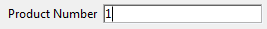
The placeholder text is displayed again if the contents of the field is erased.
You can set a placeholder text in the "Entry" theme of the Property List:
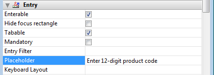
The Placeholder option is available for the following objects:
- variables,
- fields,
- combo boxes.
A placeholder can be displayed for the following types of data:
- string (text or alpha)
- date and time when the Blank if null property is checked.
You can use an xliff reference in the ":xliff:resname" form as a placeholder, for instance:
:xliff:PH_LastnameYou only pass the reference in the "Placeholder" field; it is not possible to combine a reference with static text.
Note: You can also set and get the placeholder text by programming using the OBJECT SET PLACEHOLDER and OBJECT Get placeholder commands.
You can restrict a Number, Date, or Time field or enterable object by entering maximum and minimum values in the corresponding entry areas in the “Range of Values” theme of the object properties.
During data entry, if the user enters a value below the minimum or above the maximum, a warning message is displayed. 4D returns the user to the field so that a valid entry can be made.
To set a maximum or minimum value, type the value you want to define the limit. Use the data entry format appropriate for the type of field or enterable object for which you are setting a limit. For example, for a Date field or object, use the date entry format to set the maximum or minimum value.
The values you set are inclusive. That is, if the user enters the same value you have set as a maximum or minimum value, the entry is allowed. Only entries lower than the minimum or higher than the maximum are disallowed. For example, if the value you set as a maximum is 15, the user can enter 15, but not 16.
You can also use methods to restrict the values that the user can enter. With a method, you can give more precise and informative feedback to the user, or set minimum or maximum values based on other values in the database. For example, a method can check a customer’s credit limit before validating a new transaction.
You can also use a required choice list to create unusual ranges of allowable values. For more information, see the Required lists section above and the Creating and modifying lists section.
You can assign a default value to be entered in a field or enterable object. The default value is entered when a new record is first displayed. You can change the value unless the field or entry area has been defined as non-enterable.
You create a default value by typing the value you want in the Default Value entry area in the “Range of Values” theme of the Property List. The default value must be appropriate for the field type. 4D provides stamps for generating default values for the date, time, and sequence number. The date and time are taken from the system date and time. 4D automatically generates any sequence numbers needed. The table below shows the stamp to use to generate default values automatically:
| Stamp | Meaning |
| #D | Current date |
| #H | Current time |
| #N | Sequence number |
VYou can use a sequence number to create a unique number for each record. A sequence number is a longint that is generated for each new record. The numbers start at one (1) and increase incrementally by one (1). A sequence number is never repeated even if the record it is assigned to is deleted from the table. Each table has its own set of sequence numbers. For more information, refer to the Sequence number command in the 4D Language Reference manual.
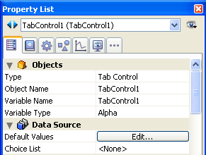
If the object displays a list of values (such as a combo box, scrollable area, pop-up menu, tab control, or drop-down list), you can specify a list of values that will be used as default values. The list will be loaded into the object prior to its being displayed on the form.
For objects that accept a list of default values, the Default Value area becomes a button:
When you click this button, the Default values dialog box appears:
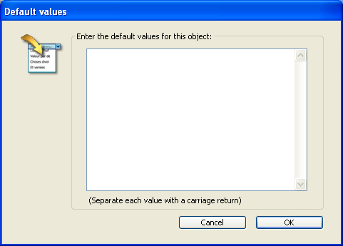
Enter the list of default values. Each value should be on a separate line. Click OK to put away the Default values dialog box and return to the Property List window.
When you enter default values into the Default values dialog box, they are automatically loaded into an array whose name is the name of the object. Using the language, you can manage the object by referring to this array.
Notes:
- You can also use a list that you created using the Lists editor to set default values for hierarchical lists or tab controls.
- You can also set default values using a method. For objects that accept one, you can assign the default value when the On Load event executes in the object or form method.
- For objects that accept lists, you can enter the default values using the Lists editor and then use the Load list command in order to create a hierarchical list. You can then work with the list and its contents using the commands of the “Hierarchical Lists” theme. You can load the lists into a hierarchical list when the On Load form event occurs or load all lists in the On Startup database method.
This option associates a specific keyboard layout to a field or an enterable object. For example, in an international application, if a form contains a field whose contents must be entered in Greek characters, you can associate the "Greek" keyboard layout with this field. This way, during data entry, the keyboard configuration is automatically changed when this field has the focus.
The default value, <None>, indicates that the object uses the current keyboard layout.
Note: It is possible to set this option dynamically using the OBJECT SET KEYBOARD LAYOUT and OBJECT Get keyboard layout commands.
4D includes an integrated and customizable spell-check utility. Alpha and Text type variables and fields can be checked, as well as 4D Write documents.
The Auto Spellcheck property (“Entry” theme) activates the spell-check for the object. In this case, a spell-check is automatically performed when entering data.
Note: You can also execute the SPELL CHECKING command for each object to be checked.
In 4D, spell-checking is applied continuously in text areas, with errors highlighted directly in the text with a dotted underline:
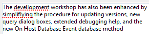
Dotted lines in different colors are used in order to determine the type of correction to be made:
- In red for spelling errors,
- In green for grammatical errors (only with native OS X spell checker),
- In blue for words to substitute (when the Show text substitutions option is enabled, see below).
The user can then correct the text using the context menu (right-clicking on underlined word) or using the spell checker dialog box.
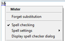
To display the spell check options, you can right-click on an unknown word and a context menu containing spell checker commands appears:
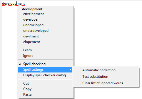
Note: The Auto Spellcheck and Context Menu options must be checked for the object.
You can select the Display spell checker dialog option to display a dialog where you can enter a corrected value:
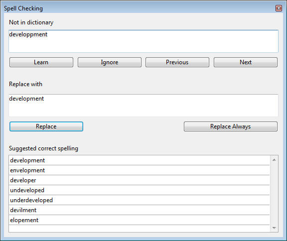
This dialog box is a floating window that remains available for all the windows of the application during the session, until the user closes it.
In addition to suggestions for corrections, the following options and functions are provided by the spell checker in 4D (in the context menu and/or the spell checker dialog box):
- Learn: The unknown word is added to the dictionary; it will no longer be indicated by the spell checker.
- Under OS X, learned words are kept permanently in /Users/[UserName]/Library/Spelling (so a word learned by the system spell checker is also learned for all the applications using the system spell checker).
- With Hunspell, learned words are saved in a custom Hunspell dictionary in the user system directory of the current application data that is always loaded along with the main dictionary (as in previous versions).
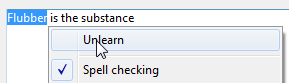
- Unlearn (context menu): This option appears when a previously-learned word is selected. It lets the user remove this word from the list of learned words so that it is once again indicated as a possible spelling error.
- Ignore: The unknown word is left untouched and is no longer underlined, however it will be indicated again if it is detected later on.
The spell checker keeps a table of words to ignore for each document. You can erase this table using the Clear list of ignored words option (see below).
- Previous / Next (dialog box): The unknown word is ignored but remains underlined and the spell checker examines the previous or next unknown word in the text.
- Spell checking (context menu): Generally enables or disables spell checking in the area for the current process.
- Replace (dialog box): When the word selected in the text matches the one in the first editable field, it is replaced by the word in the second editable field, and moves on to the next error.
- Replace Always (dialog box): Same as Replace but the substitution is memorized (see Text substitution below).
The Spell settings> submenu contains the following functions:
- Automatic correction: Enables or disables automatic correction mode in the area for the current process. In this mode, unknown words are automatically replaced by the closest known word (except when the ambiguity is too great). Corrections are performed during input.
By default, automatic correction is disabled. - Text substitution: Enables or disable text substitution. This consists in replacing one word by another. For example, you can choose to replace the word "Mr" with "Mister".
To create "to be replaced"/"replaced by" word pairs, you must use the spell checker dialog box: enter the word to be replaced in the "Not in dictionary" area and the replacement word in the "Replace with" area, then click the Replace Always button: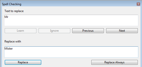
Replacements are performed throughout the application. With Hunspell, the spell checker keeps a global table of substitutions for the application that is saved in the user system directory of the application; for the OS X spellchecker, this table is merged with the system substitutions ("Use symbol and text substitution" option in the System Preferences).
The substitution process differs depending on whether or not the Show text substitutions option in the Spell settings submenu is checked (see below). - Show text substitutions (This option is only shown when the Text substitution option is checked): When this option is checked, the spell checker underlines possible substitutions in the text with a blue line and the user must right-click on the word to select the value to be substituted.
When this option is not checked, substitutions are performed automatically, without any user intervention. - Clear list of ignored words: Erases the list of words chosen to be ignored in the document.
The native OS X spell checker provides several other correction options:
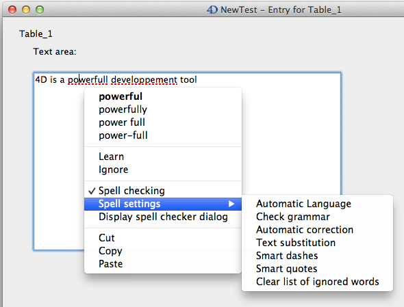
- Automatic Language: Automatically identifies dictionary language to be used based on text contents.
By default, this spell checker uses the language of the 4D application, just like the Hunspell spell checker. - Check grammar: Enables grammar checking of text.
- Smart dashes: replaces double hyphens (--) with em dashes (—) during input.
- Smart quotes: replaces straight quotes with smart quotes adapted to the current language.
The 4D spell-check can use:
- under Windows and OS X, the open source Hunspell dictionary (see Support of Hunspell dictionaries in the 4D Language Reference manual)
- under OS X only, the native spell checker.
By default under OS X, 4D uses the native spell checker. You can choose to use Hunspell spell-checking using the SET DATABASE PARAMETER command. Note that additional functions are provided by the native OS X spell checker (see below).
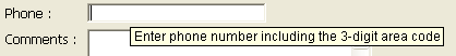
You can add a help message to fields and active objects in your forms to help users work with your database more productively. Help messages will appear as tips.
For example, you can create a help message for a Date field which reminds the user to include a separator such as the slash mark (/) between the month, day, and year when entering data.
The help tip appears in the form whenever the mouse moves over the field or object:
Note: You can also associate a help message with a field at the level of the database structure. In this case, the help tip of the field is displayed in every form where it appears. For more information, refer to “Help Tips” in Field properties. If two different help tips are associated with the same field in these two locations, priority is granted to the help tip set at the form level.
You can associate a help tip with any active object in your form by using the Help Tip drop-down list found in the "Help" theme of the Property List. You can either:
- Choose an existing help tip. The help tip must have been previously specified in the Help tips editor of 4D.
- Enter the help message directly in the area. This allows you to take advantage of XLIFF architecture. You can enter an XLIFF reference here in order to display a message in the application language (for more information about XLIFF, refer to Appendix C: XLIFF architecture. You can also use 4D references (see Using references in static text).
The message you select or enter will appear as a help tip for the field or object selected in the form.
To delete the association of a help tip with the selected object, choose None in the Property List.
Note: Under Mac OS, displaying help tips is not supported in pop-up type windows.
This property is available for Alpha or Text type fields or variables in forms. This property keeps the selection visible within the object after it has lost the focus. This makes it easier to implement interfaces that allow the text style to be modified (see GET DATA SOURCE LIST).
The OPEN FONT PICKER and OPEN COLOR PICKER commands display the system color and font picker windows. Users can change the color or font of an object that has the focus in the form directly just by clicking in one of these windows.
To allow you to control user actions, this function is subject to the value of the Allow Font/Color Picker property found in the "Text" theme:
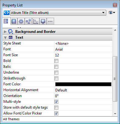
This property is available for form objects of the field, variable and combo box type. By default, it is unchecked for all form objects. You must explicitly check it for every object where you want font and/or color attributes to be modifiable using the system picker window.

Product: 4D
Theme: Properties for active objects
4D Design Reference ( 4D v16)
4D Design Reference ( 4D v16.1)
4D Design Reference ( 4D v16.3)


