
4D v16.3
List box specific properties
 List box specific properties
When you select a List Box object in the Form editor, the Property List displays several specific themes and properties. Additional specific properties are available when you select a list box column (see List box column specific properties) or a column header (see List box header specific properties) or a column footer (see List box footer specific properties).
This theme includes the Data Source property that is used to specify the type of list box:
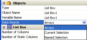
- Select the Arrays option if you want to use array elements as the rows of the list box. The Arrays option is required when you want to be able to retrieve the result of an SQL query in a list box (see Displaying the result of an SQL query in a list box).
- Select the Current Selection option if you want to use expressions, fields or methods whose values will be evaluated for each record of the current selection of a table.
- Select the Named Selection option if you want to use expressions, fields or methods whose values will be evaluated for each record of a named selection.
This theme appears for selection type list boxes only. It contains the Master Table property for list boxes based on the Current Selection or the Named Selection property for list boxes based on a named selection.
- Master Table: Specifies the table whose current selection will be used. This table and its current selection will form the reference for the fields associated with the columns of the list box (field references or expressions containing fields). Even if some columns contain fields from other tables, the number of rows displayed will be defined by the master table.
The menu associated with this property displays all of the database tables, regardless of whether the form is related to a table (table form) or not (project form). By default, the property displays the first table of the database. For more information about the behavior of this property, refer to Display of fields in list boxes.
- Named Selection: Specifies the named selection to be used. You must enter the name of a valid named selection. It can be a process or interprocess named selection. The contents of the list box will be based on this selection. The named selection chosen must exist and be valid at the time the list box is displayed, otherwise the list box will be displayed blank. If you leave the name area blank, the list box will also be displayed blank.
Note: Named selections are ordered lists of records. They are used to keep the order and current record of a selection in memory. For more information, refer to Named Selections of the 4D Language Reference manual.
This theme groups together all the basic object properties.
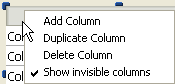
- Number of Columns: Number of columns displayed in the list box (1 by default). You can modify the number of columns (add, duplicate or delete a column) using the context menu (click on a column or column header):
- Number of Locked Columns: Number of columns that must stay permanently displayed in the left part of the list box, even when the user scrolls through the columns horizontally. A locked column can be resized, is enterable, and so on, just like regular columns. Only its position in the list box is locked (does not scroll). This can be useful, for instance, to display row "titles" in large sized arrays.
This property lets you set a "locked area". If a locked column is deleted by programming, the number of locked columns in the list box is decreased by 1. Similarly, if a column is inserted by programming into the locked area, this column is locked automatically itself.
Note: Refer to the "Locked columns and static columns" section below for a comparison of these two functions.
- Number of Static Columns: Number of columns that cannot be moved during execution. This value indicates the number of static columns starting from the first column of the list box. To prevent any column being moved, this value must be equal to the total number of columns. This property takes invisible columns into account.
By default, if the hierarchical mode is not active (Hierarchical list box option not checked), the property value is 0, which means that all columns can be moved. When the hierarchical mode is active (array type list boxes only), this option is always at least 1.
Note: Refer to the "Locked columns and static columns" section below for a comparison of these two functions.
- Highlight Set: This property is added for selection type list boxes only. It is used to specify the set to be used to manage highlighted records in the list box (when the Arrays data source is selected, a Boolean array with the same name as the list box is used).
4D creates a default set named ListBoxSetN where N starts at 0 and is incremented according to the number of list boxes in the form. If necessary, you can modify the default set. It can be a local, process or interprocess set (we recommend using a local set, for example $LBSet, in order to limit network traffic). It is then maintained automatically by 4D. If the user selects one or more rows in the list box, the set is updated immediately. If you want to select one or more rows by programming, you can apply the commands of the “Sets” theme to this set.
Notes:- The highlighted status of the list box rows and the highlighted status of the table records are completely independent.
- If the “Highlight Set” property does not contain a name, it will not be possible to make selections in the list box.
- Row Control Array (array type list boxes only): Used to control the "hidden," "disabled" and "selectable" properties for each row of an array type list box. You need to enter the name of a Longint type array containing the same number of elements as the list box. Each array element indicates whether the corresponding row is:
- hidden or visible (visible is the default)
- enabled or disabled (enabled is the default)
- selectable or not selectable (selectable is the default)
You can set properties for each row by assigning constants to its corresponding array element. For more information, refer to the Managing row display section.
Compatibility note: In previous versions of 4D, this property was named "Hidden Rows Array" and received a Boolean array. For compatibility, a Boolean array is still accepted for a row control array. In this case, each element of the Boolean array indicates the displayed/hidden state of the corresponding row in the list box. True means the row is hidden and False means that it is displayed.
The Row Control Array property can be set or read using the LISTBOX SET ARRAY and LISTBOX Get array commands. The array can also be returned by the LISTBOX GET ARRAYS command.
- Selection Mode: Specifies the selection mode for rows in the list box. Three modes are available:
- None: No row can be selected and no data can be entered (except when the "Single-Click Edit" option is checked, see Entry theme). Selection and data entry can only be managed by programming. Clicking or double-clicking on the list will have no effect (even if the Enterable option is checked) but the On Clicked and On Double Clicked events can be generated. With this mode, the developer has full control over selections (using the Highlight Set) and over data entry (using the EDIT ITEM command). The On Selection Change and On Before Data Entry events are not generated. On the other hand, the On After Edit event can be generated when data is entered by the user through the EDIT ITEM command.
- Single: Only one row can be selected at a time.
- Multiple: Several rows can be selected (adjacent or not) using standard shortcuts: Shift+click for an adjacent selection and Ctrl+click (Windows) or Command+click (Mac OS) for a non-adjacent selection.
- Double-click on Row (selection type list box only): Sets the action to be performed when a user double-clicks on a row in the list box. The available options are:
- Do nothing (default): Double-clicking a row does not trigger any automatic action.
- Edit Record: Double-clicking a row displays the corresponding record in the detail form defined for the list box (see the “Detail Form” bullet point below). The record is opened in read-write mode so it can be modified.
- Display Record: Identical to the previous action, except that the record is opened in read-only mode so it cannot be modified.
Note: Double-clicking an empty row is ignored.
Regardless of the action selected/chosen, the On Double clicked form event is generated.
For the last two actions, the On Open Detail form event is also generated. The On Close Detail is then generated when a record displayed in the detail form associated with the list box is about to be closed (regardless of whether or not the record was modified).
- Detail Form (selection type list box only): Specifies the form to use for modifying or displaying individual records of the list box.
The specified form is displayed:- when using Add Subrecord and Edit Subrecord standard actions applied to the list box (see Using standard actions),
- when a row is double-clicked and the Double-click on Row property is set to "Edit Record" or "Display Record" (see the “Double-click on Row” bullet point above).
Locked columns and static columns are two separate and independent functionalities in list boxes:
- Locked columns always stay displayed to the left of the list box; they do not scroll horizontally.
- Static columns cannot be moved by drag and drop within the list box.
Note: You can set static and locked columns by programming, refer to List Box in the 4D Language Reference manual.
These properties interact as follows:
- If you set columns that are only static, they cannot be moved.
- If you set columns that are locked but not static, you can still change their position freely within the locked area. However, a locked column cannot be moved outside of this locked area.
- If you set all of the columns in the locked area as static, you cannot move these columns within the locked area.
- You can set a combination of locked and static columns according to your needs. For example, if you set three locked columns and one static column, the user can swap the two right-most columns within the locked area (since only the first column is static).
These themes manage the display and height of headers and footers for list box columns. Note that header and footer areas are not enterable during use. Their contents are always calculated.
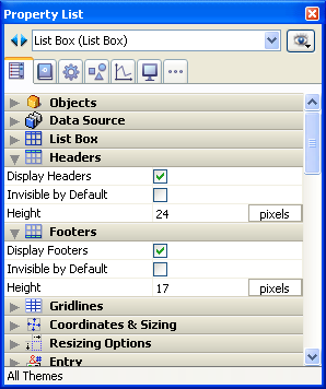
- Display Headers / Display Footers: Used to display or hide column headers and footers. No other options are available in each theme unless this property is checked. Once the area is displayed in the list box, you can click on it to select it and access its specific properties in the Property List (see List box header specific properties and List box footer specific properties). You can have one header and one footer per column; each of them is configured separately.
- Invisible by Default: As with all form objects, this option facilitates displaying the dynamic display of the object using the OBJECT SET VISIBLE command.
The OBJECT SET VISIBLE command has no effect if the corresponding "Display Headers" or "Display Footers" options are not checked in the Property List.
- Height: Used to set the row height for a list box header or foooter. You can set the unit (lines or pixels) for the height value. For more information about this, refer to Height in pixels or lines below. By default, the height of headers and footers is 1 line.
Warning: The minimum height of headers in pixels depends on the system. If you pass a value that is too small, it will be replaced by the minimum size set for headers in the system. There is no minimum size for footers and for rows.
Compatibility note: In Windows 7 and Windows Vista, the minimum header height is 24 pixels. If any headers in your converted databases have a height set smaller than this, they are resized automatically. In this case, you may need to alter your forms accordingly.
You can also set the row height for headers and footers dynamically using the LISTBOX SET HEADERS HEIGHT and LISTBOX SET FOOTERS HEIGHT commands.
You can set a height for headers, footers and rows in either pixels or text lines. In the Property List, you set the unit using the button next to the "Height" field.

You can also insert an "L" (for Line) or a "P" (for pixels) directly in the value area, (e.g., "17 P") and the button label is updated accordingly.
You can even use both types of units in the same list box:
- When you use "Pixel", the height value is applied directly to the row concerned, regardless of the font size contained in the columns. If a font is too big, the text is truncated. Moreover, pictures are truncated or resized according to their format.
- When you use "Line", the height is calculated while taking into account the font size of the row concerned.
- If more than one size is set, 4D uses the biggest one. For example, if a row contains "Verdana 18", "Geneva 12" and "Arial 9", 4D uses "Verdana 18" to determine the row height (for instance, 25 pixels). This height is then multiplied by the number of rows defined.
- This calculation does not take into account the size of pictures nor any styles applied to the fonts.
- In OS X, the row height may be incorrect if the user enters characters that are not available in the selected font. When this occurs, a substitute font is used, which may cause variations in size.
- Conversion of units: When you switch from one unit to the other, 4D converts them automatically and displays the result in the Property List. For example, if the font used is "Lucida grande 24", a height of "1 line" is converted to "30 pixels" and a height of "60 pixels" is converted to "2 lines".
Note that converting back and forth may lead to an end result that is different from the starting value due to the automatic calculations made by 4D. This is illustrated in the following sequences:
(font Arial 18): 52 pixels -> 2 lines -> 40 pixels
(font Arial 12): 3 pixels -> 0.4 line rounded up to 1 line -> 19 pixels
This theme groups together all of the properties linked to the grid displayed in the list box object.
- Horizontal Lines: Displays or hides the horizontal lines of the list box (displayed by default).
- Horizontal Line Color: Defines the color of horizontal lines in the list box (gray by default).
- Vertical Lines: Displays or hides the vertical lines of the list box (displayed by default).
- Vertical Line Color: Defines the color of vertical lines in the list box (gray by default).
This theme is only available for list boxes whose data source is Arrays. Its options configure the hierarchical display of the list box. Note that these properties are modified automatically when you define the hierarchy using the pop-up menu of the list box object (see Creating and using hierarchical list boxes).
- Hierarchical list box: Used to specify that the list box must be displayed in hierarchical form.
- Variable 1 ... 10: These additional options appear when the Hierarchical list box option is checked. Each time a value is entered in a field, a new row is added. Up to 10 variables can be specified. These variables set the hierarchical levels to be displayed in the first column.
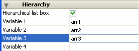
The first variable always corresponds to the name of the variable for the first column of the list box (the two values are automatically bound). This first variable is always visible and enterable. For example: country.
The second variable is also always visible and enterable; it specifies the second hierarchical level. For example: regions.
Beginning with the third field, each variable depends on the one preceding it. For example: counties, cities, and so on. A maximum of ten hierarchical levels can be specified.
If you remove a value, the whole hierarchy moves up a level.
The last variable is never hierarchical even if several identical values exists at this level. For example, referring to the configuration illustrated above, imagine that arr1 contains the values A A A B B B, arr2 has the values 1 1 1 2 2 2 and arr3 the values X X Y Y Y Z. In this case, A, B, 1 and 2 could appear in collapsed form, but not X and Y:
+ A
+ 1
X
X
Y
+ B
+ 2
Y
Y
Z
This principle is not applied when only one variable is specified in the hierarchy: in this case, identical values may be grouped.
Note: If you specify a hierarchy based on the first columns of an existing list box, you must then remove or hide these columns (except for the first), otherwise they will appear in duplicate in the list box. If you specify the hierarchy via the pop-up menu of the editor (see Creating and using hierarchical list boxes), the unnecessary columns are automatically removed from the list box.
This theme groups together all the properties related to the coordinates, width and height of the list box.
The Row Height property is specific: it allows you to set the height of the list box rows. Note that the row height for headers and footers are defined separately, in the "Headers" and "Footers" theme.
You can set a height in either pixels or lines. For more information about the choice of unit, refer to "Height in pixels or lines" above.
By default, the row height is set according to the platform and the font size.
4D View Pro only: This feature requires a 4D View Pro license. For more information, refer to 4D View Pro.
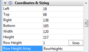
This property is used to specify the name of a row height array that you want to associate with the list box. A row height array must be of the numeric type (longint by default).
When a row height array is defined, each of its elements whose value is different from 0 (zero) is taken into account to determine the height of the corresponding row in the list box, based on the current Row Height unit.
For example, you can write:
 ARRAY LONGINT(RowHeights;20)

 RowHeights{5}:=3
Assuming that the unit of the rows is "lines," then the fifth row of the list box will have a height of three lines, while every other row will keep its default height.
The row height array can also be managed using the LISTBOX SET ROW HEIGHT command.
Note: The Row Height Array property is not taken into account for hierarchical list boxes.
This theme contains options to configure the list box object when it is resized. Resizing options apply both to resizing by users and by programming (e.g. using the OBJECT SET COORDINATES command).
- Horizontal Sizing / Vertical Sizing: These standard object display properties are detailed in the Resizing paragraph.
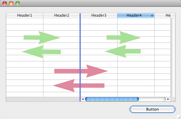
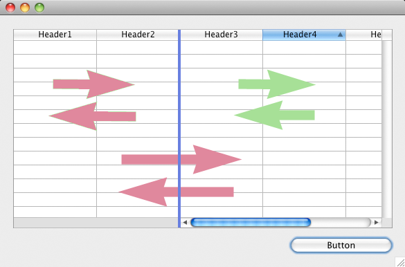
- Column Auto-Resizing: When this property is checked, list box columns are automatically resized along with the list box, within the limits of the minimum and maximum widths defined (see below).
When this property is not checked (default in databases converted from a 4D version prior v16), only the rightmost column of the list box is resized, even if its width exceeds the maximum value defined in the Property list.
- As the list box width increases, its columns are enlarged, one by one, starting from right to left, until each reaches its maximum width. Note: All columns with the Resizable property checked are resized. (This property is set individually for each column.)
- The same procedure applies when the list box width decreases, but in reverse order (i.e., columns are resized starting from left to right). When each column has reached its minimum width, the horizontal scroll bar becomes active again.
- Columns are resized only when the horizontal scroll bar is not "active"; i.e., all columns are fully visible in the list box at its current size. Note: If the horizontal scroll bar is hidden, this does not alter its state: a scroll bar may still be active, even though it is not visible.
- After all columns reach their maximum size, they are no longer enlarged and instead a blank (fake) column is added on the right to fill the extra space.
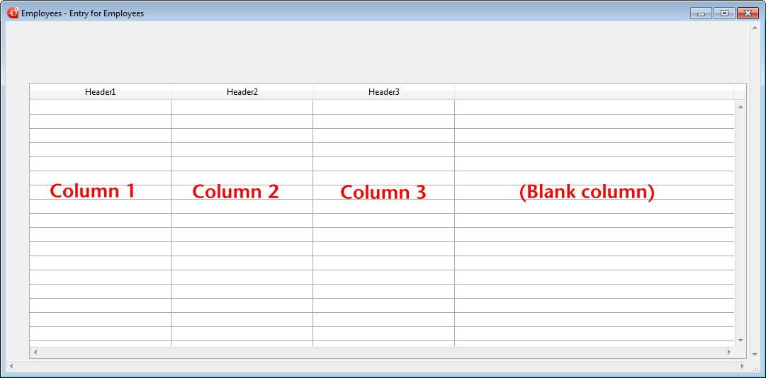
Notes:- If a fake (blank) column is present, when the list box width decreases, this is the first area to be reduced.
- The appearance of the fake column matches that of the existing columns; it will have a fake header and/or footer if these elements are present in the existing list box columns and it will have the same background color(s) applied.
- The fake header and/or footer can be clicked but this does not have any effect on the other columns (e.g.: no sort is performed); nevertheless, the On Clicked, On Header Click and On Footer Click events are generated accordingly.
- If a cell in the fake column is clicked, the LISTBOX GET CELL POSITION command returns "X+1" for its column number (where X is the number of existing columns).
This theme contains standard properties related to data entry in the list box.
The Single-Click Edit property is specific: it enables direct passage to edit mode.
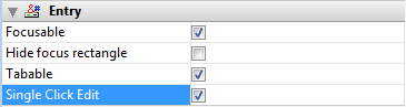
When this option is checked, list box cells switch to edit mode after a single user click, regardless of whether or not this area of the list box was selected beforehand. Note that this option allows cells to be edited even when the list box selection mode is set to "None" (see List Box theme).
When this option is not checked, users must first select the cell row and then click on a cell in order to edit its contents. This is standard behavior for versions of 4D prior to v15 R3. For compatibility, this option is unchecked by default.
This theme contains two properties for the global display of the list box:
- Invisible by Default: generic option managing the display of the object when the form is loaded (see Invisible by Default).
- Truncate with ellipsis: controls the display of values when list box columns are too narrow to show their full contents. This option is available for columns with any type of content, except pictures and objects.
- When the option is checked (default), if the contents of a list box cell exceed the width of the column, they are truncated and an ellipsis is displayed:
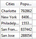
Note: The position of the ellipsis depends on the OS. In the above example (Windows), it is added on the right side of the text. In OS X, the ellipsis is added in the middle of the text.
- When the option is unchecked, if the contents of a cell exceed the width of the column, they are simply clipped with no ellipsis added:
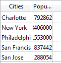
The Truncate with ellipsis option is checked by default and can be specified with list boxes of the Array or Selection type.
The Truncate with ellipsis option is also available separately for each list box column or footer. For more information, refer to the List box column specific properties section.
- When the option is checked (default), if the contents of a list box cell exceed the width of the column, they are truncated and an ellipsis is displayed:
This theme groups together properties related to the background color of rows as well as the border style.
- Background Color: Allows setting the background color of the list box. This color is used for the entire object with the exception of headers (if displayed).
- Alternate Background Color: Allows setting a different background color for odd-numbered rows in the list box. Using an alternating background color makes reading arrays easier.
- Row Background Color Array (array type list box) / Row Background Color (selection type list box): Used to apply a custom background color to each row of the list box. You must use RGB color values. For more information about this, please refer to the description of the OBJECT SET RGB COLORS command in the 4D Language Reference manual.
- For array type list boxes, you must enter the name of a Longint type array. Each element of this array corresponds to a row of the list box; the array must have the same size as the arrays associated with columns. You can use the constants of the SET RGB COLORS theme. To apply the background color specified in the list box properties to a row, pass the value -255 to the corresponding element of the array.
- For selection type list boxes, you must enter an expression or a variable (except for an array). The expression or variable will be evaluated for each row displayed. You can use the Formula editor to specify an expression. To do this, click on the [...] button which appears when you select the area. You can use the constants of the SET RGB COLORS theme.
- Border Line Style: Allows setting a standard style for the list box object border.
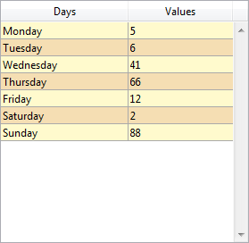
- Hide extra blank rows:Controls the display of extra blank rows added at the bottom of a list box object. By default, 4D adds such extra rows to fill the empty area:
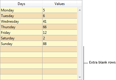
You can remove these empty rows by checking this option. The bottom of the list box object is then left blank:
This theme groups together standard properties for defining text displayed in the list box (style sheet, font, style), as well as several specific properties for configuring the display of text within each "cell" of the list box:
- Row Style Array (array type list box) / Row Style (selection type list box): Used to apply a custom character style to each row of the list box.
- For array type list boxes, you must enter the name of a Longint type array. Each element of this array corresponds to a row of the list box; the array must have the same size as the arrays associated with columns. To fill in the array (using a method), use the “Font Styles” theme constants. By adding constants, you can combine styles. To apply the style set in the properties of the list box to a row, pass the value -255 to the element of the corresponding array.
- For selection type list boxes, you must enter an expression or a variable (except for an array). The expression or variable will be evaluated for each row displayed. You can use the Formula editor to specify an expression. To do this, click on the [...] button which appears when you select the area. You can use the constants of the Font Styles theme.
The following example uses a variable name: enter CompanyStyle in the Row Style area and, in the form method, write the following code:
- Row Font Color Array (array type list box) / Row Font Color (selection type list box): Used to apply a custom font color to each row of the list box. You must use RGB color values. For more information about this, refer to the description of the OBJECT SET RGB COLORS command in the 4D Language Reference manual.
- For array type list boxes, you must enter the name of a Longint type array. Each element of this array corresponds to a row of the list box; the array must have the same size as the arrays associated with columns. You can use the constants of the SET RGB COLORS theme. To apply the font color specified in the list box properties to a row, pass the value -255 to the corresponding element of the array.
- For selection type list boxes, you must enter an expression or a variable (except for an array). The expression or variable will be evaluated for each row displayed. You can use the Formula editor to specify an expression. To do this, click on the [...] button which appears when you select the area. You can use the constants of the SET RGB COLORS theme.
The following example uses a variable name: enter CompanyColor in the Row Font Color area and, in the form method, write the following code:
CompanyColor:=Choose([Companies]ID;Default background color;Default light shadow color;Default foreground color;Default dark shadow color)
- Horizontal Alignment: the contents of each cell can be aligned horizontally to the Left, Right or Center. The Default option sets the alignment according to the type of data found in each column: text and pictures are aligned to the left and numeric data is aligned to the right.
- Vertical Alignment: the contents of each cell can be aligned vertically to the Top, Center or Bottom. The Default option sets the alignment according to the type of data found in each column: Bottom for all data except pictures and Top for picture type data.
Note that these properties can be applied generally to the entire list box or separately for each column (see Managing styles and colors). The alignment properties are also available for header and footer areas.
This theme groups together all the properties related to the dynamic behavior of the list box.
- Method (Edit...): This button displays the method of the list box object (note that each column can also contain an object method).
- Draggable and Droppable: Activates the drag-and-drop functions of the list boxes, which allows a list box row to be dragged and dropped onto another list box or another 4D object and vice versa. Only list box rows are concerned; it is not possible to drag and drop columns (however, it is still possible to move columns inside the same list box).
Drag and drop in list boxes is managed using standard 4D drag-and-drop mechanisms (On Drop and On Drag Over form events, DRAG AND DROP PROPERTIES and Drop position commands).
- Movable Rows (array type list boxes only): Authorizes the movement of rows during execution. This option is checked by default. It is not available for selection type list boxes nor for list boxes in hierarchical mode (Hierarchical list box option checked).
- Sortable: Allows sorting column data by clicking the header. This option is checked by default. Picture type arrays (columns) cannot be sorted using this mechanism.
In list boxes based on a selection of records, the standard sort function is available only:- When the data source is Current Selection,
- With columns associated with fields (of the Alpha, Number, Date, Time or Boolean type).
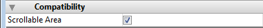
The Scrollable Area option found in this theme is designed to go with the conversion of former "scrollable areas", which are transformed automatically into list boxes beginning with 4D v13. However, it is available for all list boxes:
When the Scrollable Area option is checked for a list box, the following specific operations are implemented:
- If the array (unique) of the list box has the "invisible" property, the list box object is also entirely invisible.
- Assigning a value to the array selects the corresponding row in the list box (e.g.: MyArray:=5 selects the 5th row of the list box).
- Conversely, clicking on a row of the object modifies the current value of the array.
- When a drop is performed from a list box row onto an external object, the DRAG AND DROP PROPERTIES command executed in this object returns a pointer to the list box array (and not to the list box itself).
List boxes that come from the conversion of former grouped scrollable areas are connected. Connected list boxes function in a coordinated way:
- Selecting a row in one list box selects this same row in all the list boxes belong to the connected group,
- Scrolling vertically in a list box also scrolls the other list boxes belonging to the connected group in the same way.
Note: Converted list boxes are also grouped in the form (standard 4D function).
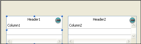
You can connect and disconnect these list boxes using the Connect and Disconnect commands found in the Object menu of the Form editor:
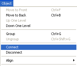
These commands are enabled contextually when several list boxes are selected in the form. When a connected list box (i.e. belonging to a connected group) is selected, a specific "shield" is displayed on all the list boxes that belong to the same connected group:
Compatibility note: These principles make it possible to reproduce the functioning of grouped scrollable areas. However, we recommend that you adapt converted forms using standard list box functionalities.

Product: 4D
Theme: List boxes

Modified: 4D v16
4D Design Reference ( 4D v16)
4D Design Reference ( 4D v16.1)
4D Design Reference ( 4D v16.3)


