
4D v16.3
Using object arrays in columns (4D View Pro)
- 4D Language Reference
-
- List Box
-
- Managing List Box Objects
- Managing Hierarchical List Boxes
- Using object arrays in columns (4D View Pro)
- 4D View Pro
- LISTBOX COLLAPSE
- LISTBOX DELETE COLUMN
- LISTBOX DELETE ROWS
- LISTBOX DUPLICATE COLUMN
- LISTBOX EXPAND
- LISTBOX Get arrayUpd
- LISTBOX GET ARRAYS
- LISTBOX GET CELL COORDINATES
- LISTBOX GET CELL POSITION
- LISTBOX Get column formula
- LISTBOX Get column width
- LISTBOX Get footer calculation
- LISTBOX Get footers height
- LISTBOX GET GRID
- LISTBOX GET GRID COLORS
- LISTBOX Get headers height
- LISTBOX GET HIERARCHY
- LISTBOX Get information
- LISTBOX Get locked columns
- LISTBOX Get number of columns
- LISTBOX Get number of rows
- LISTBOX GET OBJECTS
- LISTBOX GET PRINT INFORMATION
- LISTBOX Get row color
- LISTBOX Get row font style
- LISTBOX Get row heightNew
- LISTBOX Get rows height
- LISTBOX Get static columns
- LISTBOX GET TABLE SOURCE
- LISTBOX INSERT COLUMN
- LISTBOX INSERT COLUMN FORMULA
- LISTBOX INSERT ROWS
- LISTBOX MOVE COLUMN
- LISTBOX MOVED COLUMN NUMBER
- LISTBOX MOVED ROW NUMBER
- LISTBOX SELECT BREAK
- LISTBOX SELECT ROW
- LISTBOX SET ARRAYUpd
- LISTBOX SET COLUMN FORMULA
- LISTBOX SET COLUMN WIDTH
- LISTBOX SET FOOTER CALCULATION
- LISTBOX SET FOOTERS HEIGHT
- LISTBOX SET GRID
- LISTBOX SET GRID COLOR
- LISTBOX SET HEADERS HEIGHT
- LISTBOX SET HIERARCHY
- LISTBOX SET LOCKED COLUMNS
- LISTBOX SET ROW COLOR
- LISTBOX SET ROW FONT STYLE
- LISTBOX SET ROW HEIGHTNew
- LISTBOX SET ROWS HEIGHT
- LISTBOX SET STATIC COLUMNS
- LISTBOX SET TABLE SOURCE
- LISTBOX SORT COLUMNS
 Using object arrays in columns (4D View Pro)
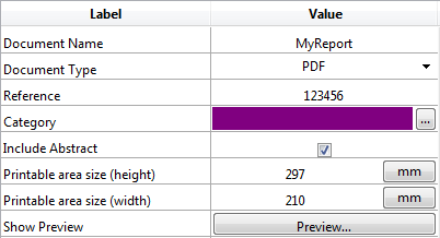
List box columns can work with object arrays. Since object arrays can contain different kinds of data, this powerful feature allows you to enter and display various types of values in the rows of a single column, and use various widgets as well. For example, you could insert a text input in the first row, a check box in the second, and a drop-down list in the third. Object arrays also provide access to new kinds of widgets, such as buttons or color pickers.
The following list box was designed using an object array:
About 4D View Pro: The ability to use object arrays in list boxes is a "4D View Pro" function, which means that its use requires you to have a valid 4D View license. 4D View Pro is a new tool being developed which includes a set of features related to arrays and list presentations. It is intended to progressively replace the 4D View plug-in. For more information, please refer to the 4D Web site.
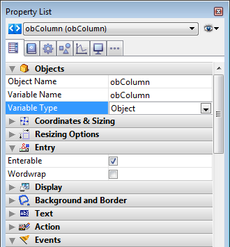
To assign an object array to a list box column, you just need to set the object array name in either the Property list ("Variable Name" field), or using the LISTBOX INSERT COLUMN command, like with any array-based column. In the Property list, you can select Object as a "Variable Type" for the column:
Standard properties related to coordinates, size, and style are available for object columns. You can define them using the Property list, or by programming the style, font color, background color and visibility for each row of an object-type list box column. These types of columns can also be hidden.
However, the Data Source theme is not available for object-type list box columns. In fact, the contents of each column cell are based on attributes found in the corresponding element of the object array. Each array element can define:
- the value type (mandatory): text, color, event, etc.
- the value itself (optional): used for input/output.
- the cell content display (optional): button, list, etc.
- additional settings (optional): depend on the value type
To define these properties, you need to set the appropriate attributes in the object (available attributes are listed below). For example, you can write "Hello World!" in an object column using this simple code:
 ARRAY OBJECT(obColumn;0) //column array

 C_OBJECT($ob) //first element

 OB SET($ob;"valueType";"text") //defines the value type (mandatory)

 OB SET($ob;"value";"Hello World!") //defines the value

 APPEND TO ARRAY(obColumn;$ob)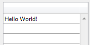
Note: Display format and entry filters cannot be set for an object column. They automatically depend on the value type.
When a list box column is associated with an object array, the way a cell is displayed, entered, or edited, is based on the valueType attribute of the array element. Supported valueType values are:
- "text": for a text value
- "real": for a numeric value that can include separators like a <space>, <.>, or <,>
- "integer": for an integer value
- "boolean": for a True/False value
- "color": to define a background color
- "event": to display a button with a label.
4D uses default widgets with regards to the "valueType" value (i.e., a "text" is displayed as a text input widget, a "boolean" as a check box), but alternate displays are also available through options (e.g., a real can also be represented as a drop-down menu). The following table shows the default display as well as alternatives for each type of value:
| valueType | Default widget | Alternative widget(s) |
| text | text input | drop-down menu (required list) or combo box (choice list) |
| real | controlled text input (numbers and separators) | drop-down menu (required list) or combo box (choice list) |
| integer | controlled text input (numbers only) | drop-down menu (required list) or combo box (choice list) or three-states check box |
| boolean | check box | drop-down menu (required list) |
| color | background color | text |
| event | button with label | |
| All widgets can have an additional unit toggle button or ellipsis button attached to the cell. |
You set the cell display and options using specific attributes in each object (see below).
You cannot set display formats or entry filters for columns of object-type list boxes. They are automatically defined according to the value type. These are listed in the following table:
| Value type | Default format | Entry control |
| text | same as defined in object | any (no control) |
| real | same as defined in object (using system decimal separator) | "0-9" and "." and "-" |
| "0-9" and "." if min>=0 | ||
| integer | same as defined in object | "0-9" and "-" |
| "0-9" if min>=0 | ||
| Boolean | check box | N/A |
| color | N/A | N/A |
| event | N/A | N/A |
Each element of the object array is an object that can contain one or more attributes that will define the cell contents and data display (see example above).
The only mandatory attribute is "valueType" and its supported values are "text", "real", "integer", "boolean", "color", and "event". The following table lists all the attributes supported in list box object arrays, depending on the "valueType" value (any other attributes are ignored). Display formats are detailed and examples are provided below.
| valueType | text | real | integer | boolean | color | event | |
| Attributes | Description | ||||||
| value | cell value (input or output) | x | x | x | |||
| min | minimum value | x | x | ||||
| max | maximum value | x | x | ||||
| behavior | "threeStates" value | x | |||||
| requiredList | drop-down list defined in object | x | x | x | |||
| choiceList | combo box defined in object | x | x | x | |||
| requiredListReference | 4D list ref, depends on "saveAs" value | x | x | x | |||
| requiredListName | 4D list name, depends on "saveAs" value | x | x | x | |||
| saveAs | "reference" or "value" | x | x | x | |||
| choiceListReference | 4D list ref, display combo box | x | x | x | |||
| choiceListName | 4D list name, display combo box | x | x | x | |||
| unitList | array of X elements | x | x | x | |||
| unitReference | index of selected element | x | x | x | |||
| unitsListReference | 4D list ref for units | x | x | x | |||
| unitsListName | 4D list name for units | x | x | x | |||
| alternateButton | add an alternate button | x | x | x | x | x |
Cell values are stored in the "value" attribute. This attribute is used for input as well as output. It can also be used to define default values when using lists (see below).
Example:
 ARRAY OBJECT(obColumn;0) //column array

 C_OBJECT($ob1)

 $entry:="Hello world!"

 OB SET($ob1;"valueType";"text")

 OB SET($ob1;"value";$entry) // if the user enters a new value, $entry will contain the edited value

 C_OBJECT($ob2)

 OB SET($ob2;"valueType";"real")

 OB SET($ob2;"value";2/3)

 C_OBJECT($ob3)

 OB SET($ob3;"valueType";"boolean")

 OB SET($ob3;"value";True)


 APPEND TO ARRAY(obColumn;$ob1)

 APPEND TO ARRAY(obColumn;$ob2)

 APPEND TO ARRAY(obColumn;$ob3)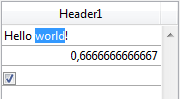
Note: Null values are supported and result in an empty cell.
When the "valueType" is "real" or "integer", the object also accepts min and max attributes with appropriate values (values must be of the same type as the valueType).
These attributes can be used to control the range of input values. When a cell is validated (when it loses the focus), if the input value is lower than the min value or greater than the max value, then it is rejected. In this case, the previous value is maintained and a tip displays an explanation.
Example:
 C_OBJECT($ob3)

 $entry3:=2015

 OB SET($ob3;"valueType";"integer")

 OB SET($ob3;"value";$entry3)

 OB SET($ob3;"min";2000)

 OB SET($ob3;"max";3000)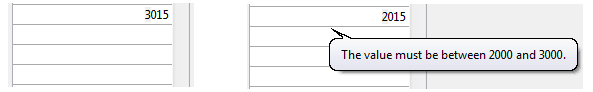
The behavior attribute provides variations to the regular representation of values. In the current version of 4D, a single variation is proposed:
| Attribute | Available value(s) | valueType(s) | Description |
| behavior | threeStates | integer | Represents a numeric value as a three-states check box. 2=semi-checked, 1=checked, 0=unchecked, -1=invisible, -2=unchecked disabled, -3=checked disabled, -4=semi-checked disabled |
Example:
 C_OBJECT($ob3)

 OB SET($ob3;"valueType";"integer")

 OB SET($ob3;"value";-3)

 C_OBJECT($ob4)

 OB SET($ob4;"valueType";"integer")

 OB SET($ob4;"value";-3)

 OB SET($ob4;"behavior";"threeStates")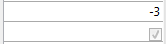
When a "choiceList" or a "requiredList" attribute is present inside the object, the text input is replaced by a drop-down list or a combo box, depending of the attribute:
- If the attribute is "choiceList", the cell is displayed as a combo box. This means that the user can select or type a value.
- If the attribute is "requiredList" then the cell is displayed as a drop-down list and the user can only select one of the values provided in the list.
In both cases, a "value" attribute can be used to preselect a value in the widget.
Note: The widget values are defined through an array. If you want to assign an existing 4D list to the widget, you need to use the "requiredListReference", "requiredListName", "choiceListReference", or "choiceListName" attributes.
Examples:
- You want to display a drop-down list with only two options: "Open" or "Closed". "Closed" must be preselected:
 ARRAY TEXT($RequiredList;0)

 APPEND TO ARRAY($RequiredList;"Open")

 APPEND TO ARRAY($RequiredList;"Closed")

 C_OBJECT($ob)

 OB SET($ob;"valueType";"text")

 OB SET($ob;"value";"Closed")

 OB SET ARRAY($ob;"requiredList";$RequiredList)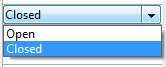
- You want to accept any integer value, but display a combo box to suggest the most common values:
 ARRAY LONGINT($ChoiceList;0)

 APPEND TO ARRAY($ChoiceList;5)

 APPEND TO ARRAY($ChoiceList;10)

 APPEND TO ARRAY($ChoiceList;20)

 APPEND TO ARRAY($ChoiceList;50)

 APPEND TO ARRAY($ChoiceList;100)

 C_OBJECT($ob)

 OB SET($ob;"valueType";"integer")

 OB SET($ob;"value";10) //10 as default value

 OB SET ARRAY($ob;"choiceList";$ChoiceList)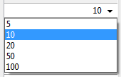
The "requiredListName" and "requiredListReference" attributes allow you to use, in a list box cell, a list defined in 4D either in Design mode (in the Lists editor of the Tool box) or by programming (using the New list command). The cell will then be displayed as a drop-down list. This means that the user can only select one of the values provided in the list.
Use "requiredListName" or "requiredListReference" depending on the origin of the list: if the list comes from the Tool box, you pass a name; otherwise, if the list has been defined by programming, you pass a reference. In both cases, a "value" attribute can be used to preselect a value in the widget.
Note: If you want to define these values through a simple array, you need to use the "requiredList" attribute.
In this case, the "saveAs" attribute will define whether the selected item must be saved as a "value" or as a "reference".
- If "saveAs" = "reference" then it will be saved as a reference and the "valueType" must be real or integer.
- If "saveAs" = "value" then the value is saved. In this case, the "valueType" must be the same type as the values of the list, usually "text" or "integer"; otherwise 4D will try to convert the value of the list into the "valueType" of the object (see examples below).
For more information about the "save as" option, please refer to the Save as Value or Reference section in the Design Reference manual.
Note: If the list contains text items representing real values, the decimal separator must be a period ("."), regardless of the local settings, e.g.: "17.6" "1234.456".
Examples:
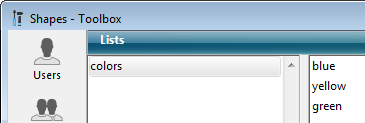
- You want to display a drop-down list based on a "colors" list defined in the Tool box (containing the values "blue", "yellow", and "green"), save it as a value and display "blue" by default:
 C_OBJECT($ob)

 OB SET($ob;"valueType";"text")

 OB SET($ob;"saveAs";"value")

 OB SET($ob;"value";"blue")

 OB SET($ob;"requiredListName";"colors")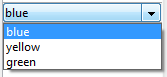
- You want to display a drop-down list based on a list defined by programming and save it as a reference:
 <>List:=New list

 APPEND TO LIST(<>List;"Paris";1)

 APPEND TO LIST(<>List;"London";2)

 APPEND TO LIST(<>List;"Berlin";3)

 APPEND TO LIST(<>List;"Madrid";4)

 C_OBJECT($ob)

 OB SET($ob;"valueType";"integer")

 OB SET($ob;"saveAs";"reference")

 OB SET($ob;"value";2) //displays London by default

 OB SET($ob;"requiredListReference";<>List)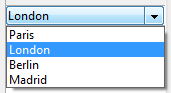
The "choiceListName" and "choiceListReference" attributes allow you to use, in a list box cell, a list defined in 4D either in Design mode (in the Tool box) or by programming (using the New list command). The cell is then displayed as a combo box, which means that the user can select or type a value.
Use "choiceListName" or "choiceListReference" depending on the origin of the list: if the list comes from the Tool box, you pass a name; otherwise, if the list has been defined by programming, you pass a reference. In both cases, a "value" attribute can be used to preselect a value in the widget.
Note: If you want to define these values through a simple array, you need to use the "choiceList" attribute.
The "saveAs" attribute cannot be used in this case because selected items are automatically saved as a "value" (cf. for more information).
Note: If the list contains text items representing real values, the decimal separator must be a period ("."), regardless of the local settings, e.g.: "17.6" "1234.456".
Example:
You want to display a combo box based on a "colors" list defined in the Tool box (containing the values "blue", "yellow", and "green") and display "green" by default:
 C_OBJECT($ob)

 OB SET($ob;"valueType";"text")

 OB SET($ob;"value";"blue")

 OB SET($ob;"choiceListName";"colors")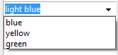
You can use specific attributes to add units associated with cell values (e.g.: "10 cm", "20 pixels", etc.). To define the unit list, you can use one of the following attributes:
- "unitsList": an array containing the x elements used to define the available units (e.g.: "cm", "inches", "km", "miles", etc.). Use this attribute to define units within the object.
- "unitsListReference": a reference to a 4D list containing available units. Use this attribute to define units with a 4D list created with the New list command.
- "unitsListName": a name of a design-based 4D list that contains available units. Use this attribute to define units with a 4D list created in the Tool box.
Regardless of the way the unit list is defined, it can be associated with the following attribute:
- "unitReference": a single value that contains the index (from 1 to x) of the selected item in the "unitList", "unitsListReference" or "unitsListName" values list.
The current unit is displayed as a button that cycles through the "unitList", "unitsListReference" or "unitsListName" values each time it is clicked (e.g., "pixels" -> "rows" -> "cm" -> "pixels" -> etc.)
Example: We want to set up a numeric input followed by two possible units: "rows" or "pixels". The current value is "2" + "lines". We use values defined directly in the object ("unitsList" attribute):
 ARRAY TEXT($_units;0)

 APPEND TO ARRAY($_units;"lines")

 APPEND TO ARRAY($_units;"pixels")

 C_OBJECT($ob)

 OB SET($ob;"valueType";"integer")

 OB SET($ob;"value";2) // 2 "units"

 OB SET($ob;"unitReference";1) //"lines"

 OB SET ARRAY($ob;"unitsList";$_units)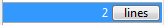
If you want to add an ellipsis button [...] to a cell, you just need to pass the "alternateButton" with the True value in the object. The button will be displayed in the cell automatically.
When this button is clicked by a user, an On Alternate Click event will be generated, and you will be able to handle it however you want (see the "Event management" section below for more information).
Example:
 C_OBJECT($ob1)

 $entry:="Hello world!"

 OB SET($ob;"valueType";"text")

 OB SET($ob;"alternateButton";True)

 OB SET($ob;"value";$entry)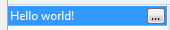
The "color" valueType allows you to display either a color or a text.
- If the value is a number, a colored rectangle is drawn inside the cell. Example:
 C_OBJECT($ob4)

 OB SET($ob4;"valueType";"color")

 OB SET($ob4;"value";0x00FF0000)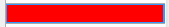
- If the value is a text, then the text is displayed (e.g.: "value";"Automatic").
The "event" valueType displays a simple button that generates an On Clicked event when clicked. No data or value can be passed or returned.
Optionally, you can pass a "label" attribute.
Example:
 C_OBJECT($ob)

 OB SET($ob;"valueType";"event")

 OB SET($ob;"label";"Edit...")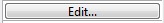
Several events can be handled while using an object list box array:
- On Data Change: An On Data Change event is triggered when any value has been modified either:
- in a text input zone
- in a drop-down list
- in a combo box area
- in a unit button (switch from value x to value x+1)
- in a check box (switch between checked/unchecked)
- On Clicked: When the user clicks on a button installed using the "event" valueType attribute, an On Clicked event will be generated. This event is managed by the programmer.
- On Alternative Click: When the user clicks on an ellipsis button ("alternateButton" attribute), an On Alternative Click event will be generated. This event is managed by the programmer.
Compatibility note (4D v15): On Alternative Click is the new name of the On Arrow Click event that was available in previous versions of 4D. This event has been renamed since its scope has been extended.

Product: 4D
Theme: List Box
Created: 4D v15
4D Language Reference ( 4D v16)
4D Language Reference ( 4D v16.1)
4D Language Reference ( 4D v16.2)
4D Language Reference ( 4D v16.3)


