4D v14.3
Tab Controls
- 4D Design Reference
-
- Working with active objects
-
- What are active objects?
- Field and variable objects
- Buttons
- 3D Buttons, 3D Check Boxes and 3D Radio Buttons
- Picture Buttons
- Button Grids
- Check Boxes
- Radio Buttons and Picture Radio Buttons
- Pop-up Menus/Drop-down Lists
- Combo Boxes
- Hierarchical Pop-up Menus and Hierarchical Lists
- Picture Pop-up Menus
- Indicators
- Tab Controls
- Splitters
- Web areas
- Plug-in areas
 Tab Controls
A tab control creates an object that lets the user choose among a set of virtual screens that are enclosed by the tab control object. Each screen is accessed by clicking its tab.
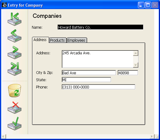
The following multi-page form uses a tab control object.

To navigate from screen to screen, the user simply clicks the desired tab.
The screens can represent pages in a multi-page form or an object that changes when the user clicks a tab. If the tab control is used as a page navigation tool, then the FORM GOTO PAGE command or the Goto Page standard action would be used when a user clicks a tab.
Another use of the tab control is to control the data that is displayed in a subform or grouped scrollable areas. For example, a Rolodex could be implemented using a tab control. The tabs would display the letters of the alphabet and the tab control’s action would be to load the data corresponding to the letter that the user clicked.
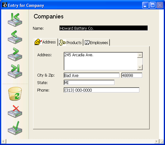
Each tab can display labels or labels and a small icon. If you include icons, they appear to the left of each label. Here is an example of a tab control that uses icons:

When you create a tab control, 4D manages the spacing and placement of the tabs. You only need to supply the labels in the form of an array, or the icons and labels in the form of a hierarchical list.
If the tab control is wide enough to display all the tabs with both the labels and icons, it displays both. If the tab control is not wide enough to display both the labels and icons, 4D displays the icons only. If it can’t fit all the icons, it places scroll arrows to the right of the last visible tab. The scroll arrows allow the user to scroll the icons to the left or right.
Under Mac OS, in addition to the standard position (top), the tab controls can also be aligned to the left, to the right, or below (see the "Modifying Direction (Mac OS Only)" section below).
There are several ways to supply the labels for a tab control:
- You can associate the tab control with a list of default values, which can be accessed using the Edit button next to the Default Values property found in the “Data Source” theme of the Property List. For more information about this, refer to Default lists of values. . Default values are automatically loaded into an array. You can refer to this array using the name of the variable associated with the tab control.
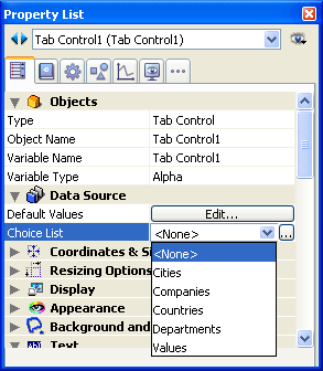
- You can create a list using the Lists editor and assign the list to the tab control as a choice list, as shown below:

If you like, you can associate a small icon with each list item using the Lists editor. For more information about this, refer to Adding a small icon to an item. - You can create a Text array that contains the names of each page of the form. This code must be executed before the form is presented to the user. For example, you could place the code in the object method of the tab control and execute it when the On Load event occurs.
 ARRAY TEXT(arrPages;3)

 arrPages{1}:="Name"

 arrPages{2}:="Address"

 arrPages{3}:="Notes"
Note: You can also store the names of the pages in a hierarchical list and use the Load list command to load the values into the array.
Use the FORM GOTO PAGE command in the tab control’s method:
FORM GOTO PAGE(arrPages)The command is executed when the On Clicked event occurs. You should then clear the array when the On Unload event occurs.
Here is an example object method:
 Case of

    :(Form event=On Load)

       LIST TO ARRAY("Tab Labels";arrPages)

    :(Form event=On Clicked)

       FORM GOTO PAGE(arrPages)

    :(Form event=On Unload)

       CLEAR VARIABLE(arrPages)

End caseYou can assign the Goto Page action to a tab control. When that action is selected, 4D will automatically display the page of the form that corresponds to the number of the tab that is selected.
For example, if the user selects the 3rd tab, 4D will display the third page of the current form (if it exists).
If you want to manage the effect of the selection of a button yourself, select No action.
For more information about standard actions, refer to Standard actions.
You can set the direction of tab controls in your forms. This property is available on all the platforms but can only be displayed under Mac OS, when the platform interface is “System.” You can choose to place the tab controls on top (standard) or on the bottom.
The tab control direction is set in the “Appearance” theme of the Property List.
When tab controls with a custom direction are displayed under Windows or with the “Printing” platform appearance, they automatically return to the standard direction (top).
Product: 4D
Theme: Working with active objects
4D Design Reference ( 4D v14 R2)
4D Design Reference ( 4D v14 R3)
4D Design Reference ( 4D v14.3)
4D Design Reference ( 4D v14 R4)
Inherited from : Tab Controls ( 4D v12.4)


