
4D v15.4
Preconfigured library objects
- 4D Design Reference
-
- Building forms
-
- Form editor
- Form properties
- Form Properties (Explorer)
- Creating a multi-page form
- Using inherited forms
- Modifying data entry order
- Inserting and organizing form objects
- Setting object display properties
- Rotation of text
- Using static pictures
- Using references in static text
- Duplicating on a matrix
- Incrementing a set of variables
- Scaling a form
- Using object methods
- Using object views
- Using shields
- Using the preconfigured library
- Preconfigured library objects
- Creating and using custom object libraries
- Displaying information about objects on forms being executed
 Preconfigured library objects
| Object | Button | Description |
| Variable |  | Adds an Enterable variable of the String type. |
| Enterable Styled Text |  | Adds a styled text area (Text type variable) where you can set the character font and define its size and color. |
| Hierarchical List |  | Adds a hierarchical list that includes sample code in its object method to implement a basic multi-level hierarchy. |
| List Box |  | Adds a three-column list box object that you can use to display arrays of data. |
| Scrollable Area |  | Adds a scrollable area which consists of a single-column list box whose headers and footers are not displayed. |
| Picture |  | Adds a picture area which can be configured using the Property list, for example to add a context menu or include a display format. |
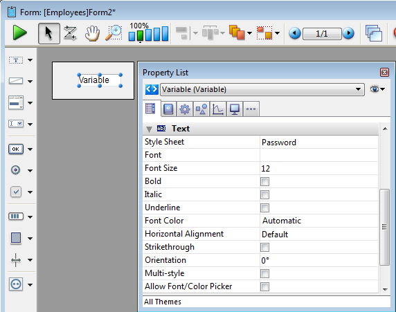
| Password |  | Adds a Text variable associated with a “Password” style sheet, which displays entered characters as asterisks. |
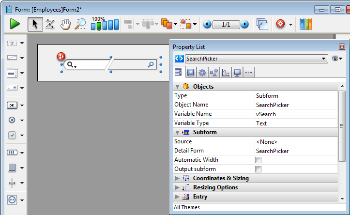
| Search Area |  | Adds a SearchPicker area that includes customizable sample code in its object method. |
| Rich Text Area |  | Adds a rich text area containing a set of menus and buttons to manage font styles and references. |
| Button |  | Adds a simple button associated with a variable whose action must be specified either using a method or by assigning a standard action in the Property list. |
| OK Cancel Buttons |  | Adds a pair of Cancel and OK buttons that have standard Cancel and Accept actions (respectively) associated with them. |
| 3D Button |  | Adds a basic 3D button. |
| Check Box |  | Adds a basic check box. |
| Small Check Box (Mac only) |  | Adds a small-sized check box (available on Mac only). |
| Radio Button |  | Adds a basic radio button. |
| Small Radio Button (Mac only) |  | Adds a small-sized radio button (available on Mac only).. |
| Round Button |  | Adds a round 3D button whose appearance has been preformatted. |
| Square Button (Mac only) |  | Adds a square 3D button whose appearance has been preformatted. |
| Textured Button (Mac only) |  | Adds a textured 3D button whose appearance has been preformatted. |
| Gradient Button (Mac only) |  | Adds a gradient 3D button whose appearance has been preformatted. |
| Toolbar Button |  | Adds a toolbar 3D button whose appearance has been preformatted. |
| XP Toolbar Button |  | Adds a XP toolbar 3D button whose appearance has been preformatted. |
| Mac Rounded Button (Mac only) |  | Adds a Mac rounded button (not available on Windows). |
| Help Button |  | Adds a help 3D button whose appearance has been preformatted. |
| Collapse-Expand Button |  | Adds a Collapse-Expand 3D button whose appearance has been preformatted. |
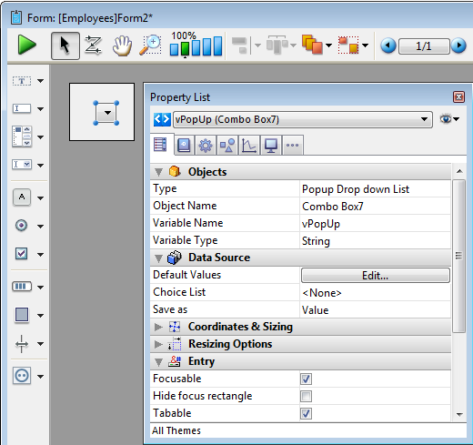
| Pop-up Menu |  | Adds a pop-up menu associated with an Array type variable which can display most types of data. |
| Pop-up Button (Mac only) |  | Adds a pop-up menu whose width has been reduced to form a button. (Only available on the Macintosh platform) |
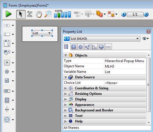
| Hierarchical Pop-up |  | Adds a hierarchical pop-up menu associated with a String variable of the hierarchical list type. |
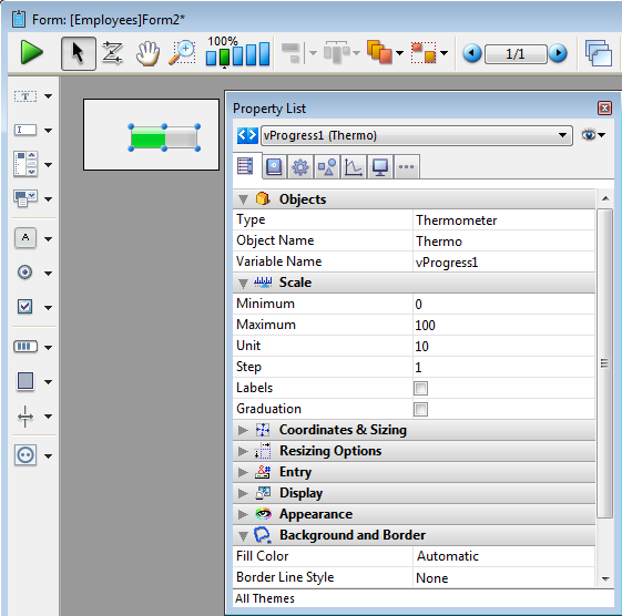
| Horizontal Progress Bar |  | Adds a horizontal progress bar associated with a number variable whose default min and max values are 0 and 100. |
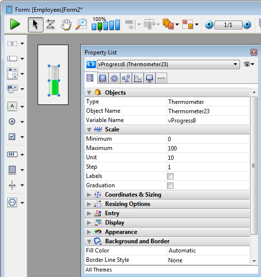
| Vertical Progress Bar |  | Adds a vertical progress bar associated with a number variable whose default min and max values are 0 and 100. |
| Asynchronous (Barber Shop) Progress Bar |  | Adds an asynchronous progress bar associated with a number variable. |
| Asynchronous Progress Wheel |  | Adds an asynchronous progress wheel associated with a number variable. |
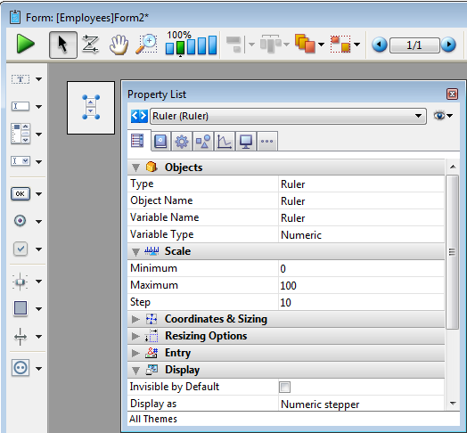
| Horizontal Ruler |  | Adds a horizontal ruler associated with a number variable whose default min and max values are 0 and 100. |
| Vertical Ruler |  | Adds a vertical ruler associated with a number variable whose default min and max values are 0 and 100. |
| Graduated Horizontal Ruler |  | Adds a graduated horizontal ruler associated with a number variable whose default min and max values are 0 and 100. |
| Stepper Button |  | Adds a ruler in the form of a button whose value is incremented and decremented in steps. |
| Tabs |  | Adds a tab object whose contents come from an array or a hierarchical list. By default, the standard action “Goto Page” is associated with this type of object. |
| Tabs Without Frame (Mac only) |  | Adds a variant of the tab object which has the same properties (standard “Goto Page” action, contents from array or hierarchical list), but is displayed without a frame. |
| Horizontal Splitter |  | Adds a horizontal splitter to divide the form (or part of it) into two areas which can be resized respectively. |
| Vertical Splitter |  | Adds a vertical splitter to divide the form (or part of it) into two areas which can be resized respectively. |
| Rectangle |  | Adds a rectangle whose properties (color, line thickness, pattern, etc.) can be specified either using the Property list or by programming. |
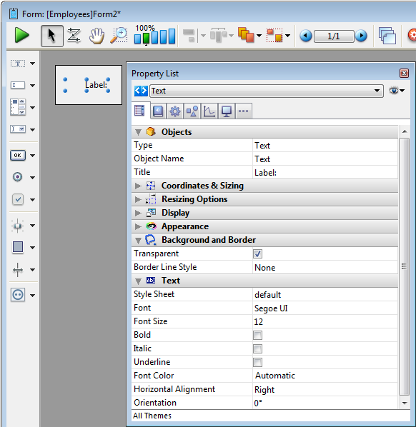
| Label |  | Adds a label whose properties (color, line thickness, pattern, etc.) can be specified either using the Property list or by programming. |
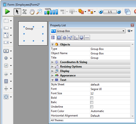
| Group Box |  | Adds a group box whose properties (color, line thickness, pattern, etc.) are specified either using the Property list or by programming. |
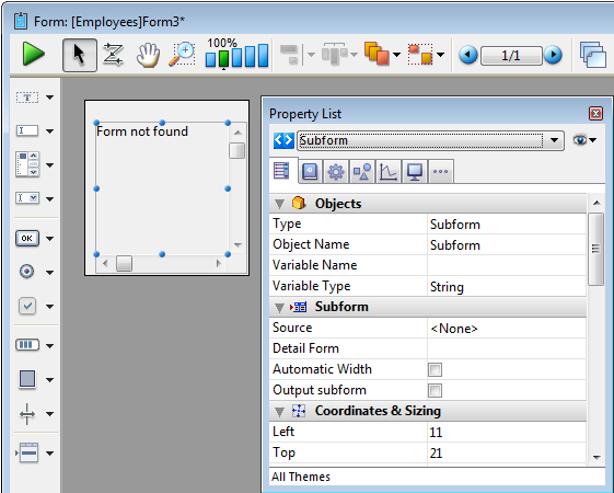
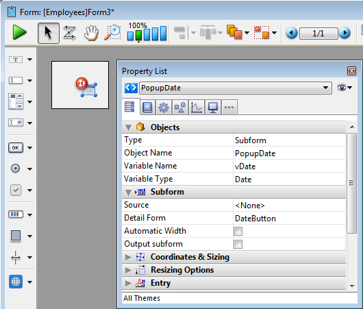
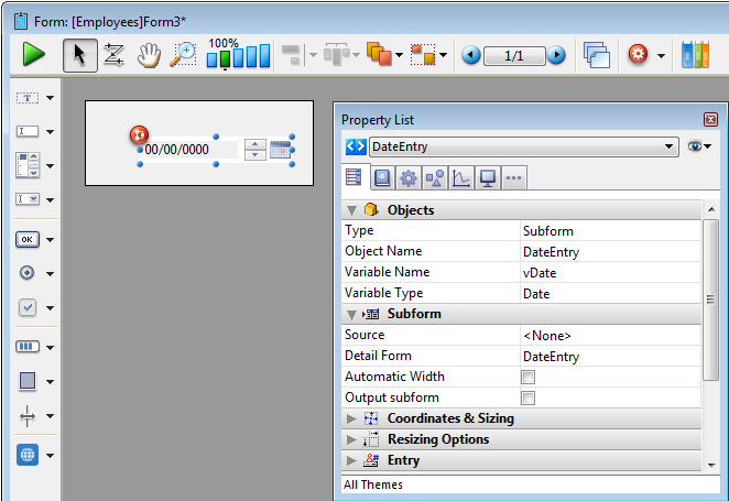
| Subform |  | Adds a subform area which can be used to display a form from another database or a project form shared by a component. |
| 4D Write Zone |  | Adds a 4D Write area. |
| 4D View Zone |  | Adds a 4D View area. |
| Web Area |  | Adds a Web area which can display local HTML pages or pages from the Web. |
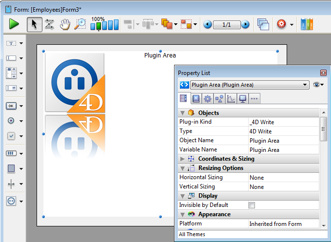
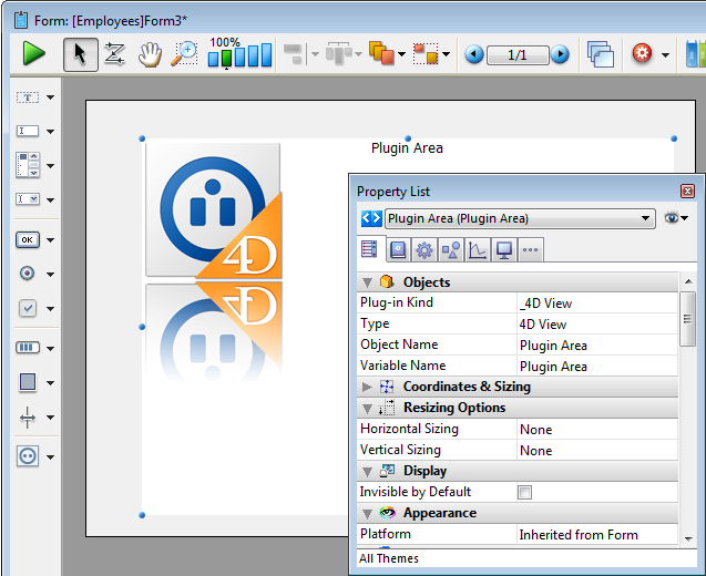
| Plug-in |  | Adds a plug-in area where you can use external 4D tools (for example, 4D Write, 4D View, 4D Web areas), as well as tools developed by third-party companies. |
| Date Picker |  | Adds a calendar associated with a Date variable, which can be configured in order to specify holidays, a date span, and so on. |
| Pop-up Date |  | Adds a pop-up area used to display a calendar for selecting dates. Dates selected are assigned directly to the Date variable associated with this area. |
| Date Entry Area |  | Adds a data entry area with three separate fields for entering the day, month and year, respectively. |
| Time Pickers |     | Adds a pop-up area used to enter a time. You |
| Time Entry Areas |   | Adds a time entry area with three separate fields for entering the hour, minute and second, respectively. |
| Time Display Areas |   | Adds a time display area (clock or LCD) which can display a static time or a functioning clock, depending on the type of associated variable. |
Note: Initially, the Date picker, Pop-up date and Date entry area objects all share the same Date variable and will display matching dates when used on the same form.
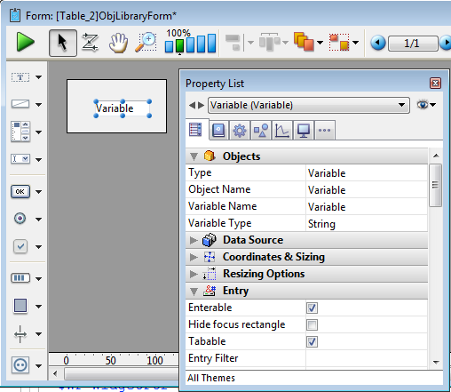
Adds an enterable String type variable named "Variable". You can use the Property list to modify its type or other properties.
For more information about using variables in forms, refer to Field and variable objects.
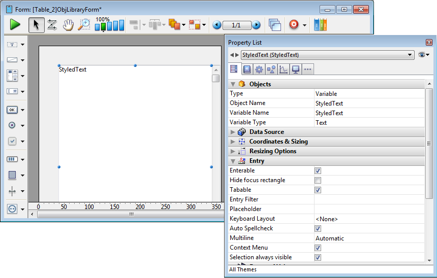
Adds a styled text area (variable) where you can set the character font and define its size and color. This area can be resized and has a vertical scroll bar and a context menu. You can modify these default features using the Property list.
For more information about using variables in forms, refer to Field and variable objects.
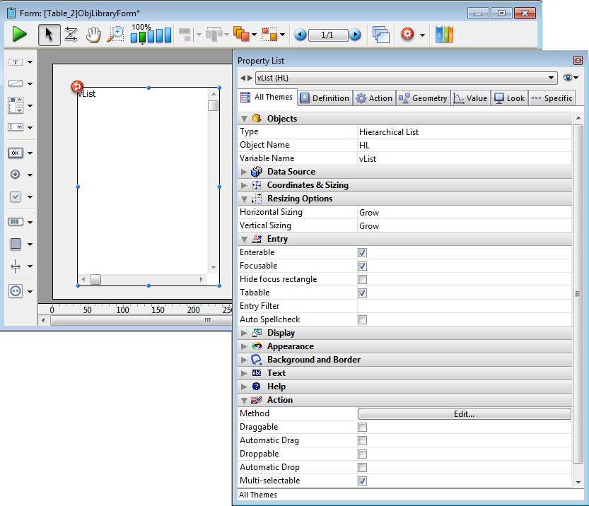
Adds a hierarchical list that includes sample code in its object method used to implement a basic multi-level hierarchy. You can use the Property list to modify its properties.
By modifying the sample code in the object method, you can customize the existing hierarchy to meet your specific needs.
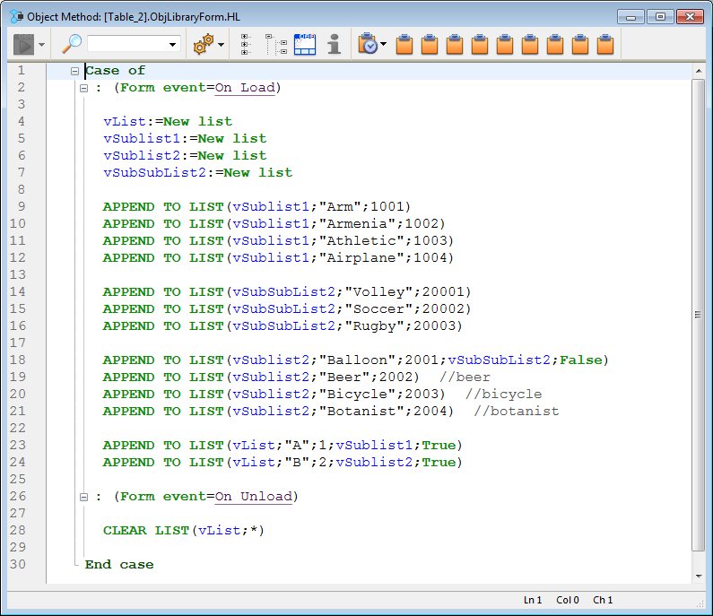
Here is how the list appears in the form with its default sample code:
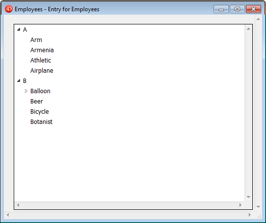
For more information about using hierarchical lists in forms, refer to Hierarchical Pop-up Menus and Hierarchical Lists.
Adds a three-column list box object that you can use to display arrays of data. You use the Property list to specify the data source and define the options desired.
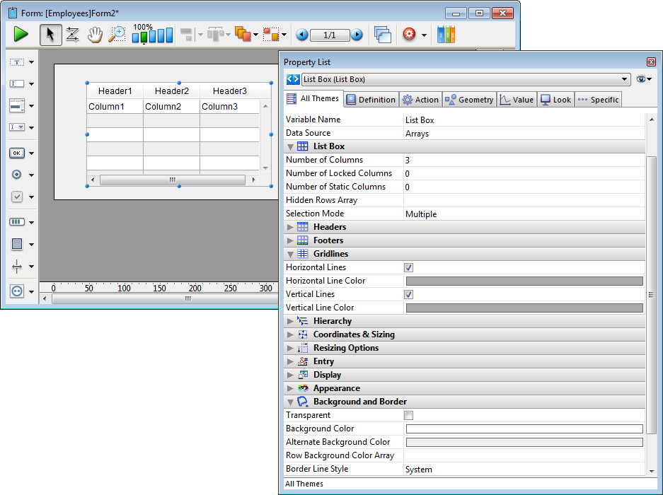
For more information about using list boxes in forms, refer to the Overview section for list boxes.
Adds a scrollable area which consists of a single-column list box whose headers and footers are not displayed. This area is not enterable by default but you can configure it using the Property list.
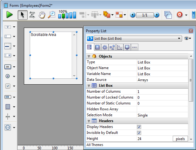
For more information about using scrollable areas in forms, refer to the Overview section for list boxes.
Adds a picture area which can be configured using the Property list, for example to add a context menu or include a display format.
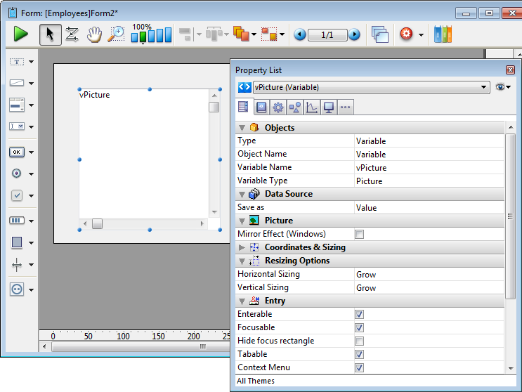
For more information about using picture variables in forms, refer to Typing of picture variables in forms.
Adds an enterable String variable associated with a “Password” style sheet, which displays entered characters as asterisks. You can use the Property list to modify its properties.
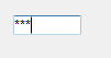
When you enter text in a password area in a form, only asterisks are displayed:
For more information about using variables in forms, refer to Field and variable objects. You can also refer to the Style sheets section for more information.
Adds a SearchPicker area that includes customizable sample code in its object method. You can use the Property list to modify its properties.
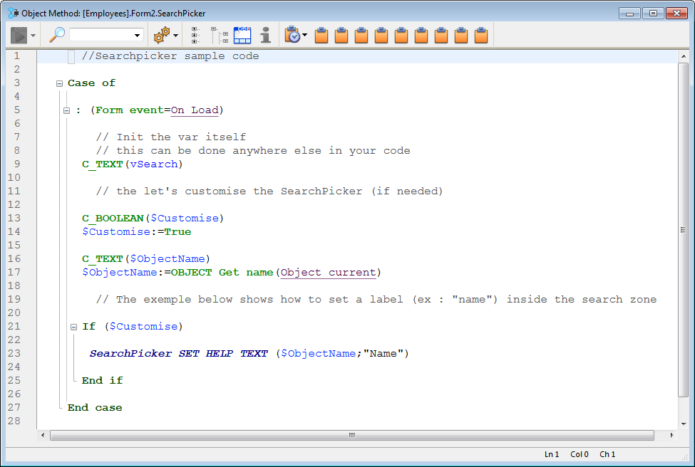
You can modify the sample code in the object method in order to customize the label displayed in this area by means of the SearchPicker SET HELP TEXT command.
Here is the search area in a form:
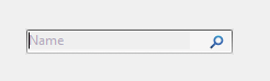
For more information, refer to the Overview of the SearchPicker widget.
Adds a rich text area along with a set of menus and buttons to manage font styles and references.
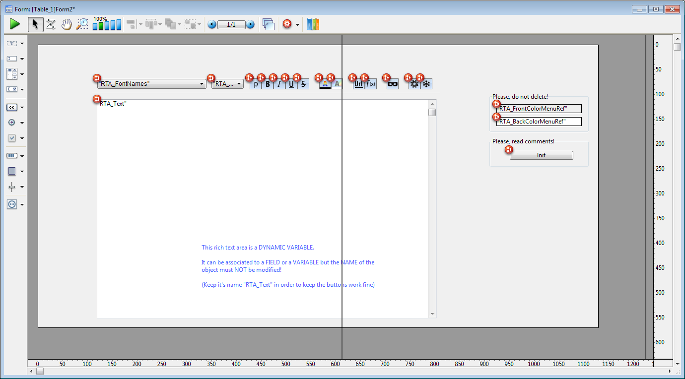
This rich text area consists of a dynamic variable named “RTA_Text”. In order for the menus and buttons of this area to work properly, it is important that you Do Not modify this name.
Note: In order for the XLIFF references to be copied into your database, you will need to restart it after dropping this area onto a form.
There are two offscreen variables used to save the font color and background color menu references. When they are present, the menus will be built "On Load" and released "On Unload".
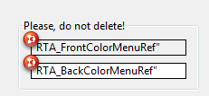
Note: If these variables are deleted (not recommended), these menus will have to be created (and deleted) each time a user clicks on the font color or background color buttons.
There is also an offscreen button labeled "Init" whose purpose is to copy certain resources from the 4D application into your database.
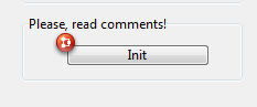
These resources are used inside the buttons and in the color menu. They only need to be copied once and this button should be deleted once its script has been executed.
When the form is in user mode, the rich text area appears as follows:
The following menus and buttons are included by default with the rich text area:
 | Use these drop-down menus to select the font and its size. |
 | Plain, Bold, Italics, Underline and Strikethrough style buttons. |
 | Buttons to set font color and background color, respectively. |
 | Buttons to insert a URL or an Expression (respectively). |
 | Button to display expressions as references (strings) instead of values. |
 | Use these buttons to compute or freeze, respectively, the expressions in the text. |
Adds a simple button associated with a variable whose action must be specified either using a method or by assigning a standard action in the Property list. There is also an associated style sheet that you can modify if desired.
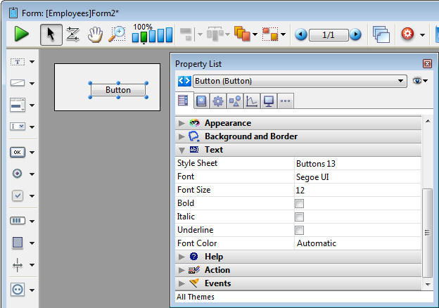
For more information about using buttons in forms, refer to Buttons. You can also refer to the Style sheets section for more information.
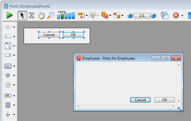
Adds a pair of Cancel and OK buttons that have standard Cancel and Accept actions (respectively) associated with them. They also have associated keyboard shortcuts (“Return” for OK and “Escape” for Cancel) and are configured to move with the window so as to remain side by side in the lower right corner.
For more information about using buttons in forms, refer to Buttons.
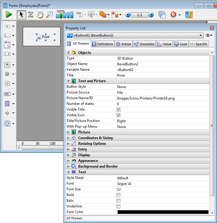
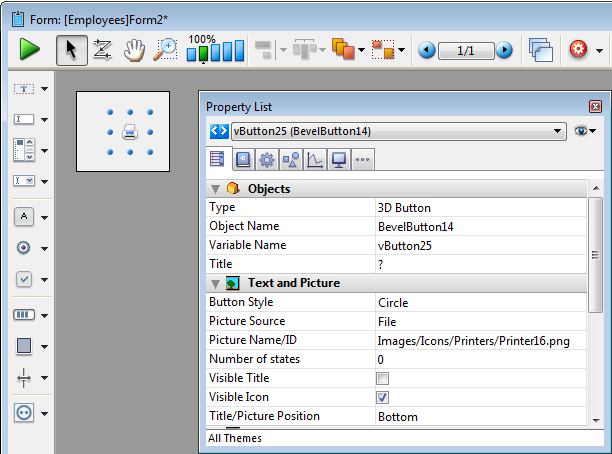
Adds a basic 3D button. You can use the Property list to modify its properties.
For more information about using 3D buttons in forms, refer to 3D Buttons, 3D Check Boxes and 3D Radio Buttons.
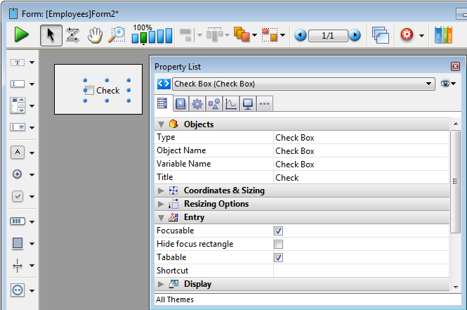
Adds a basic check box. You can use the Property list to modify its properties.
For more information about using check boxes in forms, refer to Check Boxes.
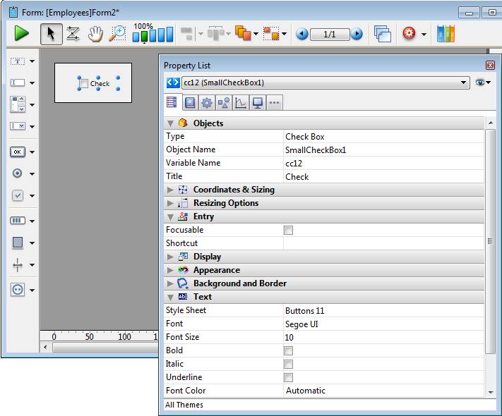
Adds a small-sized check box (available on Mac only). You can use the Property list to modify its properties.
For more information about using check boxes in forms, refer to Check Boxes.
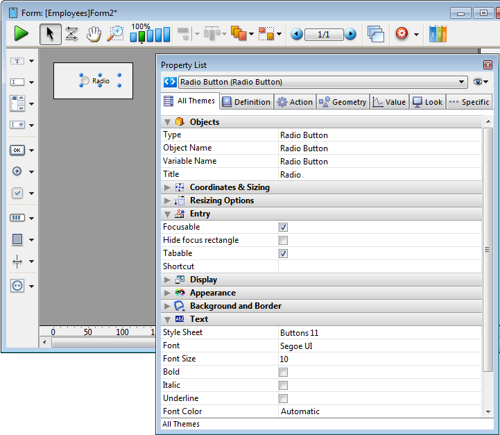
Adds a basic radio button. You can use the Property list to modify its properties.
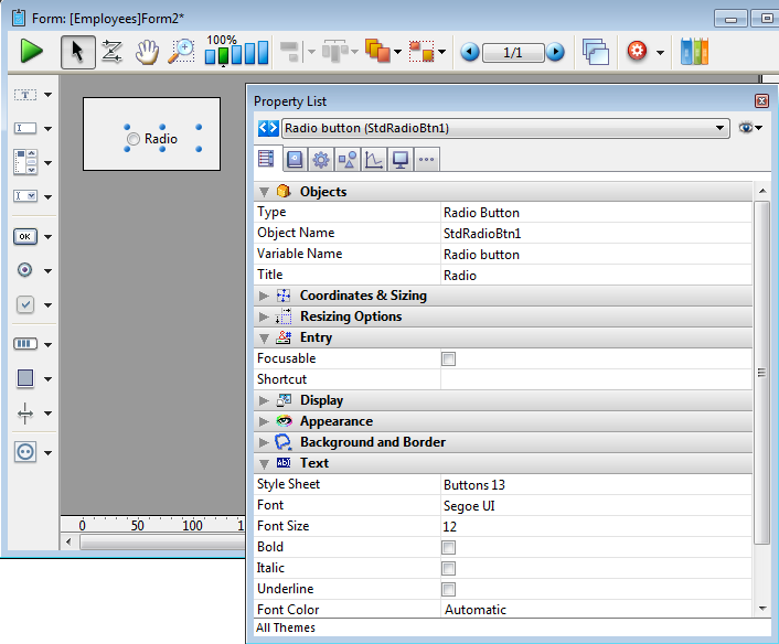
For more information about using radio buttons in forms, refer to Radio Buttons and Picture Radio Buttons.
Adds a small-sized radio button (available on Mac only). You can use the Property list to modify its properties.
For more information about using radio buttons in forms, refer to Radio Buttons and Picture Radio Buttons.
Adds a round 3D button whose appearance has been preformatted. You can use the Property list to modify its properties.
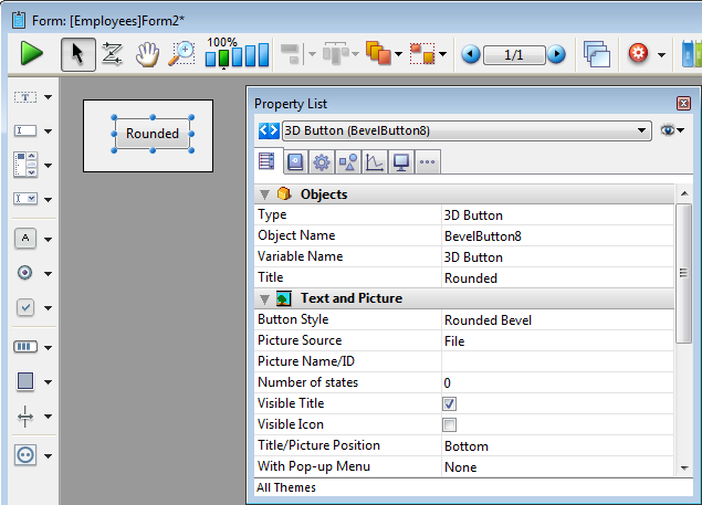
For more information about using 3D buttons in forms, refer to 3D Buttons, 3D Check Boxes and 3D Radio Buttons.
Adds a square 3D button whose appearance has been preformatted. You can use the Property list to modify its properties.
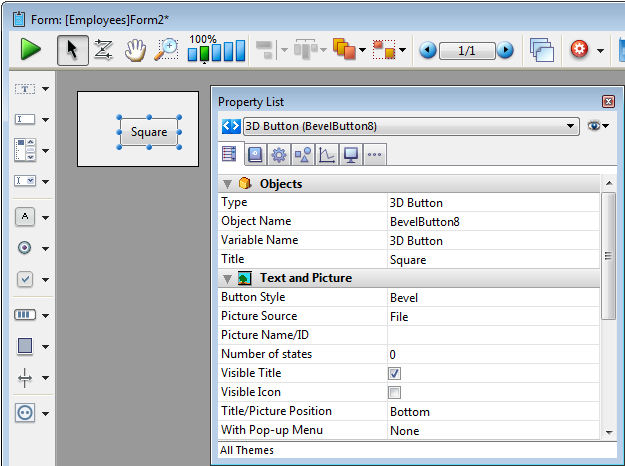
For more information about using 3D buttons in forms, refer to 3D Buttons, 3D Check Boxes and 3D Radio Buttons.
Adds a textured 3D button whose appearance has been preformatted. You can use the Property list to modify its properties.
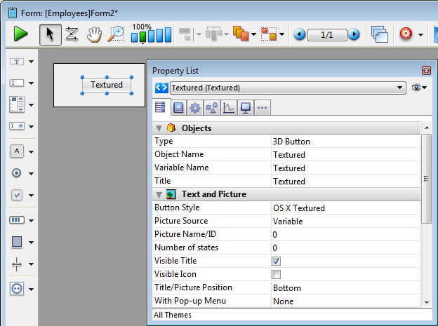
For more information about using 3D buttons in forms, refer to 3D Buttons, 3D Check Boxes and 3D Radio Buttons.
Adds a gradient 3D button whose appearance has been preformatted. You can use the Property list to modify its properties.
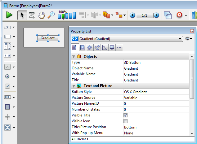
For more information about using 3D buttons in forms, refer to 3D Buttons, 3D Check Boxes and 3D Radio Buttons.
Adds a toolbar 3D button whose appearance has been preformatted. You can use the Property list to modify its properties.
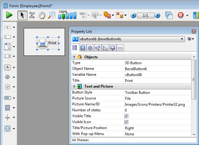
For more information about using 3D buttons in forms, refer to 3D Buttons, 3D Check Boxes and 3D Radio Buttons.
Adds a XP toolbar 3D button whose appearance has been preformatted. You can use the Property list to modify its properties.
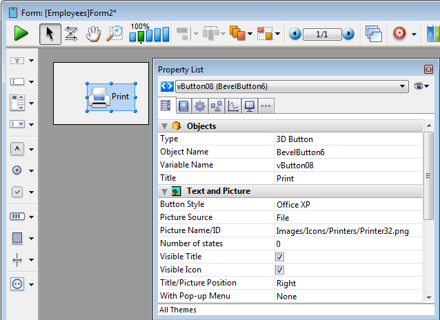
For more information about using 3D buttons in forms, refer to 3D Buttons, 3D Check Boxes and 3D Radio Buttons.
Adds a Mac rounded button (not available on Windows). You can use the Property list to modify its properties.
For more information about using 3D buttons in forms, refer to 3D Buttons, 3D Check Boxes and 3D Radio Buttons.
Adds a help 3D button whose appearance has been preformatted. You can use the Property list to modify its properties.
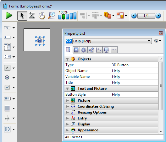
For more information about using 3D buttons in forms, refer to 3D Buttons, 3D Check Boxes and 3D Radio Buttons.
Adds a Collapse-Expand 3D button whose appearance has been preformatted. You can use the Property list to modify its properties.
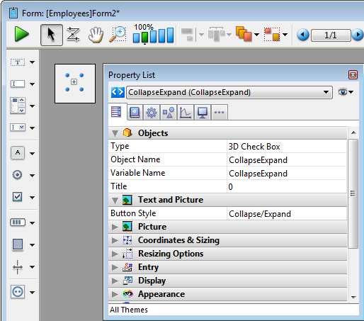
For more information about using 3D buttons in forms, refer to 3D Buttons, 3D Check Boxes and 3D Radio Buttons.
Adds a pop-up menu associated with an Array type variable which can display most types of data. You can use the Property list to modify its properties.
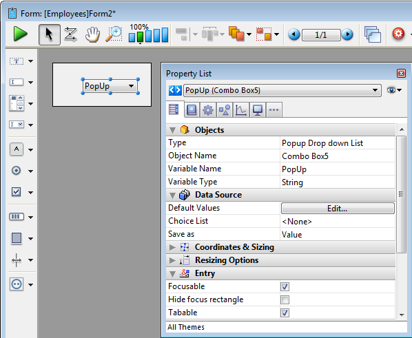
For more information about using pop-up menus in forms, refer to Pop-up Menus/Drop-down Lists.
Adds a pop-up menu whose width has been reduced to form a button. (Only available on the Macintosh platform). You can use the Property list to modify its properties.
For more information about using pop-up menus in forms, refer to Pop-up Menus/Drop-down Lists.
Adds a hierarchical pop-up menu associated with a String variable of the hierarchical list type. You can use the Property list to modify its properties.
For more information about using hierarchical pop-up menus in forms, refer to Hierarchical Pop-up Menus and Hierarchical Lists.
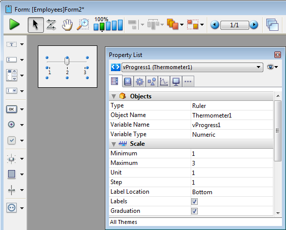
Adds a horizontal progress bar associated with a number variable whose default min and max values are 0 and 100. You can modify these values using the Property list.
For more information about using progress indicators in forms, refer to Indicators.
Adds a vertical progress bar associated with a number variable whose default min and max values are 0 and 100. You can modify these values using the Property list.
For more information about using progress indicators in forms, refer to Indicators.
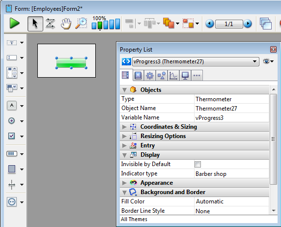
Adds an asynchronous progress bar associated with a number variable. This bar is animated when the value of the variable is greater than zero. You can modify its display mode using programming.
For more information about using progress indicators in forms, refer to Indicators.
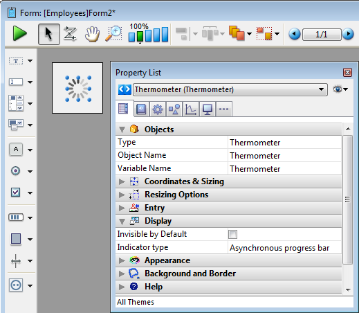
Adds an asynchronous progress wheel associated with a number variable. This wheel is animated when the value of the variable is greater than zero.
For more information about using progress indicators in forms, refer to Indicators.
Adds a horizontal ruler associated with a number variable whose default min and max values are 0 and 100. You can modify these values using the Property list.
For more information about using progress indicators in forms, refer to Indicators.
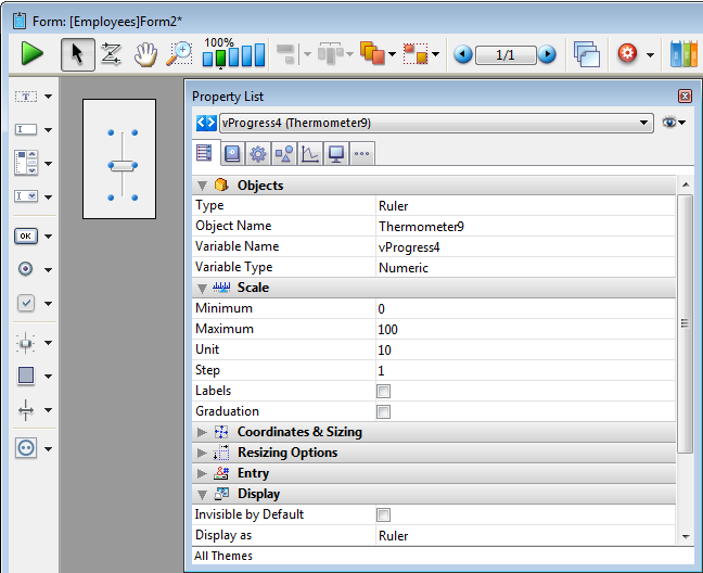
Adds a vertical ruler associated with a number variable whose default min and max values are 0 and 100. You can modify these values using the Property list.
For more information about using progress indicators in forms, refer to Indicators.
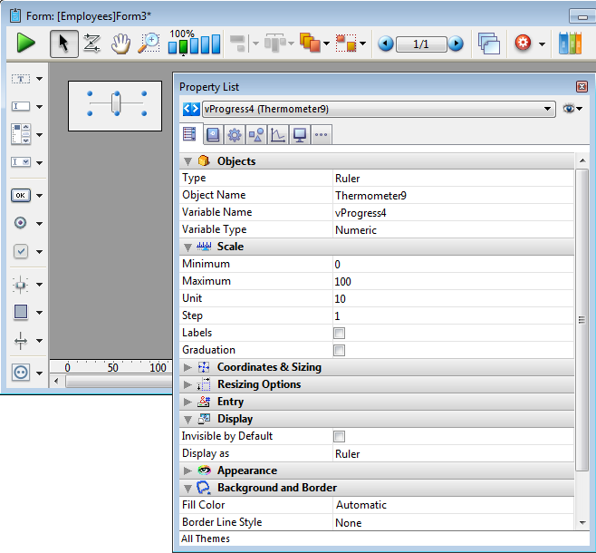
Adds a graduated horizontal ruler associated with a number variable whose default min and max values are 0 and 100. You can modify these values using the Property list.
For more information about using progress indicators in forms, refer to Indicators.
Adds a ruler in the form of a button whose value is incremented and decremented in steps. You can set the min and max values, as well as the step, using the Property list.
For more information about using progress indicators in forms, refer to Indicators.
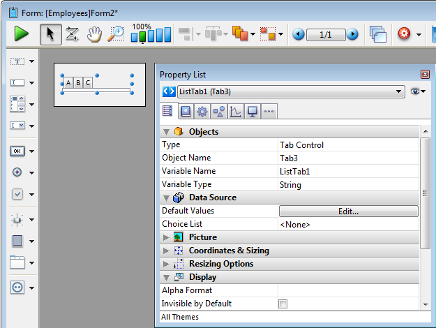
Adds a tab object whose contents can come from an array or a hierarchical list. You can use the Property list to modify its properties.
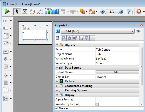
Here is how this tab appears in the form:
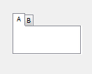
For more information about using tab controls in forms, refer to Tab Controls.
Adds a variant of the tab object which has the same properties (contents from array or hierarchical list), but is displayed without a frame. This variant is only available on the Macintosh platform.
For more information about using tab controls in forms, refer to Tab Controls.
Adds a horizontal splitter to divide the form (or part of it) into two areas which can be resized respectively. Any dependent objects must be assigned appropriate resizing properties.
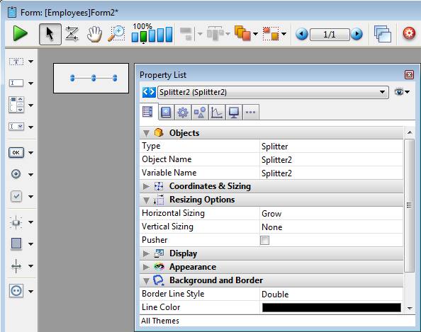
For more information about using splitters in forms, refer to Splitters.
Adds a vertical splitter to divide the form (or part of it) into two areas which can be resized respectively. Any dependent objects must be assigned appropriate resizing properties.
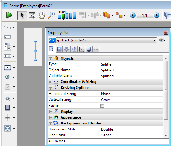
For more information about using splitters in forms, refer to Splitters.
Adds a rectangle whose properties (color, line thickness, pattern, etc.) can be specified either using the Property list or by programming.
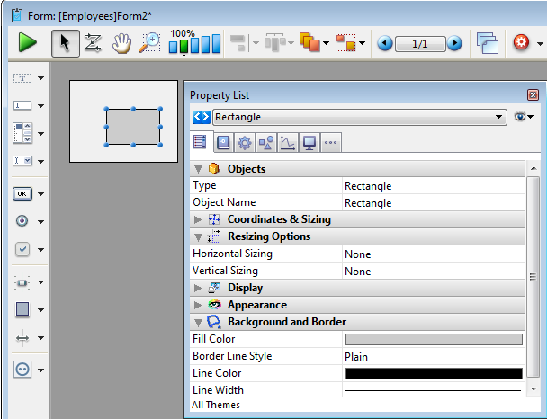
For more information about displaying objects such as rectangles, refer to Setting object display properties.
Adds a label whose properties (color, line thickness, pattern, etc.) can be specified either using the Property list or by programming.
For more information about displaying objects such as labels, refer to Setting object display properties.
Adds a group box whose properties (color, line thickness, pattern, etc.) are specified either using the Property list or by programming.
For more information about displaying objects such as group boxes, refer to Setting object display properties.
Adds a subform area which can be used to display a form from another database or a project form shared by a component.
For more information about using subforms, refer to the Overview section for Subforms and Widgets.
Adds a 4D Write plug-in area.
For more information using plug-in areas in forms, refer to Plug-in areas.
Adds a 4D View plug-in area.
For more information using plug-in areas in forms, refer to Plug-in areas.
Adds a Web area which can display local HTML pages or pages from the Web. Its contents can be controlled using programming.
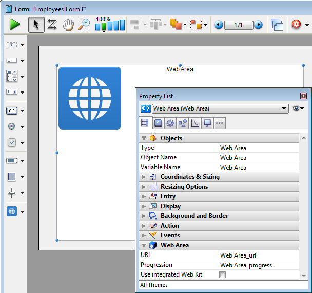
For more information about using Web areas in forms, refer to Web areas.
Adds a plug-in area where you can use external 4D tools (for example, 4D Write, 4D View, 4D Web areas), as well as tools developed by third-party companies.
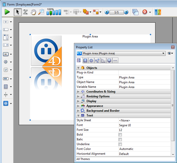
For more information using plug-in areas in forms, refer to Plug-in areas.
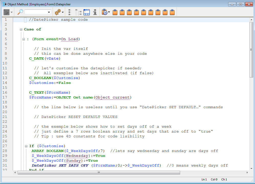
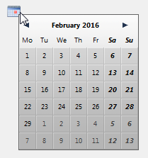
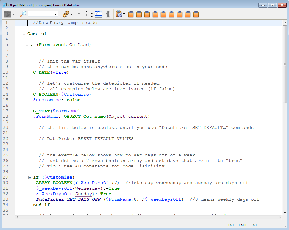
Adds a calendar associated with a Date variable, which can be configured in order to specify holidays, a date span, and so on.
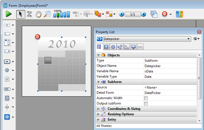
Sample code is provided in its object method. You can configure it using the commands provided for the Date picker widget.
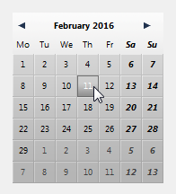
Here is the calendar as it appears in the form:
For more information about DatePicker widget commands, refer to DatePicker.
Note: Initially, the Date picker, Pop-up Date and Date entry objects all share the same Date variable and will display matching dates when used on the same form.
Adds a pop-up area used to display a calendar for selecting dates. Dates selected are assigned directly to the Date variable associated with this area.
Sample code is provided in its object method. You can configure it using the commands provided for the Date picker widget.
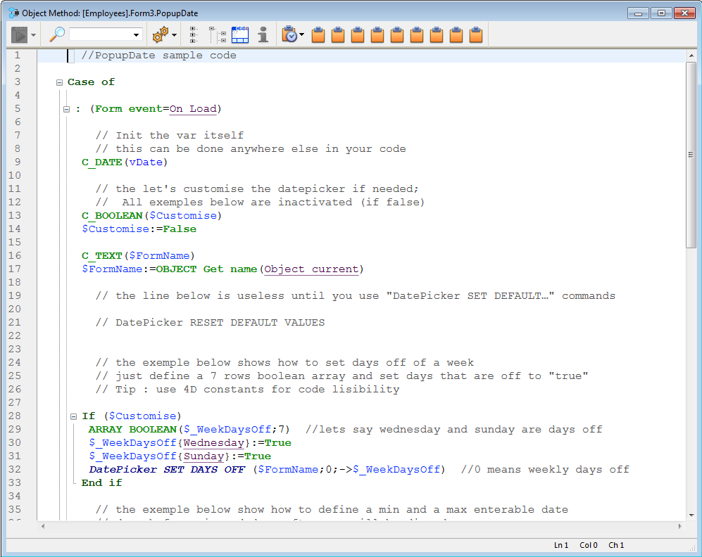
Here is how it appears in the form:
For more information about DatePicker widget commands, refer to DatePicker.
Note: Initially, the Date picker, Pop-up Date and Date entry objects all share the same Date variable and will display matching dates when used on the same form.
Adds a data entry area with three separate fields for entering the day, month and year, respectively. You can also configure it to specify an enterable span of dates.
Sample code is provided in its object method. You can configure it using the commands provided for the Date picker widget.
Here is a date entry area when the form is in use:
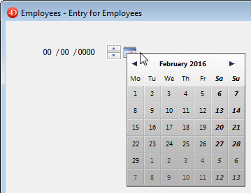
For more information about DatePicker widget commands, refer to DatePicker.
Note: Initially, the Date picker, Pop-up Date and Date entry objects all share the same Date variable and will display matching dates when used on the same form.
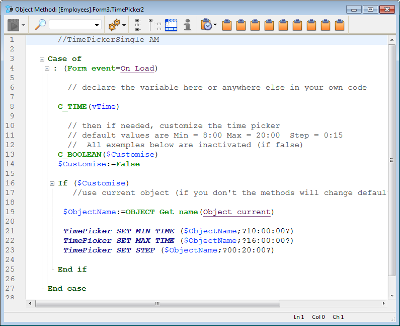
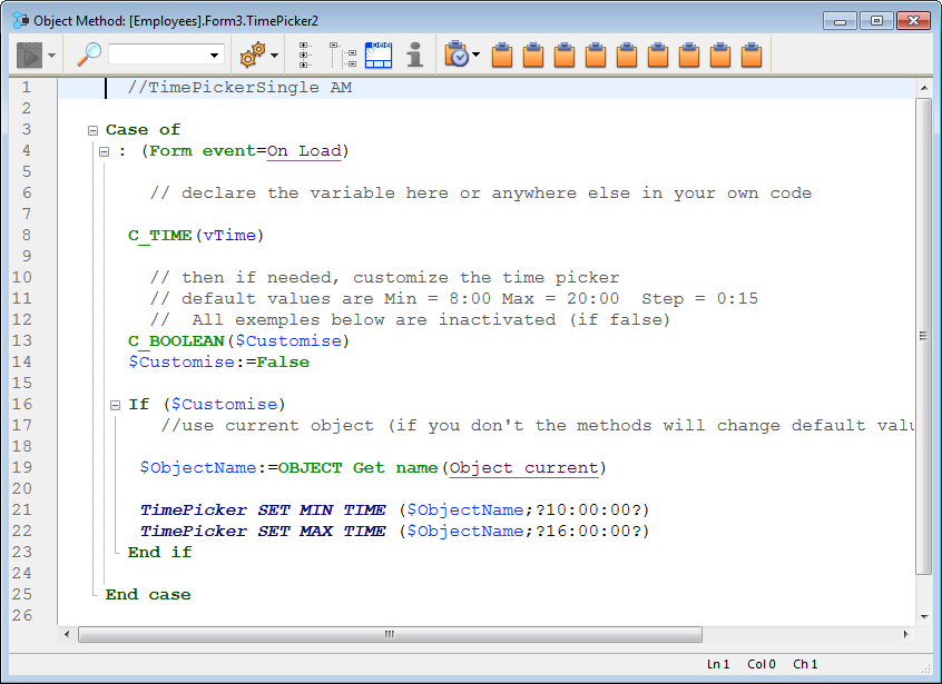
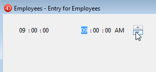
Adds a pop-up area used to enter a time. You can configure min and max values as well as the intervals used.
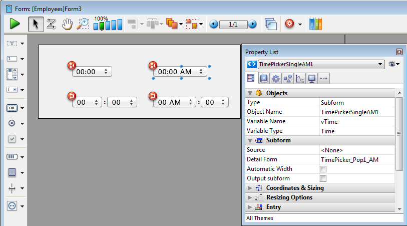
Sample code is provided in its object method. You can configure it using the commands provided for the Time picker widget.
Here are the different time pickers available in a form:
For more information about TimePicker widget commands, refer to TimePicker.
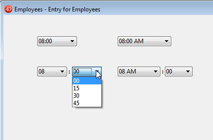
Adds a time entry area with three separate fields for entering the hour, minute and second, respectively. You can also configure it to specify an enterable span of times.
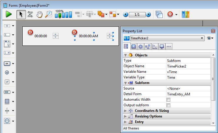
Sample code is provided in its object method. You can configure it using the commands provided for the Time picker widget.
Here are the time entry areas available in a form:
For more information about TimePicker widget commands, refer to TimePicker.
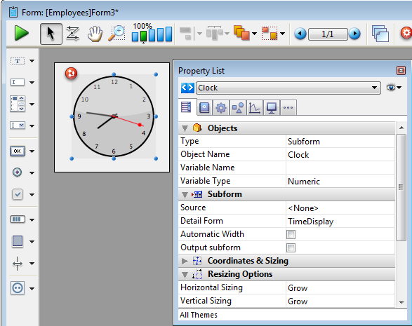
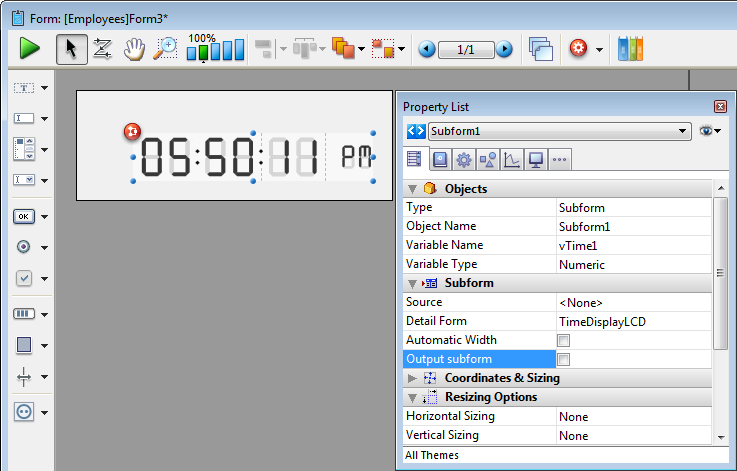
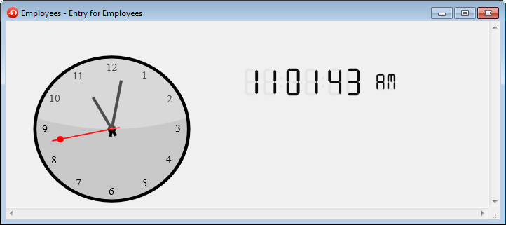
Adds a time display area (clock or LCD) which can display a static time or a functioning clock, depending on the type of associated variable.
Sample code is provided in each object method to demonstrate different display options. You can also configure it using the commands provided for the Time picker widget.
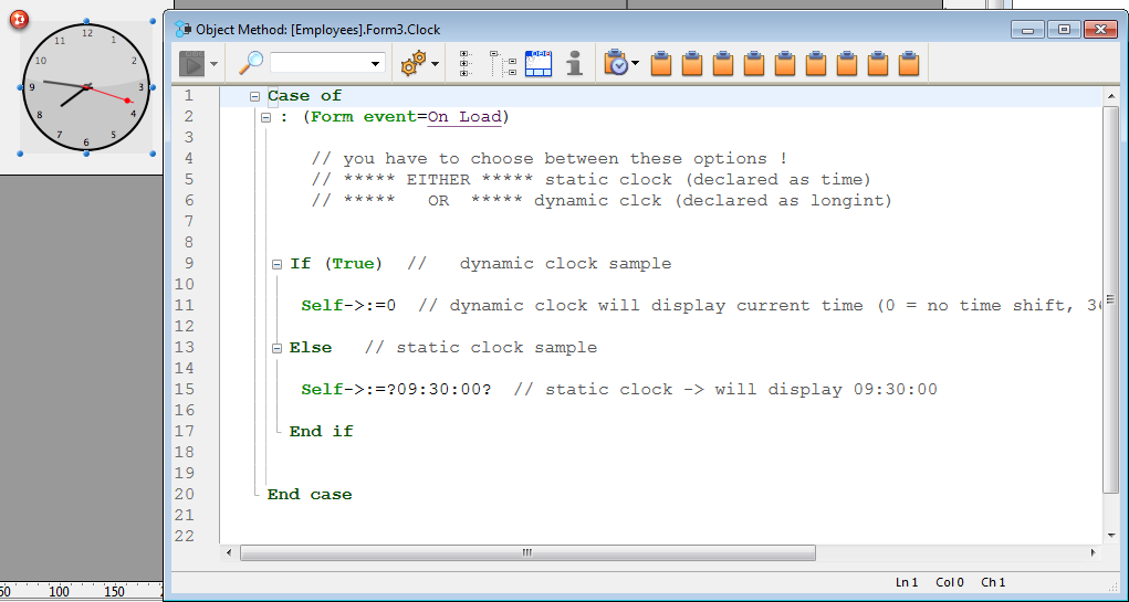
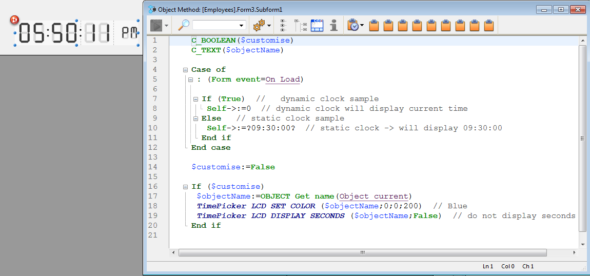
When you declare the associated variable as a specific time in the object method, this time is displayed as a static object.
To display a dynamic time, you must declare the variable as a longint. When you set its value to “0”, the clock or LCD displays the current time.
You can set other values (positive or negative) in order to shift the time displayed accordingly. This value is expressed in seconds, so passing “3600” shifts the time displayed ahead one hour, for example, and passing “-1800” shifts the time displayed back by a half hour.
For more information about TimePicker widget commands, refer to TimePicker.

Product: 4D
Theme: Building forms
4D Design Reference ( 4D v15.4)
4D Design Reference ( 4D v15.3)


