
4D v12.4
List box specific properties
 List box specific properties
When you select a List Box object in the Form editor, the Property List displays several specific themes and properties. Additional specific properties are available when you select a list box column (see List box column specific properties) or a column header (see List box header specific properties).
This theme includes the Data Source property that is used to specify the type of list box:
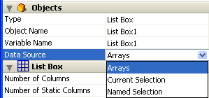
- Select the Current Selection option if you want to use expressions, fields or methods whose values will be evaluated for each record of the current selection of a table.
- Select the Named Selection option if you want to use expressions, fields or methods whose values will be evaluated for each record of a named selection.
- Select the Arrays option if you want to use array elements as the rows of the list box.
The Arrays option is required when you want to be able to retrieve the result of an SQL query in a list box (see Displaying the result of an SQL query in a list box).
This theme appears for selection type list boxes only. It contains the Master Table property for list boxes based on the current selection or the Named Selection property for list boxes based on a named selection.
- Master Table: Specifies the table whose current selection will be used. This table and it current selection will form the reference for the fields associated with the columns of the list box (field references or expressions containing fields). Even if some columns contain fields from other tables, the number of rows displayed will be defined by the master table.
The menu associated with this property displays all the database tables, regardless of whether the form is related to a table (table form) or not (project form). By default, the property displays the first table of the database. For more information about the behavior of this property, refer to Display of fields in list boxes. - Named Selection: Specifies the named selection to be used. You must enter the name of a valid named selection. It can be a process or interprocess named selection. The contents of the list box will be based on this selection. The named selection chosen must exist and be valid at the time the list box is displayed, otherwise the list box will be displayed blank. If you leave the name area blank, the list box will also be displayed blank.
Note: Named selections are ordered lists of records. They are used to keep the order and current record of a selection in memory. For more information, refer to Named Selections of the 4D Language Reference manual.
This theme groups together all the basic object properties.
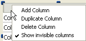
- Number of Columns: Number of columns displayed in the list box (1 by default). You can modify the number of columns (add, duplicate or delete a column) using the context menu (click on a column or column header):
- Number of Static Columns: Number of columns that cannot be moved during execution. This value indicates the number of static columns starting from the first column of the list box. To prevent any column being moved, this value must be equal to the total number of columns. This property takes invisible columns into account.
By default, if the hierarchical mode is not active (Hierarchical list box option not checked), the property value is 0, which means that all columns can be moved. When the hierarchical mode is active (array type list boxes only), this option is always at least 1. - Show Column Headers: Allows displaying or hiding column headers (displayed by default).
- Highlight Set: This property is added for selection type list boxes only. It is used to specify the set to be used to manage highlighted records in the list box (when the Arrays data source is selected, a Boolean array with the same name as the list box is used).
4D creates a default set, named ListBoxSet1, that you can modify if necessary. It can be a local, process or interprocess set (we recommend using a local set, for example $LBSet, in order to limit network traffic). It is then maintained automatically by 4D. If the user selects one or more rows in the list box, the set is updated immediately. If you want to select one or more rows by programming, you can apply the commands of the “Sets” theme to this set.
Notes:- The highlighted status of the list box rows and the highlighted status of the table records are completely independent.
- If the “Highlight Set” property does not contain a name, it will not be possible to make selections in the list box.
- Row Style Array (array type list box) / Row Style (selection type list box): Used to apply a custom character style to each row of the list box.
- For array type list boxes, you must enter the name of a Longint type array. Each element of this array corresponds to a row of the list box; the array must have the same size as the arrays associated with columns. To fill in the array (using a method), use the “Font Styles” theme constants. By adding constants, you can combine styles. To apply the style set in the properties of the list box to a row, pass the value -255 to the element of the corresponding array.
- For selection type list boxes, you must enter an expression or a variable (except for an array). The expression or variable will be evaluated for each row displayed. You can use the Formula editor to specify an expression. To do this, click on the [...] button which appears when you select the area. You can use the constants of the “Font Styles” theme.
The following example uses a variable name: enter CompanyStyle in the Row Style area and, in the form method, write the following code:
- Row Font Color Array (array type list box) / Row Font Color (selection type list box): Used to apply a custom font color to each row of the list box. You must use RGB color values. For more information about this, refer to the description of the OBJECT SET RGB COLORS command in the 4D Language Reference manual.
- For array type list boxes, you must enter the name of a Longint type array. Each element of this array corresponds to a row of the list box; the array must have the same size as the arrays associated with columns. You can use the constants of the “SET RGB COLORS” theme. To apply the font color specified in the list box properties to a row, pass the value -255 to the corresponding element of the array.
- For selection type list boxes, you must enter an expression or a variable (except for an array). The expression or variable will be evaluated for each row displayed. You can use the Formula editor to specify an expression. To do this, click on the [...] button which appears when you select the area. You can use the constants of the “SET RGB COLORS” theme.
The following example uses a variable name: enter CompanyColor in the Row Font Color area and, in the form method, write the following code:CompanyColor:=Choose([Companies]ID;Default background color;Default light shadow color;Default foreground color;Default dark shadow color)
- Row Background Color Array (array type list box) / Row Background Color (selection type list box): Used to apply a custom background color to each row of the list box. You must use RGB color values. For more information about this, please refer to the description of the OBJECT SET RGB COLORS command in the 4D Language Reference manual.
- For array type list boxes, you must enter the name of a Longint type array. Each element of this array corresponds to a row of the list box; the array must have the same size as the arrays associated with columns. You can use the constants of the “SET RGB COLORS” theme. To apply the background color specified in the list box properties to a row, pass the value -255 to the corresponding element of the array.
- For selection type list boxes, you must enter an expression or a variable (except for an array). The expression or variable will be evaluated for each row displayed. can use the Formula editor to specify an expression. To do this, click on the [...] button which appears when you select the area. You can use the constants of the “SET RGB COLORS” theme.
- Hidden Rows Array (array type list box only): Used to hide one or more rows in the list box. You must enter the name of a Boolean type array. This array must have the same number of elements as the list box. Each element of the array represents the displayed/hidden status of the corresponding row in the list box:
- To hide a row, pass True,
- To display a row, pass False.
Hiding rows only affects the display of the list box. The hidden rows are still present in the arrays and can be managed by programming. The language commands, more particularly LISTBOX Get number of rows or LISTBOX GET CELL POSITION, do not take the displayed/hidden status of rows into account. For example, in a list box with 10 rows where the first 9 rows are hidden, LISTBOX Get number of rows returns 10.
From the user’s point of view, the presence of hidden rows in a list box is not visibly discernible. Only visible rows can be selected (for example using the Select All command). - Selection Mode: Used to specify the selection mode for rows in the list box. Three modes are available:
- None: No row can be selected and no data can be entered. Selection and data entry can only be managed by programming. Clicking or double-clicking on the list will have no effect (even if the Enterable option is checked) but the On Clicked and On Double Clicked events can be generated. With this mode, the developer has full control over selections (using the Highlight Set) and over data entry (using the EDIT ITEM command). The On Selection Change and On Before Data Entry events are not generated. On the other hand, the On After Edit event can be generated when data is entered by the user through the EDIT ITEM command.
- Single: Only one row can be selected at a time.
- Multiple: Several rows can be selected (adjacent or not) using standard shortcuts: Shift+click for an adjacent selection and Ctrl+click (Windows) or Command+click (Mac OS) for a non-adjacent selection.
This theme groups together all of the properties linked to the grid displayed in the list box object.
- Horizontal Lines: Displays or hides the horizontal lines of the list box (displayed by default).
- Horizontal Line Color: Defines the color of horizontal lines in the list box (gray by default).
- Vertical Lines: Displays or hides the vertical lines of the list box (displayed by default).
- Vertical Line Color: Defines the color of vertical lines in the list box (gray by default).
This theme is only available for list boxes whose data source is Arrays. Its options configure the hierarchical display of the list box. Note that these properties are modified automatically when you define the hierarchy using the pop-up menu of the list box object (see Creating and using hierarchical list boxes).
- Hierarchical list box: Used to specify that the list box must be displayed in hierarchical form.
- Variable 1 ... 10: These additional options appear when the Hierarchical list box option is checked. Each time a value is entered in a field, a new row is added. Up to 10 variables can be specified.
These variables set the hierarchical levels to be displayed in the first column.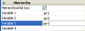
The first variable always corresponds to the name of the variable for the first column of the list box (the two values are automatically bound). This first variable is always visible and enterable. For example: country.
The second variable is also always visible and enterable; it specifies the second hierarchical level. For example: regions.
Beginning with the third field, each variable depends on the one preceding it. For example: counties, cities, and so on. A maximum of ten hierarchical levels can be specified.
If you remove a value, the whole hierarchical specified moves up a level.
The last variable is never hierarchical even if several identical values exists at this level. For example, referring to the configuration illustrated above, imagine that arr1 contains the values A A A B B B, arr2 has the values 1 1 1 2 2 2 and arr3 the values X X Y Y Y Z. In this case, A, B, 1 and 2 could appear in collapsed form, but not X and Y:
+ A
+ 1
X
X
Y
+ B
+ 2
Y
Y
Z
This principle is not applied when only one variable is specified in the hierarchy: in this case, identical values may be grouped.
Note: If you specify a hierarchy based on the first columns of an existing list box, you must then remote or hide these columns (except for the first), otherwise they will appear in duplicate in the list box. If you specify the hierarchy via the pop-up menu of the editor (see Creating and using hierarchical list boxes), the unnecessary columns are automatically removed from the list box.
This theme groups together all the properties related to the coordinates, width and height of the list box.
The Row Height property is specific: it allows you to set the height of the list box rows (in pixels). This height is also applied to headers. The row height is set, by default, according to the platform and the font size.
This theme groups together properties related to the background color of rows as well as the border style.
- Background Color: Allows setting the background color of the list box. This color is used for the entire object with the exception of headers (if displayed).
- Alternate Background Color: Allows setting a different background color for odd-numbered rows in the list box. Using an alternating background color makes reading arrays easier.
- Border Line Style: Allows setting a standard style for the list box object border.
This theme groups together all the properties related to the dynamic behavior of the list box.
- Method (Edit...): This button displays the method of the list box object (note that each column can also contain an object method).
- Draggable and Droppable: Activates the drag-and-drop functions of the list boxes, which allows a list box row to be dragged and dropped onto another list box or another 4D object and vice versa. Only list box rows are concerned; it is not possible to drag and drop columns (however, it is still possible to move columns inside the same list box).
Drag and drop in list boxes is managed using standard 4D drag-and-drop mechanisms (On Drop and On Drag Over form events, DRAG AND DROP PROPERTIES and Drop position commands). - Movable Rows (array type list boxes only): Authorizes the movement of rows during execution. This option is checked by default. It is not available for selection type list boxes nor for list boxes in hierarchical mode (Hierarchical list box option checked).
- Sortable: Allows sorting column data by clicking the header. This option is checked by default.
Picture type arrays (columns) cannot be sorted using this mechanism.
In list boxes based on a selection of records, the standard sort function is available only:- When the data source is Current Selection,
- With columns associated with fields (of the Alpha, Number, Date, Time or Boolean type).
A standard list box sort changes the order of the current selection in the database. However, the highlighted records and the current record are not changed.
A standard sort synchronizes all the columns of the list box, including calculated columns.
Product: 4D
Theme: List boxes


